Wikipedia:Graphics Lab/Illustration workshop/Archive/Sep 2011
  | This page, part of the Graphics Lab Wikiproject, is an archive of requests for September 2011. Please do not edit the contents of this page. You can submit new requests here. |
Stale
Royal symbols
-
Personal standard of Crown Prince Nicholas
-
done
Article(s): etc..(different ones for each)
Request: Could someone vectorize them and make svg versions. Spongie555 (talk) 04:25, 30 July 2011 (UTC)
Graphist opinion(s): None of these have clear sources, so the copyright status is suspect. -MissMJ (talk) 04:35, 30 July 2011 (UTC)
- They're all PD due to age, so yes they can be vectorized and uploaded on Commons. Fry1989 (talk) 20:35, 10 August 2011 (UTC)
National Emblems of Ethiopia
-
National Emblem of Ethiopia
(1974–1987) -
National Emblem of Ethiopia
(1987–1991)
Article(s): Emblem of Ethiopia
Request: Vectorise, many thanks. TRAJAN 117 (talk) 19:55, 11 August 2011 (UTC)
Graphist opinion(s):
Coat of Maldonado
-
Coat of Arms of the Department of Maldonado, Uruguay.
Request: Hi, could someone please make a SVG version of the coat, notice that there are huge differences between one coat and another, thanks in advance. --190.64.87.142 (talk) 03:09, 18 August 2011 (UTC)
Graphist opinion(s):
Company Logos
Article(s): GoAir, Rashtriya Swayamsevak Sangh, Network 18 and HT Media
 |
Request: Vectorize.--Kkm010* ۩ ۞ 04:39, 5 August 2011 (UTC)
- Network 18 done. Connormah (talk) 04:15, 13 August 2011 (UTC)
- What about the GoAir! please try to find an SVG version of GoAir. Thanks--Kkm010* ۩ ۞ 04:21, 2 September 2011 (UTC)
Graphist opinion(s):
Seals of the Confederate States
-
Seal of the President
-
Seal of the Congress
-
Seal of the Navy Department
Article(s): President of the Confederate States, Congress of the Confederate States, Confederate States Navy
Request: Vectorise please. TRAJAN 117 (talk) 07:50, 16 August 2011 (UTC)
Graphist opinion(s):
![]() Done the one on the right placed a link on the image page to the SVG version. Tsange ☯ Talk 16:01, 16 August 2011 (UTC)
Done the one on the right placed a link on the image page to the SVG version. Tsange ☯ Talk 16:01, 16 August 2011 (UTC)
- Agh, can someone clean up the Confederate Navy SVG? It's a a bitmap trace and could use cleaning up. 76.117.247.55 (talk) 00:04, 21 August 2011 (UTC)
- The fictional seals of the Congress and President should await the vectorization of the real Seal of the Confederacy above in the Top 4. The Naval Department seal however, needs a proper vectorization, not a conversion. Fry1989 eh? 19:03, 21 August 2011 (UTC)
Spanish Supercup
Article(s): Supercopa de España
Request: Can someone create the logo for the competition? The red colour should be the same as that of the RFEF logo 79.77.16.14 (talk) 10:03, 18 August 2011 (UTC)
Graphist opinion(s):
There's two logos on that sheet, which one's the one you want? --The Pink Oboe (talk) 00:32, 21 August 2011 (UTC)
- The red silhouette logo on the right. — Preceding unsigned comment added by 79.77.23.98 (talk) 22:56, 21 August 2011 (UTC)
Flag of the President of the United States
-
Flag of the President (1882)
-
Similer 1916 eagle design
Article(s): Flag of the President of the United States
Request: Vectorise if possible, many thanks. TRAJAN 117 (talk) 17:52, 21 August 2011 (UTC)
Graphist opinion(s):
Flags of Hawaii
Article(s): Flag of Hawaii
Request: Create all with union jack at same palace and same proportion 1. nine stripe flag that goes white, red, blue, 2. & 3. two seven stripe flags is white, red, blue and red, white, blue. 4. and 5. red and white stripe flags with no blue stripe. 6. and 7. white and red stripe flags with no blue stripe.
Stick with the exact color as the version above. The first image should be called File:Flag of Hawaii 1818 variant.svg and I don't care about the title of the others. KAVEBEAR (talk) 06:13, 29 July 2011 (UTC)
- Also I don't known the exact position of the Union jack on the seven stripe version. Is it five stripe down or four stripe down? So either someone should find out or create different versions.--KAVEBEAR (talk) 07:10, 29 July 2011 (UTC)
- Also if anybody is wondering why. I'm not making these things up. They were actually observed by visiting sea captains and explorers in from 1816 to 1845.--KAVEBEAR (talk) 07:10, 29 July 2011 (UTC)
Graphist opinion(s): ![]() Request taken by roshan220195.
Request taken by roshan220195.
Signature of Armand Trousseau
Article(s): Armand Trousseau
Request: Please vectorize the signature on the bottom... KAVEBEAR (talk) 23:06, 22 August 2011 (UTC)
Graphist opinion(s):
Indonesian regency shield
-
Shield of Bone Regency, Indonesia
Article(s): Bone Regency
Request: Please trace as SVG and remove background. Thank you. Crisco 1492 (talk) 15:40, 23 August 2011 (UTC)
Graphist opinion(s):
Great Lakes Circle Tours
-
Great Lakes Circle Tour marker
-
Lake Superior Circle Tour marker
-
Lake Michigan Circle Tour marker
-
Lake Michigan Circle Tour marker
-
Lake Erie Circle Tour marker
Article(s): Many, primarily Great Lakes Circle Tour
Request: Please create SVG versions of these five highway markers using MUTCD Green (Pantone 342). Two additional versions of the lakes Michigan Superior markers are needed in MUTCD Brown (Pantone 469). (My signature is MUTCD Green, which is the correct shade for highway markers, although the reflectorized sheeting looks lighter when reflecting light, which is what these approximate.) They should all have the white border with a thin green (or black) outline around them as well.Imzadi 1979 → 01:12, 22 August 2011 (UTC)
- I don't suppose you know which font face is used? --The Pink Oboe (talk) 21:37, 22 August 2011 (UTC)
- Normally, I'd say that it would be one of the FHWA Highway Gothic typeface series, which are available online as the "Roadgeek" fonts. I can't state that for certain though. Imzadi 1979 → 22:55, 22 August 2011 (UTC)
- Looks to be a combination of FHWA Highway Gothic Series C and D. If you can't download them, wiki-email me and I will send them. –Fredddie™ 02:50, 25 August 2011 (UTC)
- Normally, I'd say that it would be one of the FHWA Highway Gothic typeface series, which are available online as the "Roadgeek" fonts. I can't state that for certain though. Imzadi 1979 → 22:55, 22 August 2011 (UTC)
Graphist opinion(s):
Lolicon for FP
-
An illustration of lolicon
Request: Please vectorize in preparation for a FP nomination. Creator seems to have retired, as he has been inactive for 2 years. Crisco 1492 (talk) 15:19, 1 September 2011 (UTC)
Graphist opinion(s): It'll be a couple of days as I'm vectorising another of Kasuga's fine artwork but if that's okay timewise then put me down for this one. Though I have to admit I'm not going to look forward to the dirty looks my family are gonna give me for this one! Says me who considers 35 too young to lust after! --The Pink Oboe (talk) 01:28, 3 September 2011 (UTC)
- LOL. I expect some dirty looks at the nomination too. No rush. Crisco 1492 (talk) 10:11, 3 September 2011 (UTC)
Coats of arms of Iran
-
Coat of arms of Iran (1576–1907)
-
Coat of arms of Iran (1907–1925)
-
Done
-
Done
Article(s): Emblem of Iran
Request: Vectorise please, many thanks. TRAJAN 117 (talk) 21:49, 6 September 2011 (UTC)
- I think I can make the second one shortly, the first one I think is on an old Iranian flag somewhere so I can also take it from there for you. I'll reply here again if I can't find it. Fry1989 eh? 23:17, 6 September 2011 (UTC)
- Thanks, look forward to hearing from you anyways. :P TRAJAN 117 (talk) 23:37, 6 September 2011 (UTC)
- Done the second one, hope that's good. Hunting for the other one now :) Fry1989 eh? 00:14, 7 September 2011 (UTC)
- There we go :) Fry1989 eh? 00:17, 7 September 2011 (UTC)
- Many thanks, but i noticed that the second one has a Pahlavi Crown, instead of the Qajar Crown. Perhaps Sodacan could redraw a new one, using the original. :) TRAJAN 117 (talk) 00:38, 7 September 2011 (UTC)
- Yeah, that was the best I could do. I'm sure he can fix that for you :) Fry1989 eh? 00:41, 7 September 2011 (UTC)
- Judging by the number of requests he has, it looks like a long wait :( TRAJAN 117 (talk) 01:01, 7 September 2011 (UTC)
- Yeah, that was the best I could do. I'm sure he can fix that for you :) Fry1989 eh? 00:41, 7 September 2011 (UTC)
- Many thanks, but i noticed that the second one has a Pahlavi Crown, instead of the Qajar Crown. Perhaps Sodacan could redraw a new one, using the original. :) TRAJAN 117 (talk) 00:38, 7 September 2011 (UTC)
- Thanks, look forward to hearing from you anyways. :P TRAJAN 117 (talk) 23:37, 6 September 2011 (UTC)
- I think I can make the second one shortly, the first one I think is on an old Iranian flag somewhere so I can also take it from there for you. I'll reply here again if I can't find it. Fry1989 eh? 23:17, 6 September 2011 (UTC)
Graphist opinion(s):
Resolved
Slight mistake correction
Articels: Meiji Constitution
Request: The blue text above the legislature should read "Appointment of Peers and dissolution of the House of Representatives". 76.117.247.55 (talk) 20:30, 15 August 2011 (UTC)
Oppinion:
![]() Done. Derfel73 (talk) 22:26, 15 August 2011 (UTC)
Done. Derfel73 (talk) 22:26, 15 August 2011 (UTC)
- I just noticed something else: "Emperor" is misspelled... 76.117.247.55 (talk) 00:02, 21 August 2011 (UTC)
- You could change that yourself in a text editor. Just do a text search for the guilty text. --The Pink Oboe (talk) 00:29, 21 August 2011 (UTC)
- I have converted the text into path and corrected "Emperor". --Robot8A (talk) 09:44, 29 August 2011 (UTC)
- You could change that yourself in a text editor. Just do a text search for the guilty text. --The Pink Oboe (talk) 00:29, 21 August 2011 (UTC)
Change image to an SVG
-
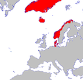
Map of Denmark-Norway
-
Possible base 2
-
Vector map
Article(s): Denmark-Norway
Request: Please can you trace this and change it into an SVG file, if possible. Thanks. Peter (talk) 00:39, 16 August 2011 (UTC) Edit: Is it possible for the red colour to be the same as that found on File:Flag of Denmark? Many thanks. Peter (talk) 01:13, 16 August 2011 (UTC)
Graphist opinion(s):
![]() Request taken by Derfel73.. I have suggested three possible base maps in vector format; using these would be slightly easier than vectorising the png image. Please indicate if the/which possible base maps would be satisfactory (note that File:Europe_(orthographic_projection).svg provides a full depiction of Greenland). Derfel73 (talk) 01:15, 16 August 2011 (UTC)
Request taken by Derfel73.. I have suggested three possible base maps in vector format; using these would be slightly easier than vectorising the png image. Please indicate if the/which possible base maps would be satisfactory (note that File:Europe_(orthographic_projection).svg provides a full depiction of Greenland). Derfel73 (talk) 01:15, 16 August 2011 (UTC)
- The orthographic projection would be the best, although the Faroe Islands will need adding on, which I assume would be easy to do (with a dot to represent them). Would the redclash with the background though? Thanks. Peter (talk) 03:51, 16 August 2011 (UTC)
- On second thoughts, File:Blank map europe no borders.svg would be better, and there is enough of Greenland visible for it to work. The globe is not detailed enough. The blank map also allows the red colour to be used. Peter (talk) 03:55, 16 August 2011 (UTC)
- The orthographic projection would be the best, although the Faroe Islands will need adding on, which I assume would be easy to do (with a dot to represent them). Would the redclash with the background though? Thanks. Peter (talk) 03:51, 16 August 2011 (UTC)
![]() Done Derfel73 (talk) 12:15, 16 August 2011 (UTC)
Done Derfel73 (talk) 12:15, 16 August 2011 (UTC)
Map of USA with state names.svg needs a more detailed/robust font-family in source SVG
-
A compass of the United States, with state names.
Article(s): Political_divisions_of_the_United_States
Request: In the source of the file, replace:
font-family:Nimbus Sans L
with:
font-family:'Arial Narrow','Nimbus Sans L',sans-serif;"
This makes the source SVG map more readable where "Nimbus Sans L" is not installed. Tested on a local copy.
Re-opening this request. Sorry for not following up last time. This is what happened last time:
Made the font bold. What do you think about that? Wereldburger758 (talk) 07:18, 22 February 2011 (UTC)
The problem is not the boldness of the font; in fact, I prefer the thinner font that fits better into the boundaries. My problem is that when "Nimbus Sans L" is not installed (e.g. most Microsoft Windows systems) the font-family string does not find a match, so the font is not rendered properly and usually a serif font will be used. The change I stated above tries first 'Arial Narrow' and if that is not found uses 'Nimbus Sans L' and then finally falls back to a sans-serif font. Looking back perhaps it would be better to put 'Nimbus Sans L' as the first choice, and 'Arial Narrow' second. You can perform this change by editing the SVG source in a text editor and doing a simple find-replace. It appears the change making the font bold also was not uniformly applied; I see a few instances where the font is not bold. I recommend doing a find-replace for "font-weight:bold" to "font-weight:normal", but another alternative would be to do the reverse, either of which would bring more of the font-weights in sync.
Graphist opinion(s):
![]() Done - When user now opens the file, the font renders in Arial Narrow, if installed. Wikipedia still renders Nimbus for its previews. -MissMJ (talk) 05:55, 31 August 2011 (UTC)
Done - When user now opens the file, the font renders in Arial Narrow, if installed. Wikipedia still renders Nimbus for its previews. -MissMJ (talk) 05:55, 31 August 2011 (UTC)
Arabic script
-
Dissection of the Arabic writing of Allah
-
Vector version (without Arabic text)
Article(s): Allah
Request: Please convert to SVG then upload to Commons. Crisco 1492 (talk) 06:42, 30 August 2011 (UTC)
Graphist opinion(s):
- Since most editors here probably don't know any Arabic, could you perhaps transcribe the Arabic text used in the image? —Quibik (talk) 13:08, 1 September 2011 (UTC)
- It would be much appreciated if you could simply write the Arabic text here on this page; then I can paste it into the vector image. Derfel73 (talk) 13:26, 1 September 2011 (UTC)
- It doesn't have to be an exact copy of the existing image. Just use the Commons' international method and use numbering so that various translations can be used in the summary box? This will then also solve the 'fonts on system', eg I have hundreds of fonts on my system due to my work yet I didn't have Freestyle and Freestyle Symbols. --The Pink Oboe (talk) 14:59, 1 September 2011 (UTC)
- Arabic text is الله (based on our article). If you wish, you can use some more stylized bases found here. (Superscript is partially out of frame in current SVG. Crisco 1492 (talk) 15:23, 1 September 2011 (UTC)
- It doesn't have to be an exact copy of the existing image. Just use the Commons' international method and use numbering so that various translations can be used in the summary box? This will then also solve the 'fonts on system', eg I have hundreds of fonts on my system due to my work yet I didn't have Freestyle and Freestyle Symbols. --The Pink Oboe (talk) 14:59, 1 September 2011 (UTC)
- It would be much appreciated if you could simply write the Arabic text here on this page; then I can paste it into the vector image. Derfel73 (talk) 13:26, 1 September 2011 (UTC)
- Remaining Arabic text:
الف خنيريي: alif khanjariya شدق: shadda تشديد: tashdid الف وصلق: alif wasla همزتا الوصل: hamzatu 'wasl
- Hope this helps. Mind you, the diacritics are rather important for the English text Crisco 1492 (talk) 15:47, 1 September 2011 (UTC)
 Done. I have made a version with numbers, though if you prefer the version with text, you can revert the image to that version in its history (all text errors are fixed) or I can upload the image with text as another file. Derfel73 (talk) 16:54, 1 September 2011 (UTC)
- Thanks
National Police Corps
Article(s): National Police Corps of Spain
Request: Vectorise please. 89.168.38.142 (talk) 21:10, 25 August 2011 (UTC)
Graphist opinion(s):
![]() Request taken by The Pink Oboe.
Request taken by The Pink Oboe.![]() Done
Done
Company Logo
-
Sprint Nextel logo
-
Sprint Nextel logo wing
-
Bebo logo
Article(s): See below
Bebo logo: Bebo
Sprint Nextel logo: Sprint Nextel
Sprint Nextel wing: Template:Sprint
Request: These logos of two companies have simple geometry that are ineligible for copyright and therefore in the public domain. These logos should be moved to Wikimedia Commons. The wing of Sprint Nextel logo should be used on "Sprint" template. Kungfu2187 (talk) 12:21, 29 August 2011 (UTC)
- RE: Please remove the white background of Bebo logo. Thank you. --Kungfu2187 (talk) 12:22, 29 August 2011 (UTC)
Graphist opinion(s): It should be noted that the Bebo SVG file is merely a container for the raster version of the logo. It is not a true SVG file. --The Pink Oboe (talk) 12:50, 29 August 2011 (UTC)
![]() Done Derfel73 (talk) 16:47, 30 August 2011 (UTC)
Done Derfel73 (talk) 16:47, 30 August 2011 (UTC)
Today's FA
-
Edmund Herring, Australian soldier
Article(s): Edmund Herring
Request: Remove watermarks, touch up white area at top. Crisco 1492 (talk) 04:03, 2 September 2011 (UTC)
Graphist opinion(s):
Wrong workshop, edit protected, but what the hell... --The Pink Oboe (talk) 10:15, 2 September 2011 (UTC)
- It's a portrait, so I thought this is where it should go. Anyways, thanks! Crisco 1492 (talk) 00:48, 3 September 2011 (UTC)
- Actually the one I did turned out to be a lower res duplicate of the one Krinkle uploaded, so although my work was for naught, we've ended up with a better version than the original anyway :)
- As for the 'wrong workshop'... anything that involves manipulating pixels goes to the photography workshop, anything that involves vectors comes here and anything that involves maps, whether raster-based or vector, goes to the map workshop. I hope that clears that one up. Now for sleep, have fun one and all... --The Pink Oboe (talk) 01:23, 3 September 2011 (UTC)
- Ah. Gotcha. Crisco 1492 (talk) 10:09, 3 September 2011 (UTC)
Ride On logos
-
Svg version without bottom text
Article(s): Ride On (bus)
Request: Requesting that these images be converted to SVG. Thanks! SchuminWeb (Talk) 19:07, 27 August 2011 (UTC)
Graphist opinion(s):
![]() Request taken by Robot8A.
Request taken by Robot8A.
- What is the name of the font on new logo? --Robot8A (talk) 10:30, 29 August 2011 (UTC)
- First version of new logo (without text): en:File:Ride on (logo).svg --Robot8A (talk) 10:42, 29 August 2011 (UTC)
- The same on old logo: en:File:Ride on (old logo).svg --Robot8A (talk) 11:03, 29 August 2011 (UTC)
- I don't know what font the new logo uses, but the text is also available on this PDF, which might help. SchuminWeb (Talk) 02:25, 30 August 2011 (UTC)
- Thanks, but it doesn't help me. I'm sorry. --Robot8A (talk) 06:02, 1 September 2011 (UTC)
- First version of new logo (without text): en:File:Ride on (logo).svg --Robot8A (talk) 10:42, 29 August 2011 (UTC)
Cooper Wheelock logos
-
Cooper Wheelock logo
-
Wheelock, Inc. historic logo
-
 Done
Done -
 Done
Done
Article(s): Cooper Wheelock
Request: Requesting that these be converted to SVG. Thanks! SchuminWeb (Talk) 03:46, 8 September 2011 (UTC)
Graphist opinion(s):
![]() Request taken by Robot8A.. I'm going to upload the historic logo, because I've already finished it. --Robot8A (talk) 13:22, 8 September 2011 (UTC)
Request taken by Robot8A.. I'm going to upload the historic logo, because I've already finished it. --Robot8A (talk) 13:22, 8 September 2011 (UTC)
 Done Historic logo. --Robot8A (talk) 13:26, 8 September 2011 (UTC)
 Done Cooper Wheelock logo, I put resolved at top. --Robot8A (talk) 14:09, 8 September 2011 (UTC)
- That's a rather poor autotrace. The edges are not sharp and the colour should be black and not a dark grey. Try viewing the 2000px png at 1:1 and tell me that looks like a vector graphic?--The Pink Oboe (talk) 19:58, 8 September 2011 (UTC)
- Fixed. --Robot8A (talk) 20:41, 8 September 2011 (UTC)
- That's a rather poor autotrace. The edges are not sharp and the colour should be black and not a dark grey. Try viewing the 2000px png at 1:1 and tell me that looks like a vector graphic?--The Pink Oboe (talk) 19:58, 8 September 2011 (UTC)
- Awesome, thanks! SchuminWeb (Talk) 21:06, 8 September 2011 (UTC)
Chef's knife diagram

-
Schematic diagram of a knife
-
It seems to have been done, though without the numbers being labelled
Article(s): Chef's_knife
Request: Convert to SVG and change labels to numbers. Kaldari (talk) 18:44, 29 August 2011 (UTC)
Graphist opinion(s):![]() Done
Done
- Would it be possible to get the numbers a tiny bit larger. It would be good to have them readable on a 300px thumb. Not a whole lot bigger, but just a little bit. Also would it be possible to get the dots at the ends of the label lines slightly larger (like in the original)? Thanks! Kaldari (talk) 01:37, 3 September 2011 (UTC)
- Will this do? --The Pink Oboe (talk) 13:21, 7 September 2011 (UTC)
- That looks great. Kaldari (talk) 19:09, 12 September 2011 (UTC)
- Will this do? --The Pink Oboe (talk) 13:21, 7 September 2011 (UTC)
UML diagrams overview
-
Overview of UML diagrams (using UML)
Article(s): Universal Modeling Language#Diagrams overview
Request: Please turn into svg. Suggested new name: File:UML diagrams overview.svg (we don't capitalise UML here do we?). Also, while it is in commons, can we still put it in en:Category:UML diagrams? DePiep (talk) 11:50, 7 September 2011 (UTC)
Graphist opinion(s):
{{Done}}. I don't think an image file can be put into a wikipedia category if it's on commons. Derfel73 (talk) 15:17, 10 September 2011 (UTC)
- Thanks.
Done.-DePiep (talk) 19:59, 10 September 2011 (UTC)- Oops. It is essential that the arrows are open, not filled. Another try? -DePiep (talk) 20:07, 10 September 2011 (UTC)
- What else hasn't been done/needs doing? --The Pink Oboe (talk) 01:11, 12 September 2011 (UTC)
- OK, current version is good (I was unaware of later edits, sorry for misunderstanding). Please consider this one
{{Done with Applause}}. -DePiep (talk) 01:32, 12 September 2011 (UTC)
- OK, current version is good (I was unaware of later edits, sorry for misunderstanding). Please consider this one
- What else hasn't been done/needs doing? --The Pink Oboe (talk) 01:11, 12 September 2011 (UTC)
- Oops. It is essential that the arrows are open, not filled. Another try? -DePiep (talk) 20:07, 10 September 2011 (UTC)
- Thanks.
Polyhedron graphs
-
Icosahedron graph, B3
-
Icosahedron graph, B2
-
Snub cube graph, B3
-
Snub cube graph, B2
-
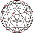
Snub dodecahedron graph, A2
-
Snub dodecahedron graph, H3
Article(s): Uniform polyhedron
Request: Make the lines thicker so that they can be seen when resized, like ![]() . 4 T C 02:13, 8 September 2011 (UTC)
. 4 T C 02:13, 8 September 2011 (UTC)
Graphist opinion(s):![]() Done --The Pink Oboe (talk) 23:30, 11 September 2011 (UTC)
Done --The Pink Oboe (talk) 23:30, 11 September 2011 (UTC)
Chi-Chi's logo
-
Chi-Chi's logo
-
SVG taken from the restaurant overseas website
Article(s): Chi-Chi's
Request: Requesting that this logo be converted to SVG. Thanks! SchuminWeb (Talk) 05:59, 8 September 2011 (UTC)
Graphist opinion(s):
 Done. I found the logo in a pdf of the restaurant menu. Apparently there are slight differences between the retaurant's logo and the one used for the salsa products, but I couldn't find a vector version of the products logo. I clarified the difference in the file descriptions, though. Regards. -- Orionist ★ talk 14:51, 12 September 2011 (UTC)
- Looks great, thanks! SchuminWeb (Talk) 17:17, 13 September 2011 (UTC)
Seals of Missouri and Massachusetts
-
Seal of Missouri
-
Seal of Massachusetts
Request: Please recreate the following seals in SVG. For Missouri: The seal of the House, seal of the Senate and the seal of the State Auditor. For Massachusetts: the seal of the Governor (the lower inscription partly cut off by the camera is "Commonwealth of Massachusetts), the seal of the Senate, and the seal of the State Police.
They can all be uploaded to Commons freely with the same licensing as the State Seals above, of which they are based off of. Thank you Fry1989 eh? 19:28, 12 September 2011 (UTC)
Graphist opinion(s):
![]() Request taken by Adelbrecht.: I've already finished Missouri. Adelbrecht (talk) 20:23, 15 September 2011 (UTC)
Request taken by Adelbrecht.: I've already finished Missouri. Adelbrecht (talk) 20:23, 15 September 2011 (UTC)
![]() Done: Finished.
Done: Finished.
- Yahoo! Thanks :) Fry1989 eh? 17:56, 16 September 2011 (UTC)
Aerocapture Diagram
-
Trajectory diagram of an object undergoing Aerocapture
Article(s): Aerocapture
Request: This image goes crazy when it's rendered on the article page. The text bunches up and generally goes mental. I don't even know how to fix it. Larryisgood (talk) 18:37, 29 August 2011 (UTC)
Graphist opinion(s):
![]() Done I have converted text to path. --Robot8A (talk) 20:27, 29 August 2011 (UTC)
Done I have converted text to path. --Robot8A (talk) 20:27, 29 August 2011 (UTC)
- Converting to paths wasn't necessary and ultimately made the file relatively enormous. --The Pink Oboe (talk) 18:03, 31 August 2011 (UTC)
- If you want things to work now on Wikipedia, just change all fonts to Arial or Times New Roman. The problem is mediawiki's rendering of SVG fonts (using librsvg, I think), and a better fix would be to change the code in the rendering engine, rather than the SVG file — it should at the very least support sans/serif as a font family, but it doesn't seem to yet. gringer (talk) 07:03, 2 September 2011 (UTC)
Barnstar image
-
Description of image
Article(s): Used in The Tireless Contributor Barnstar award.
Request: In one frame of the image (the one where one "peak" of the star points directly upwards) there appears a dark border around the star. This border should be removed in order to obtain a smooth animation. (Interestingly this doesn't seem to appear in the above depiction of the image, but I can clearly see this effect at the barnstar template page and on pages where this barnstar template is placed, such as User:WereSpielChequers/Barnstars#Helping me out). Toshio Yamaguchi (talk) 15:59, 8 September 2011 (UTC)
Graphist opinion(s): It's not an outline, the effect you are seeing is as a result of the gif format itself. Transparency in gif is very rudimentary and is as a result of one colour being declared as being transparent, so therefore cannot be dithered. As a result the edges of an object in a gif file against transparency will always either have colour aberrations and/or jaggies. It all depends on the background of the area the gif is transposed against. The only way it can be sorted is if you dither the edges of the object based on the background colour you know it's going to be up against. The problem is that it will now only look right against the backdrop you designed it for. You take pot luck as to whether it will work or not against any other, hence why it works here, but not on some other page. --The Pink Oboe (talk) 19:53, 8 September 2011 (UTC)
WikiProject Cornwall Barnstar
-
Cornwall barnstar
Article(s): Template:WikiProject Cornwall Barnstar
Request: Could the white background be made transparent please? Zangar (talk) 15:59, 15 September 2011 (UTC)
Graphist opinion(s):
![]() Done Tsange ☯ Talk 14:31, 18 September 2011 (UTC)
Done Tsange ☯ Talk 14:31, 18 September 2011 (UTC)
- Thanks, that's great. Zangar (talk) 09:23, 19 September 2011 (UTC)


