Wikipedia:Featured picture candidates/Shiprock
Appearance

- Reason
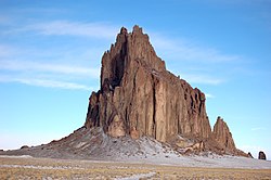
- Encyclopedic, attractive, some positive feedback on PPR
- Articles this image appears in
- Shiprock, U.S. Route 491
- Creator
- bowiesnodgrass (Flickr)
- Support as nominator --Spikebrennan (talk) 20:19, 10 October 2008 (UTC)
- Support This seems to be the week for landscapes of the American Southwest. I may have to get out my camera and (gasp) shoot something, rather than just restore. DurovaCharge! 23:14, 10 October 2008 (UTC)
- Comment Is it just me or is this way off level? Noodle snacks (talk) 00:02, 11 October 2008 (UTC)
- Yes, judging by the scree at the base this is quite a bit tilted. vlad§inger tlk 00:35, 11 October 2008 (UTC)
- Check the erosion patterns; they're consistent with a feature on rising ground. DurovaCharge! 06:41, 11 October 2008 (UTC)
- Conditional support Needs tilt correction. (Unless the consensus is that it doesn't.)--HereToHelp (talk to me) 02:17, 11 October 2008 (UTC)
Conditional Weak SupportOppose - Quite a bit of the sky is blown. Will support tilt corrected version Noodle snacks (talk) 03:24, 11 October 2008 (UTC)- Strong Oppose 1) Shiprock is much darker than this IRL 2) It'd be more enc if it showed the dike, 3) blown sky, 4) purple fringing, 5) tilt. de Bivort 03:44, 11 October 2008 (UTC)
- Support - I don't believe it is tilted. The fracture lines are pretty much vertical, and if the ground is slightly sloped - which is, of course, entirely possible - we would see what we see here. Shoemaker's Holiday (talk) 06:44, 11 October 2008 (UTC)
- The vertical lines in the rock lean to the right quite a bit, so probably it should be leveled such that they are vertical? Noodle snacks (talk) 12:04, 11 October 2008 (UTC)
- Oppose. A quick Google image search brings up some lovely images and suggests that this is indeed tilted, though the ground may slope somewhat as well making things hard to judge; perhaps those suggesting it's not tilted could explain why the clouds tilt as well in sympathy with the 'apparent' tilt of the ground and rock. Unlike Debivort I can't comment on the real colours, but can only say that these colours look quite artificial - it seems to have undergone quite a lot of image processing, excessively lifting the shadows and probably fiddling with colours. Appears quite unsharp - I suspect the focus is somewhere on the ground in front of the rock. --jjron (talk) 14:08, 12 October 2008 (UTC)
- Thank you jjron for paying attention here! It is definitely tilted. Shiprock sits in a giant wash valley that is very flat. It is not amidst hills or anything that could justify the horizon tilt. On the other hand, as an eroded lava tube, nothing says that the fissures on shiprock itself should be vertical (for those of you worrying about what a tilt correction would do to the rock's verticals). de Bivort 03:36, 13 October 2008 (UTC)
- I don't know this particular valley. What caught my attention is the erosion pattern in the sand at the base. If the feature were upon level ground and the image were tilted, then I'd expect to see an even flow pattern spreading outward from the base. What I see instead is a smooth flow pattern on the right side and an uneven flow pattern on the left side. If the feature really sits upon sloping ground then I'd expect erosion on the 'high ground' side to drift downhill, and that's what it appears to be doing. Debivort is right to say that the orientation of rock in an eroded lava tube is meaningless as a way to intuit 'up'. But sand erosion is meaningful. I can't tell whether the degree of tilt here is correct, but I'm satisfied with the basic assumption that the left side of the image is higher ground. DurovaCharge! 09:08, 13 October 2008 (UTC)
- You may be satisfied with the assumption, but it's wrong. At what point do we trust people who've been there three or four times? Never, I suppose... But look at this satellite image. The erosion patterns at the base are radial, not biased. I think what you are seeing Durova is a foreshortening effect coupled with the scree fields not being circular. de Bivort 18:57, 13 October 2008 (UTC)
- Besides! It's too pale, has blown highlights and purple fringing! And, showing the dike would increase enc. de Bivort 19:00, 13 October 2008 (UTC)
- I might be misled by the effects of prevailing winds, but I doubt very much that foreshortening played any role. DurovaCharge! 06:26, 14 October 2008 (UTC)
- Oppose tilted horizon as well as other issues. --Leivick (talk) 20:43, 13 October 2008 (UTC)
- Oppose Per above and the overall image quality isn't great. --Massimo Catarinella (talk) 15:20, 14 October 2008 (UTC)
Not promoted MER-C 08:10, 19 October 2008 (UTC)
