Talk:Aitoff projection
| This article is rated Stub-class on Wikipedia's content assessment scale. It is of interest to the following WikiProjects: | |||||||||||||||||
| |||||||||||||||||
Replace low-contrast images
[edit]
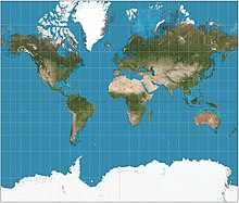
I will be replacing images on the various map projection pages. Presently many are on a satellite composite image from NASA that, while realistic, poorly demonstrates the projections because of dark color and low contrast. I have created a stylization of the same data with much brighter water areas and a light graticule to contrast. See the thumbnail of the example.
The images will be high resolution and antialiased, with 15° graticules for world projections, red, translucent equator, red tropics, and blue polar circles. The weight, color, and transparency of the graticule lines was chosen for legibility at the thumbnail size without overwhelming the full-sized image.
Please discuss agreement or objections here. I intend to start these replacements on 13 August. Thank you. Strebe (talk) 22:31, 6 August 2011 (UTC)
- Good step. :) --Chricho ∀ (talk) 11:46, 17 August 2011 (UTC)
- Why did you upload a cut off version for the Mercator projection? That one you posted on the discussion page is much better because it demonstrates the stretching. --Chricho ∀ (talk) 11:48, 17 August 2011 (UTC)
- Hi, Chricho. Thanks for the comments. I don’t follow your question. The Mercator has to be cut off somewhere because the full map is infinite in extent. Which discussion page do you refer to? Strebe (talk) 00:27, 18 August 2011 (UTC)
- Hi, your proposed image at the discussion page is simply a little bit less cut off, there the stretch is more obvious. --Chricho ∀ (talk) 22:55, 10 September 2011 (UTC)
- Which discussion page do you mean, please? Strebe (talk) 01:58, 11 September 2011 (UTC)
- Looks good, Strebe. Thank you.
- I'm pretty sure Chricho is alluding to the Talk:Mercator projection#Replace low-contrast images section. I agree with Chricho that the "square" image is a better illustration for the Mercator article than the "slightly more clipped" image, because it illustrates the stretching better. I understand that, mathematically, the Mercator projection is infinitely long north-south, so we have to clip it somewhere. I think Chrico is alluding to the following two images: --DavidCary (talk) 17:50, 4 December 2011 (UTC)


- Ah. Got it. Thanks, and thanks for the comments. I’ll consider the taller image in the context of the Mercator article. It’s very uncommon for the Mercator to extend that far. Google Maps does it for its tiling system, but Google Maps was not developed as a display world map. Meanwhile printed maps never show it like that, so to do so would be “ahistorical” and not representative. I understand that the square representation makes the vertical stretching even more obvious, but the vertical stretching already seems obvious to me, and it’s not clear to me that making it more obvious is more important than showing the map in a way more representative of how it is normally used. I’d like more discussion about this if I am to make the change. Strebe (talk) 23:33, 4 December 2011 (UTC)
- Yes, DavidCary is right about interpreting my statement. ;) Sorry, missed the discussion. --Chricho ∀ (talk) 21:27, 5 December 2011 (UTC)
- The Mercator projection#Uses section implies that the "square Mercator" arrangement is pretty common for online maps.
- Would it be possible to make two images for the Mercator article, one with a "square Mercator" projection and another one with a "typical printed map" arrangement? --DavidCary (talk) 06:04, 17 December 2011 (UTC)
- I have uploaded an image. We should move this discussion over to the Mercator page, where it belongs. I’ll copy and paste from here. Strebe (talk) 08:07, 17 December 2011 (UTC)
File:Aitoff projection SW.jpg to appear as POTD
[edit]Hello! This is a note to let the editors of this article know that File:Aitoff projection SW.jpg will be appearing as picture of the day on May 11, 2015. You can view and edit the POTD blurb at Template:POTD/2015-05-11. If this article needs any attention or maintenance, it would be preferable if that could be done before its appearance on the Main Page. Thanks! — Crisco 1492 (talk) 00:54, 23 April 2015 (UTC)


