Wikipedia:Picture peer review/Yellow onions
Appearance


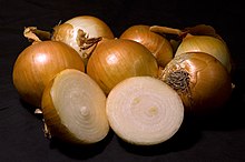
I took this shot to try and improve on Wikipedia:Featured picture candidates/Onion. I cut an onion in half to show the cross section, and did not use such a shallow DoF.
- Nominate and support. - Andrew c 16:18, 17 October 2006 (UTC)
Comments:
- This is pretty good, but try it again with just a little bit softer lighting, as the reflections from your light source are blown. Maybe even underexpose it slightly and bump the midtones in post-processing. howcheng {chat} 16:38, 17 October 2006 (UTC)
- Thanks. What about the new file? (edit: I just noticed the crop is a little poor, with more black space on the bottom than top, I'll change that later)--Andrew c 18:12, 17 October 2006 (UTC)
- Ping* Anyone?--Andrew c 01:19, 25 October 2006 (UTC)
- Thanks. What about the new file? (edit: I just noticed the crop is a little poor, with more black space on the bottom than top, I'll change that later)--Andrew c 18:12, 17 October 2006 (UTC)
- Yeah, the crop's bad. I must say I honestly don't like the black b/g anyway, perhaps others wouldn't mind. Do you notice how the parts of the onions in shadow disappear into the b/g, especially at smaller sizes? Also I find it a little too busy, i.e., too many onions (from memory the FP nom didn't have so many?). Just my opinion. --jjron 13:05, 28 October 2006 (UTC)
- I kinda like the white background better, but that's getting a little picky. This is definetly superior to the previous one on other counts. The softer light is better too. I would have turned the bruised place on the rightmost one away, it's distracting from the rest.Spyforthemoon 20:51, 27 November 2006 (UTC)
Seconder:
