Wikipedia:Picture peer review/CrotalusCerastes
Appearance


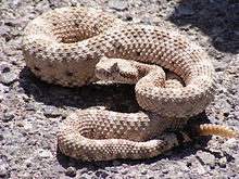
I think the picture is sharp, large, and clear enough to warrant being called an exceptional picture of the animal, along the lines of other animal FP's. However, I'd like opinions on how to improve the image, or, if it is suitable for an FP nomination at all, as I am biased by my own work!
- Nominated by
- Tigerhawkvok (talk) 17:19, 16 June 2008 (UTC)
- Comments
- I'm not sure how it will go over with others, but I say this is a cool picture and it's worth a shot. The only thing that worries me is the amount of focus at full-size and the fact that the lighting blows potions of the snake's head. Wait for what other people say, but if nothing comes of it, go for it. Elephantissimo (talk) 18:54, 16 June 2008 (UTC)
- Likely to attract a lot of opposes. The lighting at the midday time of the shot is far too bright so the snake is overexposed and the shadows are harsh. See this one of the same snake for better lighting. The Depth of field is also too shallow - not all of the snake is clear and in-focus. I have the same camera and these issues result from leaving the wheel set to Auto. For this shot (though the lighting is too harsh and a few hours earlier would be better), I'd set to aperture priority - F 6.8, -2 stops exposure compensation and change the shot angle to get rid of the shadow in the top right if possible. I like the pose, shot angle and framing though - Peripitus (Talk) 11:25, 17 June 2008 (UTC)
- Hm, I actually prefer the harsher contrast, I think it makes the snake much clearer than in the other photo, making the features much easier to identify (from a herpetological perspective). Well, one for one against here ... I'll see what a few other opinions are either way. Tigerhawkvok (talk) 02:20, 18 June 2008 (UTC)
- Just as a brief opinion, since requested, I'd tend to side with Peripitus. The harsh lighting has led to some fairly blown out areas of the snake, that shadow in the top corner is a bit unfortunate, DOF does seem a bit shallow, and I'm not really a fan of that background, it looks like a road or path, but it takes away from the 'natural' look that most animal FPs have. On the plus side I do like the composition/pose of the snake, so kudos for that. Could I also suggest that you add more detail to your image page descriptions though, e.g., where it was taken, common name as well as species name, etc, and also put the date in a more 'accepted' format. --jjron (talk) 08:25, 18 June 2008 (UTC)
- Edit posted as an FPC. Tigerhawkvok (talk) 23:22, 21 June 2008 (UTC)
- Seconder
- The edit includes darkening, selective darkening of blown out areas and lightening of the background. The was a layer of light sharpening applied followed by a slight downsize to sharpen the picture. The WB was also adjusted very slighty. --victorrocha (talk) 10:24, 18 June 2008 (UTC)
