Wikipedia:Picture peer review/Cleisthenes
Appearance

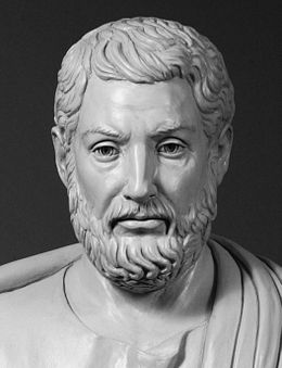
I don't think this will ever be a FP, but I need ideas here nonetheless. This picture has top EV in my mind, and it was dreadful before I tried to fix it. You can see the original on commons, and a color version I worked on many hours before finally giving up and going BW. I find the color of the original background quite poor and the color of the clay, well frankly - disgusting, and I felt that if I can't manipulate it into something bearable, then it is better just to hide it all away. It still look as though this guy is sweeting, but I don't know what to do about that. I could not find any other source than this one, which was a better starting point than what was there before, but maybe I just don't know where to look. Ideas?
- Articles this image appears in
- Cleisthenes, Democracy, and on many non-English sites.
- Creator
- yaniv256
- Suggested by
- →Yaniv256 talk contribs 08:10, 16 August 2012 (UTC)
- Comments
- The biggest problem with the photo is the way it is taken out of context. In the original link to the photo, it shows it as a Mounted-Bust. As a Mounted Bust and in the original Photo, the light reflections you termed 'Sweatiness' do not bother the viewer near as much. Also in the original photo the viewer now understands the context of the photo versus the cropped version. There is simply more information available in the original photo, as shot. Tom Photos
- Seconder
