Wikipedia:Featured picture candidates/elephant
Appearance

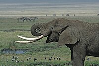
Breathtaking picture of the savannah with a wide range of animals shown.
- Nominate and support. - frothT C 06:41, 22 November 2006 (UTC)
- Calling Dr Fir0002, looks like it could do with some more contrast and other stuff. Nice image though, especially with the background. Is it me, or has the image been stretched horizontally? Stevage 06:59, 22 November 2006 (UTC)
- Weak oppose: Why only half a pachyderm, and no feet? Lacking in enc. Otherwise nice and sharp, though. Guess it is shot with a mirror tele, right?--Janke | Talk 07:00, 22 November 2006 (UTC)
- Oppose malpractice (edit1). The
ivory thingietusk looses detail (blown-out). The birds in the forground get their heads blown out as well. The sharpening is overdone and makes the elephant skin look weird to me and the blurred zebras get somewhat noisy / lose the softnes of the DOF blur. --Dschwen 12:37, 22 November 2006 (UTC) - Oppose edit 1 too much (sharpening, contrast, brightening, blown trunk). Weak oppose original per Janke. Animal is cut off. It is a striking image, though.--Andrew c 16:48, 22 November 2006 (UTC)
- Oppose all. As has been previously said, an FP with only half a subject is unacceptable. Furthermore, there is something strange with the background. I don't know it is all noise, as Dschwen mentioned, but it would seem to have something to do with the lens as well. I'm no expert, but it just feels off, and even Fir0002 can't fix it. Thegreenj 18:49, 22 November 2006 (UTC)
- Support - I don't agree that the entire subject has to be within the frame. Doesn't strike me as logical - by definition, you can never see more than half a subject at once (unless you have mirrors...). Sounds like a strange ideal that's been over-applied. The "blown out" birds' heads in the foreground are so minor as to not be a problem. This image is really fantastic, and the setting of the animal in its (pseudo-?) natural habitat is a huge bonus. It would be a huge improvement over Image:Elephantreaching.jpg for the lead image at Elephant. Stevage 22:47, 22 November 2006 (UTC)
- Comment. Tell Colbert it's not always about elephants: I've placed the Firedit in savanna and Ngorongoro Conservation Area (and neologisms). –Outriggr § 06:42, 23 November 2006 (UTC)
- Neutral. The edit made the tusks look blown. Can someone try again? NauticaShades 10:09, 23 November 2006 (UTC)
- Comment I thought I should try my n00bish hand at editing it since Fir hadn't yet done another version. Unfortunately the tusks are again quite white (although some areas are (245,245,247) in the original) and there's some detail lost near the elephant's mouth. Leon 05:25, 24 November 2006 (UTC)
- Oppose. Uninteresting composition. Too much of the elephant is cut off. - Mgm|(talk) 12:58, 24 November 2006 (UTC)
- Note from original photographer: I'm honored you guys would choose this photo to be a featured picture canidate, but I must say the origional, while I'll admit is somewhat lacking in "punch", is much closer to reality than any of the edits... Also, it was taken with a Canon 100-400L IS lens, just to clear some stuff up :). The previous unsigned comment was added by Schuyler s.
Not promoted --KFP (talk | contribs) 21:04, 29 November 2006 (UTC)
