Wikipedia:Featured picture candidates/drottningholm palace
Appearance

- Reason
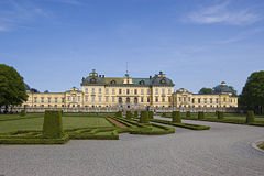
- It's a good, full shot of the Palace
- Articles this image appears in
- Drottningholm Palace
- Creator
- Sxenko
- Support as nominator — Sxenko 03:08, 31 May 2007 (UTC)
- comment has a bit of chromatic abberation and leans to the right. If the latter was fixed, I might be inclined to weak support it, despite the non-ideal off-center angle. Debivort 03:51, 31 May 2007 (UTC)
- Oppose Yellow of the building is blown, texture is wishy, washy at best. Big smudge in the sky above the right tower, (sensor dust??) otherwise I think the lighting is pretty uninteresting, a bit lacking in saturation. -Fcb981 04:59, 31 May 2007 (UTC)
- Do you actually find single blown channels distracting? I never do, even when they are pointed out to me in FP noms. Debivort 05:19, 31 May 2007 (UTC)
- I usually dont mind a few blown highlights or some flat red but this case is a bit different. The saturation is low maybe artificialy so in which case I would bet that the yellows were just above being blown (due to the frontal lighting) and were killed by noise reduction and desaturation. Also, since the yellow is the main color of the building I find its loss of detail a signifigant problem. -Fcb981 15:22, 31 May 2007 (UTC)
- Oppose. A little too much dead space (would have been a nice pano subject), sensor dirt, and a slight (subjective) CW tilt. --Dschwen 14:49, 31 May 2007 (UTC)
- Support - very nice, lovely sky. The lack of tourists or other distracting objects is particularly pleasing. The off-centre composition is a little unusual, but seems to work. While there isn't much detail on the wall surfaces, that's not a major problem. Photos of buildings get a little better than this, but not a *lot* better. Stevage 14:52, 31 May 2007 (UTC)
- Neutral - I keep wanting to lean to the right to center the building. Also as mentioned there's an obvious bit of sensor dirt above the rightmost dome. Otherwise a nice shot of a handsome building. But....hmm. Either go more off-center for more appearance of depth or square it up right in the middle, IMO. This is halfway in-between. Talshiarr 15:31, 31 May 2007 (UTC)
- Oppose its alright, but it could be better and as it is reproducable a better picture could be taken --Childzy (Talk|Contribs) 17:40, 31 May 2007 (UTC)
- Support -its not a fantastic shot, but its nice, and has good composition. -Nelro 18:21, 31 May 2007 (UTC)
 Oppose – Chromatic abberation at the edges of picture, and whole photo is little blurred to me. Centy – – 19:59, 3 June 2007 (UTC)
Not promoted MER-C 08:18, 6 June 2007 (UTC)
