Wikipedia:Featured picture candidates/delist/Ilya Repin - Sadko
Appearance
Voting period is over. Please don't add any new votes. Voting period ends on 12 Jan 2013 at 19:01:26 (UTC)


- Reason
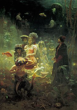
- Delist & Replace: Significantly higher quality version sourced through Google Art Project.
- Articles this image appears in
- MANY
- Previous nomination/s
- Wikipedia:Featured picture candidates/Sadko
- Nominator
- — raekyt
- D&R — — raekyt 19:01, 29 December 2012 (UTC)
- D&R, I could nitpick the Google version but in this case the current FP has a number of flaws--too dark, not completely sharp, and cropped a little bit off the frame. Note that the wooden frame intrudes a little bit at the top of the Google one; this could actually be a perspective problem (if the camera was pointing up slightly--with which I would sympathize, since it's pretty tough to photograph a huge painting like this), or it could be that the wood has warped over time; I haven't seen the painting so I don't know. Chick Bowen 04:38, 30 December 2012 (UTC)
- Comment Think we could get away with a tiny bit of colour adjustment to remove the non-intentional varnish yellow? Adam Cuerden (talk) 04:47, 30 December 2012 (UTC)
- That would be one of my nitpicks, yes. I don't think it's a white balance problem but possibly a lighting problem, so I don't know. I'd be interested to see an attempt. I'd still prefer this over the original though, even though neither is perfect. Chick Bowen 04:50, 30 December 2012 (UTC)
- If the varnish is yellowing with time that's important EV to be represented since that's how the actual painting currently looks. If it's not been restored then it's important it's preserved. It's also possible the yellowish tent is intentionally colored varnish, as the artist intended. It's not EXTREMELY old for a painting, and I'm no expert here but I donno if varnish that old would darken to any extreme amount in that time. I think it's not our place to decide to alter the colors that the museum chose to reproduce the painting as, these images are from the museum. Info on varnish and restoration I found [1]. — raekyt 06:07, 30 December 2012 (UTC)
- I'm a bit suspicious of whatever process the Google Art project is using to scan these images. As far as I can remember, it seems that every Google Art image I've seen here has appeared underexposed and with a yellowish tint, regardless of the age of the artwork. Personally, I wouldn't mind a bit of white-balance color-correction on these images. They just look terrible otherwise. Kaldari (talk) 10:35, 31 December 2012 (UTC)
- I'll give it a try, upload an alt, we can judge. The thing is, there's not strictly a single "correct" brightness or colour, since those depend on lighting, giving a range of correct. Adam Cuerden (talk) 02:19, 1 January 2013 (UTC)
- I'm a bit suspicious of whatever process the Google Art project is using to scan these images. As far as I can remember, it seems that every Google Art image I've seen here has appeared underexposed and with a yellowish tint, regardless of the age of the artwork. Personally, I wouldn't mind a bit of white-balance color-correction on these images. They just look terrible otherwise. Kaldari (talk) 10:35, 31 December 2012 (UTC)
- Comment Think we could get away with a tiny bit of colour adjustment to remove the non-intentional varnish yellow? Adam Cuerden (talk) 04:47, 30 December 2012 (UTC)
- D&R, preferring Alt Adam Cuerden (talk) 00:57, 2 January 2013 (UTC)
- I'll support the alt. Kaldari (talk) 05:07, 10 January 2013 (UTC)
- D&R prefer alt, per above. Jujutacular (talk) 00:53, 12 January 2013 (UTC)
- D&R, prefer ALT. — Crisco 1492 (talk) 03:14, 12 January 2013 (UTC)
Replaced with File:Ilya_Repin_-_Sadko_-_Google_Art_Project_levels_adjustment_2.jpg --Armbrust The Homunculus 19:59, 12 January 2013 (UTC)
