Wikipedia:Featured picture candidates/delist/Canada provinces evolution.gif
Appearance


- Reason
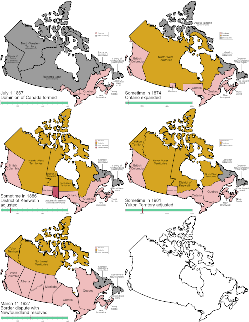
- I've just finished a much better version with better colors, a better layout, more facts, and more frames. I think we can safely replace the current FP with this.
- Previous nomination/s
- Wikipedia:Featured picture candidates/Canada provinces evolution.gif
- Nominator
- Golbez (talk)
- Delist and replace — Golbez (talk) 22:40, 14 July 2009 (UTC)
- Keep original - The info text needs some padding on the left side. Right now it is flush against the border of the box which makes it hard to read in thumbnail size. Kaldari (talk) 18:28, 16 July 2009 (UTC)
- Will fix. I was wondering, since this is somewhat different from the original, should I just nix this and put it through a standard FPC on its own merits? --Golbez (talk) 18:41, 16 July 2009 (UTC)
- Also you should make the text area bigger so that it is more readable at thumbnail size. Kaldari (talk) 17:21, 12 August 2009 (UTC)
- Will fix. I was wondering, since this is somewhat different from the original, should I just nix this and put it through a standard FPC on its own merits? --Golbez (talk) 18:41, 16 July 2009 (UTC)
- Replace Nergaal (talk) 15:00, 20 July 2009 (UTC)
- Delist and Replace Replacement looks better to me. Makeemlighter (talk) 08:17, 5 August 2009 (UTC)
- Conditional Delist and Replace or Delist + New Nom The new one is better, but it has a low contrast between each color, making it difficult to notice where each change happens. The pink color wasn't pretty, but at least, you saw right away where the yellowish territory becomes pink. Ksempac (talk) 16:21, 5 August 2009 (UTC)
- Delist and Replace This is definitely better and I like the subtler colors. The difference between them seems enough for me at full size. wadester16 05:35, 6 August 2009 (UTC)
- Keep original I dislike the addition of Greenland and the United States which add nothing to understanding the evolution (most articles will have a map of Canada in context). I also prefer the original colors although they could be made better... but a little more contrast makes colors easier to see while animated. gren グレン 21:28, 13 August 2009 (UTC)
Replaced with Image:Canada provinces evolution 2.gif --jjron (talk) 07:13, 16 August 2009 (UTC)
