Wikipedia:Featured picture candidates/WayangKulit
Appearance
Wayang Kulit Perfomance
[edit]
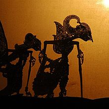
Though small in size, this one-of-a-kind image is a "FP" - worthy image. Very interesting and unique!
- Nominate and support. - Vircabutar 08:03, 31 July 2006 (UTC)
- Oppose The image is grainy, the right side is blown out (especially at the top) probably due to catching part of lighting or the sun or someting while the left side is too dark to really see anything. Thygard - Talk - Contribs - Email ---- 08:17, 31 July 2006 (UTC)
- Oppose it just doesn't have enough context. Presumably we are looking at a puppet show? Unfortunately the cropping makes that hard to tell, and there's no sense of scale, or the details of the scene as a whole. Also, what is so "one-of-a-kind" about a performance at a museum? Sorry for my tone...Stevage 12:16, 31 July 2006 (UTC)
- Oppose. Bad lighting, doesn't show the intricate detail of the puppets. —Keenan Pepper 20:26, 31 July 2006 (UTC)
- comment to address stevage: yes, the image shows a wayang kulit performance, a traditional indonesian shadow puppet.
to address keenan pepper: it's impossible to capture the intricate detail of the puppets since it's a shadow puppet performance. --Vircabutar 04:01, 1 August 2006 (UTC)
- Intricate puppets cast intricate shadows, which we could see if the lighting were better. I've been to one of these things and they look really cool. This photo doesn't quite do it justice. —Keenan Pepper 04:22, 1 August 2006 (UTC)
- Oppose The image is too small and grainy. --Thelb4 07:56, 1 August 2006 (UTC)
- Oppose. Way too small, blurry, grainy. A higher resolution photo would show the details of the puppet's shadows better. --Pharaoh Hound (talk) 12:54, 1 August 2006 (UTC)
- Oppose I've seen a lot of wayang kulit and this just doen't do it justice. – Morganfitzp 00:18, 3 August 2006 (UTC)
- Oppose. Just not significant enough to overcome its poor quality. --Tewy 07:51, 4 August 2006 (UTC)
- Oppose. It's rather boring looking. FireSpike 02:55, 5 August 2006 (UTC)
- Strong Oppose grainy, and I utterly hate the top right. all I see when I look at it is the top right which is not the point of the photo Pinkstarmaci 04:58, 5 August 2006 (UTC)
Not promoted --Fir0002 08:24, 8 August 2006 (UTC)
