Wikipedia:Featured picture candidates/Waldseemüller map
Appearance


- Reason
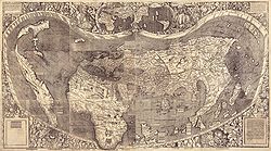
- Another gem from the LOC - a ridiculously high-res scan of the only surviving copy of the first map to name America. To get this under the 20 meg max I downsampled to 75%, then compressed (which left some artifacts, though these should be tolerable at 13,500 × 7,522 px). Others are welcome to try other combinations of downsampling and compression. This is a composite of 12 original sheets. Perhaps the original would be a better choice for featuring/articles, but my evidently inadequate computer plus awful internet connection have been giving me difficulties and I really can't spend the time to put that up myself. If others would like to try (hopefully with a decent connection it shouldn't take long!) it's also at http://hdl.loc.gov/loc.gmd/g3200.ct000725C (on the right).
- Articles this image appears in
- Waldseemüller map, Americas, Cosmographiae Introductio, Early world maps, Continent
- Creator
- Martin Waldseemüller
- Support as nominator --Calliopejen1 (talk) 03:56, 24 October 2008 (UTC)
- Comment I cannot view the full-res image on the commons, I get a red cross in the top left corner. - Mgm|(talk) 11:20, 24 October 2008 (UTC)
OpposeStitching needs attention. —Krm500 (Communicate!) 13:56, 24 October 2008 (UTC)- Is it possible to do it better? The 12 individual sheets don't seem to match up well enough to do it perfectly. I'm downloading the original right now and will fiddle with it. Chick Bowen 19:45, 24 October 2008 (UTC)
- I would support the alternate version with the twelve maps separated. —Krm500 (Communicate!) 02:15, 25 October 2008 (UTC)
- I'm having trouble with the jp2 file. Perhaps someone else would upload the separated version? (link--caution: it's rather large.) I agree with you--I don't think a stitch is a great idea, given that the map was not originally made in one piece. Chick Bowen 03:40, 25 October 2008 (UTC)
- Maybe this should be suspended until someone can upload the other version? I downloaded the other one but my computer does not have enough memory to open it. (The non-composite version is a 75 meg jp2, even larger than the composite 25 meg jp2.) Irfanview is a good free program that can handle jp2s and convert to jpg. Calliopejen1 (talk) 23:09, 25 October 2008 (UTC)
- I've tried both Irfanview and the jp2 plugin for GIMP and had no success. I think my view for now is
oppose stitched version; the original had latitude and longitude marks on every sheet, and I think the stitched one is something of a misrepresentation, sorry. I'd support the original as it stands if someone can manage to upload it. Chick Bowen 22:29, 26 October 2008 (UTC)
- I've tried both Irfanview and the jp2 plugin for GIMP and had no success. I think my view for now is
- Maybe this should be suspended until someone can upload the other version? I downloaded the other one but my computer does not have enough memory to open it. (The non-composite version is a 75 meg jp2, even larger than the composite 25 meg jp2.) Irfanview is a good free program that can handle jp2s and convert to jpg. Calliopejen1 (talk) 23:09, 25 October 2008 (UTC)
- I'm having trouble with the jp2 file. Perhaps someone else would upload the separated version? (link--caution: it's rather large.) I agree with you--I don't think a stitch is a great idea, given that the map was not originally made in one piece. Chick Bowen 03:40, 25 October 2008 (UTC)
- I would support the alternate version with the twelve maps separated. —Krm500 (Communicate!) 02:15, 25 October 2008 (UTC)
- Is it possible to do it better? The 12 individual sheets don't seem to match up well enough to do it perfectly. I'm downloading the original right now and will fiddle with it. Chick Bowen 19:45, 24 October 2008 (UTC)
- Enthusiastic support no matter what version is the final, though I would be happy to see a better stitch job done. This is indeed one of the most precious historical maps of all times and to make it public was a good action. Any idea how to get a decent copy of the Carta Marina Portugallenses of 1516? -- Alvesgaspar (talk) 21:04, 26 October 2008 (UTC)
- You mean this one? It's also weirdly stitched, sadly, and I can't find a high enough resolution version to be readable. Chick Bowen 03:47, 27 October 2008 (UTC)
- Yes, that is the one. -- Alvesgaspar (talk) 09:01, 27 October 2008 (UTC)
- Comment Jackaranga graciously helped out, taking advantage of computer power evidently superior to my own, and now we have a non-composite version above also. The commons page won't load the picture for me, but it seems to be a server/thumbnailing problem - if I download the image to my computer I can open it just fine. Calliopejen1 (talk) 21:29, 27 October 2008 (UTC)
- Support Non-composite version, very high encyclopedic value, very good resolution and detail. —Krm500 (Communicate!) 22:10, 27 October 2008 (UTC)
- Support non-stitched version per my comments above. Chick Bowen 03:23, 28 October 2008 (UTC)
- Comment The pages are lined up, but the illustrations are not. The minimal separation of the pages emphasizes the boundaries of the map illustrations. The misalignment therefore looks messy. I recommend separating the pages more and breaking them up with a darker color. Alternately, the illustrations could be lined up in a grid. Either way, the pages are separated by two different colors of margin, and this needs to be fixed. The rough edge of each page is backed by a light gray color. Some of the scans are also then separated by a white background. Wronkiew (talk) 05:16, 28 October 2008 (UTC)
Promoted Image:Waldseemuller map 2.jpg MER-C 01:50, 3 November 2008 (UTC)
