Wikipedia:Featured picture candidates/Versailles Chapel
Appearance


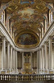
I came across this image while browsing Wikipedia and, as many of these FPCs go, I was surprised it wasn't featured yet (probably because it's so new). So, I'm nominating it for it's size, detail, and overall impression. This picture is already a quality image on Wikimedia Commons; appears in Palace of Versailles, and Diliff created the image.
- Nominate and support. - Tewy 05:37, 29 July 2006 (UTC)
- Comment Oh, and sorry about not being able to add the FPC template to the image's page, but I forgot how to do that when the image is on Commons. If someone knows how that would be great. Thanks --Tewy 05:47, 29 July 2006 (UTC)
- I’m all over it. TomStar81 09:51, 29 July 2006 (UTC)
Support. Impressive. Nice lighting (for a chapel), wonderful composition. --Pharaoh Hound (talk) 22:13, 29 July 2006 (UTC)- Support edit 1 --Pharaoh Hound (talk) 20:43, 30 July 2006 (UTC)
 Support Edit 1. Very nice, though I would have rather seen more of the mosiac on the roof - even if that meant sacrificing the pillars etc. --Fir0002 23:34, 29 July 2006 (UTC)
- Support A very nice image, though more of the mosaic would be nice, I like the pillars. Viva La Vie Boheme 02:50, 30 July 2006 (UTC)
- Support The most solid and worthy image to appear on this page in some time. I have attempted this same photo and I know how poor the lighting is. Quite an exceptional image and no doubt worthy of FP status -- Nilington 04:49, 30 July 2006 (UTC)
Oppose The original.It seems rather bland to me, and I am looking at it on a glossy screen with an insane contrast ratio. mstroeck 15:05, 30 July 2006 (UTC)- Support Fir0002's edit, though. mstroeck 15:05, 30 July 2006 (UTC)
- Support edit by Fir0002. Mikeo 17:58, 30 July 2006 (UTC)
- Support Edited version. Thygard - Talk - Contribs - Email ---- 22:39, 30 July 2006 (UTC)
- Comment. The edited version is too saturated in the ceiling; does it really look like that when you're there? I don't know, but we seem to have gone from real life to movie set with this edit. Outriggr 05:16, 31 July 2006 (UTC)
- This is the age old question.. You're right, it didn't look like the second edit. The Chapel was brightly lit from the sides and the ceiling only received sparse reflected light. We went through a similar thing for another FPC image of mine here. Diliff | (Talk) (Contribs) 11:02, 31 July 2006 (UTC)
- I completely agree. Edits are nice to improve the look of a picture that didn't capture the image as best as it could, and I support them, but overdoing an edit can turn it to "movie set", as Outriggr said. --Tewy 17:56, 31 July 2006 (UTC)
- Support edit 1. Sharp, colourful, interesting, nicely centered, great work. Stevage 08:49, 31 July 2006 (UTC)
- Support edit 1 Nicely framed, good colors, interesting subject. -Ravedave 18:12, 31 July 2006 (UTC)
- Support edit 1Nnfolz 20:52, 31 July 2006 (UTC)
- Support edit 1 per Stevage. --Thelb4 14:00, 1 August 2006 (UTC)
- Support edit 1 Pinkstarmaci 05:00, 5 August 2006 (UTC)
Promoted Image:Versailles Chapel - July 2006 edit.jpg Raven4x4x 05:45, 6 August 2006 (UTC)
