Wikipedia:Featured picture candidates/Tribute in light
Appearance

- Reason
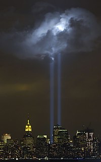
- High quality image depicting high powered beams of light as well as the memorial from the 9/11 attacks. Also in public domain.
- Articles this image appears in
- September 11, 2001 attack memorials and services, Tribute in Light, Light beam, September 11, 2001 attacks;Creator:Photo by Derek Jensen (Tysto), 2004-September-11
- Support as nominator — SirGrant 20:01, 24 June 2007 (UTC)
- Oppose Looks really noisy. 8thstar 16:14, 25 June 2007 (UTC)
- Support Agree that there's a lot going on, but it works because the light of the city and the dark of the sky and water form an interesting juxtaposition. That, coupled with the presence of two shafts of light that seems unbreakble yet fade sum up the attitude of the period (i.e., immediate post 9/11). Support. Arius Maximus 17:47, 25 June 2007 (UTC)
- Oppose. Another exciting and interesting photo with issues at 100%. Since part of the focus of the image is the sky, I am taking more notice of the sky, and there I see a lot of artifacts. I see a lot of little 3 parallel bars that look unnatural in the sky. Unlike the other one, I think that an edit may be able to clean some of this up.-Andrew c 18:17, 25 June 2007 (UTC)
- Support--Mbz1 17:16, 28 June 2007 (UTC)Mbz1
- Oppose per Andrew. --Mad Max 02:46, 29 June 2007 (UTC)
Not promoted MER-C 07:12, 1 July 2007 (UTC)

- Reason
- High quality image depicting high powered beams of light as well as the memorial from the 9/11 attacks. Also in public domain.
- Articles this image appears in
- Tribute in Light
- Creator
- Public Affairs 2nd Class Mike Hvozda
- Support as nominator — SirGrant 20:01, 24 June 2007 (UTC)
- Oppose Lots of compression artifacts.. Yzmo talk 21:34, 24 June 2007 (UTC)
- Support This pic was nominated before: Wikipedia:Featured picture candidates/Tribute in Light. However, I don't see all the artifacts everyone is complaining about. There's motion blur, but not jpeg artifacts that are suppose to be in the night sky. A lot of Wikipedians also said something about better pics online, but I frankly could not find any better ones after several google pages. It's unfortunate that the motion blur kind of takes away from an otherwise brilliant pic in my opinion. However, it's hardly distracting, even at full res. Inspiring, stunning, and of course encyclopedic. Jumping cheese 07:19, 25 June 2007 (UTC)
- I took another careful look at the pic and I kind of see the artifacts that some people are complaining about. Those blocky artifacts in the haze do get annoying after staring at them for a while and focus in on them. However, they're not really noticeable, since they are basically all slightly different shades of black. I guess downsampling might work, but I know that's discouraged. Jumping cheese 07:29, 25 June 2007 (UTC)
- Oppose very dynamic thumbnail. Subject matter is moving. The colors are interesting. That said, at 100%, the artifacts coupled with the building being not sharp ruin it for me. I wonder if there is an uncompressed version out there, of if the compression was in camera?-Andrew c 18:14, 25 June 2007 (UTC)
- Support--Mbz1 17:17, 28 June 2007 (UTC)Mbz1
- Oppose per Andrew. --Mad Max 02:46, 29 June 2007 (UTC)
Not promoted MER-C 07:12, 1 July 2007 (UTC)
