Wikipedia:Featured picture candidates/Surface waves
Appearance

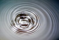
Self-nomination. Used in the article Wave
- Nominate - Roger McLassus 14:16, 23 October 2006 (UTC)
- Oppose, blurry. Night Gyr (talk/Oy) 15:05, 23 October 2006 (UTC)
- Weak oppose. Also seems kind of noisy in the dark areas. howcheng {chat} 17:19, 23 October 2006 (UTC)
- Oppose We can only see the central part of the wave system, I would want to see more of the concentric waves as they spread (but a very attractive picture, well done) - Adrian Pingstone 17:22, 23 October 2006 (UTC)
- Weak support This one is on the borderline for promotion due to unsharpness and some noise. But the composition and the theme are great. I also like the metallic look of the water, like mercury. - Alvesgaspar 18:26, 23 October 2006 (UTC)
- Weak oppose. I can't really tell that it's water without an explanation, i.e., I dislike the blown highlights and purple fringing, or whatever that is. And as others have pointed out, there's some distracting grain. It's fairly a attractive photograph, though. --Tewy 23:25, 23 October 2006 (UTC)
- Neutral Visable noise but I still like it enough not to oppose it SOADLuver 00:43, 25 October 2006 (UTC)
- Support - beautiful, I believe would definitely entice the user to read the accompanying article--The world salutes the Rising Star...Try to be One 04:08, 25 October 2006 (UTC)
- Weak Support It should be centered, but it's good. | AndonicO Talk 10:43, 25 October 2006 (UTC)
- Support - delicious composition. -- CountdownCrispy ( ? 14:37, 25 October 2006 (UTC)
- Oppose. Not very good quality for a very common subject. NauticaShades 20:25, 27 October 2006 (UTC)
- Oppose. A bit of noise, a bit blurry, would make a pretty wall paper but falls short on encyclopedic value. --Dschwen 18:29, 29 October 2006 (UTC)
Not promoted --NauticaShades 15:59, 30 October 2006 (UTC)
