Wikipedia:Featured picture candidates/SpinningHDD
Appearance

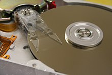
This image shows a spinning hard disk, and is intresting to look at. Appears in the article Hard disk and was created by "Alpha six", http://www.flickr.com/photos/alphasix/158829630/, who has released it under Attribution-ShareAlike 2.0 CC license.
- Nominate and support. - Mwhorn 06:39, 23 June 2006 (UTC)
- Neutral I'm split on this one. It's blurry, it doesn't include the entire drive, and there aren't very good visual cues to indicate that the disk is rotating. It's a good illustration of the arm's motion, but I feel like it doesn't convey lots of information at a glance the way an FP should. Night Gyr (talk/Oy) 06:45, 23 June 2006 (UTC)
- Oppose - the idea is great, but the execution is a little weak - should show more of the whole hard disk, and as noted, more visual cues about what's going on would help. Stevage 09:02, 23 June 2006 (UTC)
- Oppose. As mentioned above, this is a good idea, but the image itself is just too poor for FP. Diliff | (Talk) (Contribs) 10:14, 23 June 2006 (UTC)
- Comment the picture doesnt display a hard drive well it does however portray the read/write head moving over the platter very well. I have updated the caption to reflect this. -Ravedave 17:57, 23 June 2006 (UTC)
- Support Good action shot. -Ravedave 17:57, 23 June 2006 (UTC)
- Oppose It is a very good idea, the rationale behind this picture, however at the moment the picture simply doesn't work (it isn't very nice to look at). You need the whole of the hard disk in shot, simply no question about it, and the lighting in the shot could be better. The composition for me is currently a bit too weak, however would love to see a similar thing in the near future, just with that extra layer of deatil and style. --Wisden17 22:31, 23 June 2006 (UTC)
- Oppose: The nature of the device, of course, excuses the motion blur of the servo, ribbon cable, and read/write arm. But the blur of the chassis and other components disqualify the image, as do the image noise visible on the platters. –ArmadniGeneral (talk • contribs) 04:19, 24 June 2006 (UTC)
- Oppose Blurred - Adrian Pingstone 19:33, 24 June 2006 (UTC)
- Neutral Great photograph but blurry. Anonymous__Anonymous 21:50, 24 June 2006 (UTC)
- Oppose seesm to plain to me--Childzy (Talk|Contribs) 20:15, 25 June 2006 (UTC)
- Oppose Love how the arm itself, in the two positions captured are quite crisp. You can see the effect of shine lines on the metal at the center of the plate which indicates its spinning. But the mount for the arm and the PCB I see on the left are blurry. If those were in focus as well this would be a very nice action shot, and I think it'd do a lot better if those were clear as well. Kevin_b_er 07:01, 30 June 2006 (UTC)
Not promoted Raven4x4x 07:30, 1 July 2006 (UTC)
