Wikipedia:Featured picture candidates/PowerStation
Appearance


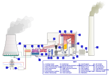
I created this and uploaded it to the Commons, and thought it might be worth a try here. The images is currently in use at Fossil fuel power plant and shows the components within a typical (single generator) coal-fired power station.
- Self-nomination. --BillC 23:40, 19 June 2006 (UTC)
- Support Cavenba 00:28, 20 June 2006 (UTC)
Oppose, labelling within the diagram is not supported by facts in the article. This would appear to violate featured picture criteria 6. Kimchi.sg 02:28, 20 June 2006 (UTC)Support, now that references have been provided. Kimchi.sg 17:54, 20 June 2006 (UTC)- If the image page cites its references, it would be alright. — BRIAN0918 • 2006-06-20 12:51
- I have now added my sources to the image description. If those are not accessible, these two images on generating company websites, though not so suitable for direct reference, are very similar: [1], [2]BillC 17:42, 20 June 2006 (UTC)
NeutralSupport Integral Key Version This is very encyclopedic, and a well done picture, but the fact that it needs a key on the description page just makes me uneasy about having it as a FP. xxpor ( Talk | Contribs ) 18:10, 20 June 2006 (UTC)- Support. Very well done and informative. A lot of FPs need keys on the description page, so that's not a big deal. howcheng {chat} 19:49, 20 June 2006 (UTC)
- Version added with integral key, if people feel this is an improvement. BillC 21:01, 20 June 2006 (UTC)
Weak oppose original, oppose "integral key" version, for visual reasons: Clicking on the thumbnail, I get to the image page, where the wiki server has sized the image to almost fill my screen. Still, the numbers (and text) are too small to be readable. So, I'll support when you put bigger numbers on the drawing, and the legend onto the image page, a bit like this: [3] (Also, there's no explanation of the 3 (4) electric wires - I know they're 3-phase, but does everyone? This is not my reason for opposing, though...) --Janke | Talk 06:44, 21 June 2006 (UTC)
- Support larger label version (no. 3). --Janke | Talk 20:38, 21 June 2006 (UTC)
- Support -- cool diagram, need more of these -- Chris 73 | Talk 12:57, 21 June 2006 (UTC)
- Oppose Even with the "integral key" I get dizzy looking back and forth between the key and the diagram. Why not integrate the labels themselves, replacing the numbers? It isn't just my opinion that this is better, it has been studied and shown people absorb more information if the labels are actually on the diagram itself rather than in a key. (I wish I'd bought the book I saw this study in just so I could reference it). —Pengo 03:03, 22 June 2006 (UTC)
- The problem with integrated labels is this: What language to choose? Remember that wiki is multi-lingual, and putting English labels into the image will hamper its use in all other wikis. Better to have the labels editable, on the image page. --Janke | Talk 06:47, 22 June 2006 (UTC)
- This is the English wikipedia - that's not our concern. By all means, keep the version with the numbers on it to make it easier for other Wikipedias to copy. But we should make also an image as good as possible for *our* Wikipedia, and if that means putting labels directly in the image, then so be it. We should intentionally *not* be judging an image on how useful it is for purposes other than English Wikipedia. Stevage 08:37, 22 June 2006 (UTC)
- Ah, yes, I seem to have had commons thoughts... --Janke | Talk 10:53, 22 June 2006 (UTC)
- Any consensus as to where we want to go? I tried adding replacing the numbers with text on the diagram itself, but there just wasn't room for it. I can easily add a key with slightly enlarged text (so it's readable) to the 3rd version. BillC 12:57, 22 June 2006 (UTC)
- There's a crap load of white space to put English labels, just perhaps not exactly in the spots the numbered-labels currently sit. Also, being an SVG file, changing the text to another language is relatively easy, even if there wasn't an original to work from. —Pengo 12:27, 25 June 2006 (UTC)
- This is the English wikipedia - that's not our concern. By all means, keep the version with the numbers on it to make it easier for other Wikipedias to copy. But we should make also an image as good as possible for *our* Wikipedia, and if that means putting labels directly in the image, then so be it. We should intentionally *not* be judging an image on how useful it is for purposes other than English Wikipedia. Stevage 08:37, 22 June 2006 (UTC)
- Oppose It's really not very eye-catching, and I think if it were to go on the main page it would probably look quite imposing, even. Plus, it's too boring! Arco Acqua 18:05, 23 June 2006 (UTC)
- Comment: With the smoke at the right of the image, there's a lot of white space. Can this be sorted out? Other than that, it's a fine and informative diagram. smurrayinchester(User), (Talk) 18:34, 23 June 2006 (UTC)
- Fourth and final version uploaded. I have tried to address as many comments as was possible. BillC 08:26, 24 June 2006 (UTC)
- Support final version. I don't like the whitre space, but there is not enough of it to oppose. say1988 13:15, 24 June 2006 (UTC)
- Support final version per above comment. smurrayinchester(User), (Talk) 21:32, 24 June 2006 (UTC)
Promoted Image:PowerStation3.svg. From what I can make out this one seems to be the most popular. Raven4x4x 07:44, 1 July 2006 (UTC)
