Wikipedia:Featured picture candidates/MeanMonthlyPrecipitations
Appearance

- Reason
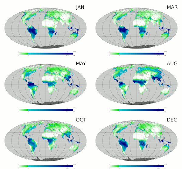
- incredibly informative animation
- Articles this image appears in
- Climate, Precipitation (meteorology)
- Creator
- PZmaps
- Support as nominator --Nergaal (talk) 04:26, 15 July 2009 (UTC)
- Oppose Great information and it appears to be sourced properly. But I would prefer another cartographic projection that makes areas near the edges more visible. Mercator projection for example. Noodle snacks (talk) 07:53, 15 July 2009 (UTC)
- Support The Mollweide projection is an equal-area projection, so the reason that areas near the edges are so small is because they are that small in real life. Mercator exaggerates extreme northern/southern areas (Greenland is not the same size as Africa!) so using this would give a misleading impression of their relative size, and hence the total rainfall they get. Splitting the projection in the Atlantic and Indian oceans would result in less skew in far NE, NW, SE and SW areas; but I don't see the current projection as a problem. Time3000 (talk) 10:16, 15 July 2009 (UTC)
- Support GerardM (talk) 14:30, 15 July 2009 (UTC)
- Support per high encyclopedic value. –Juliancolton | Talk 20:28, 16 July 2009 (UTC)
- Weak Support I agree with Noodlesnacks, but not enough to oppose. Shoemaker's Holiday (talk) 20:55, 16 July 2009 (UTC)
- Support per nom. Durova279 16:20, 17 July 2009 (UTC)
- Support — Jake Wartenberg 22:53, 17 July 2009 (UTC)
- Oppose It's too difficult to see what's going on in Alaska, New Zealand, etc. Also, the black lines for longitude, and to a lesser extent latitude, are distracting. Maybe you could make them thinner. I love the idea of this picture, but these two issues really hurt the EV. Makeemlighter (talk) 07:00, 20 July 2009 (UTC)
Promoted File:MeanMonthlyP.gif --wadester16 06:30, 22 July 2009 (UTC)
