Wikipedia:Featured picture candidates/Matt Groening
Appearance
Voting period is over. Please don't add any new votes. Voting period ends on 12 Nov 2013 at 18:24:00 (UTC)

- Reason
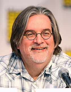
- good qualiy, and good capture of him at Comic Con 2010
- Articles in which this image appears
- Matt Groening, The Simpsons, and etc.
- FP category for this image
- Wikipedia:Featured pictures/People/Entertainment
- Creator
- the creator of the image, where possible using the format Gage
- Support as nominator --Blurred Lines 18:24, 2 November 2013 (UTC)
- Oppose - Nominator is requested to look at existing featured pictures and get an understanding of the process before making any further nominations. This has the same issues as the first Seth McFarlane nomination (harsh lighting, distracting object, etc.) — Crisco 1492 (talk) 22:19, 2 November 2013 (UTC)
- @Crisco 1492 What does your statement have to do with this image? Your completely talking about something else except for this image. Blurred Lines 23:10, 2 November 2013 (UTC)
- "This has ... harsh lighting, distracting object, etc." It's right there, if you care to read. — Crisco 1492 (talk) 23:11, 2 November 2013 (UTC)
- @Crisco 1492 1) How does it have harsh lighting, it looks normal to me.
- @Crisco 1492 2) How is the mic distracting, I have seen photos of people with mics in the featured photo categories. Blurred Lines 23:15, 2 November 2013 (UTC)
- I never said it was the mike. Look at the paper (name cards or whatever) in front of him. As for the lighting, compare his skin tone here to images taken under more favourable lighting (most of the Google image results will work). Can't you see how much of the light his reflecting of his skin here, giving an almost orange hue? — Crisco 1492 (talk) 23:19, 2 November 2013 (UTC)
- @Crisco 1492 The cards are barely in the whole picture, because it's at the bottom, and yes I do see shade of light on his skin, that's because at the event, they would have lights there, and I'm not noticing the orange hue in his skin. Blurred Lines 23:31, 2 November 2013 (UTC)
- BL: Being this confrontational is really not going to help the images you nominated be promoted. J Milburn (talk) 09:50, 3 November 2013 (UTC)
- @Crisco 1492 The cards are barely in the whole picture, because it's at the bottom, and yes I do see shade of light on his skin, that's because at the event, they would have lights there, and I'm not noticing the orange hue in his skin. Blurred Lines 23:31, 2 November 2013 (UTC)
- I never said it was the mike. Look at the paper (name cards or whatever) in front of him. As for the lighting, compare his skin tone here to images taken under more favourable lighting (most of the Google image results will work). Can't you see how much of the light his reflecting of his skin here, giving an almost orange hue? — Crisco 1492 (talk) 23:19, 2 November 2013 (UTC)
- "This has ... harsh lighting, distracting object, etc." It's right there, if you care to read. — Crisco 1492 (talk) 23:11, 2 November 2013 (UTC)
- @Crisco 1492 What does your statement have to do with this image? Your completely talking about something else except for this image. Blurred Lines 23:10, 2 November 2013 (UTC)
- Oppose Irrelevant clutter in foreground, lighting isn't very good either. Taylor Trescott - my talk + my edits 00:59, 3 November 2013 (UTC)
- Oppose per Taylor Trescott. -- ТимофейЛееСуда. 13:20, 3 November 2013 (UTC)
Not Promoted --Blurred Lines 16:45, 4 November 2013 (UTC)
- Withdrawn Blurred Lines 16:45, 4 November 2013 (UTC)
