Wikipedia:Featured picture candidates/Latin Dictionary
Appearance

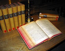
I stumbled across this by accident earlier this week while looking for material related to my pshychology class (which is apparently a cleverly disguised biology class. Go figure :/). Anyway, this image got my attention right quick, so I decided to put it up and see what everyone else thinks. This image is used on the page dictionary; the photo originates from the commons and, although not explicitly stated, I believe that it is already featured over there since it was selected as a picture of the day.
- Nominate and Support TomStar81 (Talk) 10:42, 31 October 2006 (UTC)
- Oppose. It's a nice picture (although the top-right corner is too dark), but the most important difference between our featured pictures and those on commons is that ours must illustrate a subject: "It is important that the encyclopedic value of the image be given priority over the artistic value of the image" (WP:WIAFP). This doesn't really illustrate Dictionary or Latin or University Library of Graz, so I'm going to oppose it. Stephen Turner (Talk) 10:58, 31 October 2006 (UTC)
- Actually, I have taken advantage of those subtle differnces in the past to get well known historical images up to FP standards. Here, the equation is "photographic requirements+encyclopedic value+ supporting consensus=FP", where as the commons omits the middle requirement. TomStar81 (Talk) 00:00, 1 November 2006 (UTC)
CommentSupport Just put it on Book and I'll support, because it illustrates Book very nicely - Adrian Pingstone 14:40, 31 October 2006 (UTC)- Support. It illustrates Dictionary and Book quite well, and the quality is good. NauticaShades 16:26, 31 October 2006 (UTC)
- Weak oppose. Good composition. But the book, which is the main subject of the picture, is out of focus. - Alvesgaspar 22:02, 31 October 2006 (UTC)
- Comment. Not all Commons PsOTD are FPs. Until recently, anyone could add an image to be POTD. howcheng {chat} 22:16, 31 October 2006 (UTC)
- Which is why I said "not explicitly stated". On here the rule is that the POTD must be an FP, so I made an educated guess about the pictures there based on the system here. TomStar81 (Talk) 00:00, 1 November 2006 (UTC)
- Oppose. per above say1988 01:03, 1 November 2006 (UTC)
- Oppose. bad lighting. -Ravedave (help name my baby) 04:34, 1 November 2006 (UTC)
- Weak oppose. Nice setup/composition, but the flash lighting kills it for me. Apperture was very wide so the DOF is a bit low, I guess thats what Alvesgaspar meant with the book beeing out of focus, most parts of it are tack sharp though. Again, the lighting is unfortunate and prevents you from reading the backs of the lined up books. --Dschwen 08:13, 1 November 2006 (UTC)
- Comment. What I mean is that we can't read the text in the dictionary due to lack of sharpness. - Alvesgaspar 11:15, 1 November 2006 (UTC)
- Oppose. I actually don't care for the composition particularly (though it looks better at bigger sizes than in the thumbnail). Other issues mentioned above. --jjron 09:14, 1 November 2006 (UTC)
- Oppose. Flash lighting and I can't even see the text in the book clearly. howcheng {chat} 17:12, 2 November 2006 (UTC)
- Oppose. Mostly because of the bad lighting. --Tewy 02:50, 5 November 2006 (UTC)
Not promoted --NauticaShades 17:29, 9 November 2006 (UTC)
