Wikipedia:Featured picture candidates/John Shea
Appearance


- Reason
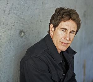
- Another professional quality publicity shot released freely through the image submission system. This is an adult releasing an image of himself, and I contacted the subject to get some explicit details on the author, as this was raised as a potential problem in my last nomination of this sort. As such, I hope that all discussion will be kept to a discussion of the technical merits of the portrait. Furthermore, this is a slightly more well known actor, which is another concern that has been raised in conjunction with these images before.
- Articles this image appears in
- John Shea
- Creator
- Photograph produced by Michael Calas in his studio in LA listed under Michael Calas Photography. Work owned by John Shea, who has released it.
- Support as nominator --J Milburn (talk) 14:42, 22 October 2009 (UTC)
- Oppose Original, Weak Oppose Crop and Edit He fades out of focus way to quickly. It's one thing if the background is blurry, but the person himself falls out of focus as well, such as at the neck and the jacket. Nezzadar ☎ 15:58, 22 October 2009 (UTC)
- Support per nom --Muhammad(talk) 17:03, 22 October 2009 (UTC)
- Support. Fulfills the criteria well. Mostlyharmless (talk) 22:21, 22 October 2009 (UTC)
- Oppose Edit 1, Weak Support Original I like the original composition better in the original, it's not a standard portriat composition, so it stands out, looks nice in my opinion. After closer inspection the flash has washed out the normal skin tone on his face and he could of used a lint brush on his black shirt before the shoot, so weakly supporting due to some technical issues. — raeky (talk | edits) 04:43, 23 October 2009 (UTC)
- Added Edit2. --jjron (talk) 07:28, 23 October 2009 (UTC) Note: redid my edit off the original to try to get better quality and gave slightly different crop. --jjron (talk) 07:41, 23 October 2009 (UTC)
WeakOppose atm. The crops work better in the article, so did an edit based on that. However while doing the edit to try to bring back some skin tone (looks too flashed in others) I noted quality issues due to excessive downsampling. In particular there's quite bad artifacting (look at his shirt, especially the shadow areas). If it's possible to get a higher quality original to work from I would probably weak support a version equivalent to Edit2, but we would not accept the current quality from a Wikipedian, so why have different standards? --jjron (talk) 07:34, 23 October 2009 (UTC) Switch to full oppose on further consideration - in for a penny in for a pound...there's a few issues on quality, but as noted above would reconsider a less degraded version. --jjron (talk) 11:50, 23 October 2009 (UTC)- Support original, oppose both edits Centering isn't necessarily a good idea. Or to be more specific, the seam in the concrete wall balances the composition and gives a gritty feel to the setting. Without that element, the background behind the subject's right cheek becomes distracting. Durova333 16:02, 23 October 2009 (UTC)
- Support original, weak support edit1, oppose edit2. Maybe it is just me, but edit1 has lost some of the neat background that adds something to the image. However, the skin tones in edit2 make it seem a bit too different from how Mr. Shea usually looks. NW (Talk) 16:29, 24 October 2009 (UTC)
- Admittedly Edit 2 is overdone. I originally edited off the first crop, but then redid it off the original with the same settings. Looking at the original and crop it seems his skin is further washed out in the crop, thus my re-edit off the original went too far. Didn't bother redoing it as none of them meet technical expectations, but would redo off a better quality original. --jjron (talk) 02:42, 25 October 2009 (UTC)
- I've no idea why it's more washed out on the crop, all I did was crop it... J Milburn (talk) 10:42, 25 October 2009 (UTC)
- Possibly lost quality in the jpg saving - for a similar res mine is almost twice the filesize, and I didn't use the highest setting. I've seen that type of result before. --jjron (talk) 12:02, 25 October 2009 (UTC)
- I've no idea why it's more washed out on the crop, all I did was crop it... J Milburn (talk) 10:42, 25 October 2009 (UTC)
- Admittedly Edit 2 is overdone. I originally edited off the first crop, but then redid it off the original with the same settings. Looking at the original and crop it seems his skin is further washed out in the crop, thus my re-edit off the original went too far. Didn't bother redoing it as none of them meet technical expectations, but would redo off a better quality original. --jjron (talk) 02:42, 25 October 2009 (UTC)
- Support Edit or Crop Meets criteria limo. Noodle snacks (talk) 21:22, 28 October 2009 (UTC)
- Oppose edit 2 per NW and jjron. Papa Lima Whiskey (talk) 10:41, 30 October 2009 (UTC)
Promoted File:JohnShea.jpg --ZooFari 01:39, 2 November 2009 (UTC)
