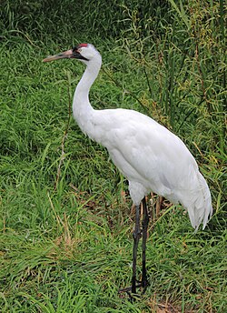
Wikipedia:Featured picture candidates/Grus americana
Appearance
Voting period is over. Please don't add any new votes. Voting period ends on 23 Sep 2010 at 06:08:18 (UTC)

- Reason
- It is high resolution, with clear details visible in the head, feathers, and surface of the legs. I was lucky with this shot, as the bird was doing its own thing and didn't seem to mind me creeping up to him only a few feet away, and also because it was overcast, so I didn't have to worry too much about blown highlights.
- Articles in which this image appears
- Whooping crane, Endangered Species Act, List of birds of Nebraska
- FP category for this image
- Birds
- Creator
- Sasata
- Support as nominator --Sasata (talk) 06:08, 14 September 2010 (UTC)
- Oppose Simply for the very distracting background. WackyWace converse | contribs 10:30, 14 September 2010 (UTC)
- Oppose If there was ever a reason for HDR treatment (see Mespelbrunn Castle, below), this one needs it. The brightness and contrast and dynamic range needs fixing. Then there is the overly in-focus background cited by WackyWace. The nearly perfectly sideways orientation of the bird also seems less than idea for this particular bird for some reason. The overcast day really lends to an exceedingly boring, *blah* look. Far too many shortcomings to be considered as exemplary bird photography (or any photography). Greg L (talk) 03:18, 15 September 2010 (UTC)
- Thanks for the comments. HDR is something I'm just starting to figure out, and I agree, some bracketed exposures and Photoshop twiddling would have helped this out. Still learning. Sasata (talk) 04:55, 15 September 2010 (UTC)
- HDR is designed for reducing contrast, not increasing it. Noodle snacks (talk) 23:12, 15 September 2010 (UTC)
- This shot just needs better lighting, not HDR. HDR isn't a substitute for shooting a good picture. Kaldari (talk) 01:40, 18 September 2010 (UTC)
- Note - Nice depth of field, but probably could use some more contrast. Shadowjams (talk) 04:56, 15 September 2010 (UTC)
- Support. Juxtaposing a unicoloured bird with a busy, (semi-)natural background is what gets some pictures to the top of photography competitions. Here is a composition that has worked for many heron photos because these birds have a very intent gaze already, and this very real impression (don't get near the beak!) is heightened by the background. You couldn't have done much more for the contrast with a single exposure - the histogram couldn't have been better-used. What you could do, though, is clean up the chromatic aberration - there are filters for that. Papa Lima Whiskey (talk) 17:55, 16 September 2010 (UTC)
- Support per nom. Cowtowner (talk) 21:17, 16 September 2010 (UTC)
- Weak Support It's a good generic picture, but needs something more to get my full support. Haljackey (talk) 00:23, 17 September 2010 (UTC)
- Support; PLW's arguments are convincing. J Milburn (talk) 11:26, 17 September 2010 (UTC)
- Comment Needs brightening. --I'ḏ♥One 18:12, 17 September 2010 (UTC)
- I tried brightening, but couldn't do it well enough to not have the highlights on the top of the bird blown out. Perhaps someone more adept in Photoshop could give it a go? (I have the RAW file too). Sasata (talk) 18:14, 17 September 2010 (UTC)
- I think the problem is the lighting itself, not the brightness. The highlights are all concentrated in one area (the back of the bird), thus leaving the rest of the picture rather dark and lackluster. Kaldari (talk) 01:43, 18 September 2010 (UTC)
- Curves can brighten without blowing stuff out. Noodle snacks (talk) 04:43, 18 September 2010 (UTC)
- Oppose per Wackywace. Lovely picture, just a little too distracting. Tim Pierce (talk) 00:46, 18 September 2010 (UTC)
Not promoted --Makeemlighter (talk) 02:24, 24 September 2010 (UTC)
