Wikipedia:Featured picture candidates/Fluorescent minerals
Appearance

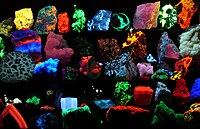
Cool looking picture, but also encyclopedic. I had no idea about the range of fluoresing rocks. It appears in Fluorescence and Ultraviolet. It was created by User:Hgrobe
- Nominate and support. - Ravedave (help name my baby) 04:58, 3 October 2006 (UTC)
- support. - Buphoff 06:14, 3 October 2006 (UTC)
- Support. Visually stunning and very encyclopedic. ☢ Ҡi∊ff⌇↯ 06:29, 3 October 2006 (UTC)
- Support - Very nice! InvictaHOG 06:38, 3 October 2006 (UTC)
- Support Brilliant! --Janke | Talk 07:10, 3 October 2006 (UTC)
 Support Good work --Fir0002 08:14, 3 October 2006 (UTC)
- Support A bit unorganized, but overall an incredible picture. NauticaShades(talk) 10:33, 3 October 2006 (UTC)
- I wish the caption had a legend to identify the minerals, but it's super kewl, so Support. --Bridgecross 13:17, 3 October 2006 (UTC)
- Weak oppose - I hate to be the first to oppose this picture but I just feel that, for all its beauty and encyclopaedic value, it is too disorganised and perhaps a little too messy to be a featured piccy. - CountdownCrispy ( ? 18:03, 3 October 2006 (UTC)
- Weak oppose I agree with Countdown Crispy. It is encyclopedic in that it shows that various unknown minerals glow in different colors under various UV lighting. I want more organization. How can I figure out which materials glow in what color and why? Overall, it is very busy, and its encyclopedic value is limited.--Andrew c 21:08, 3 October 2006 (UTC)
- Oppose per CountdownCrispy and Andrew c. --KFP (talk | contribs) 21:44, 3 October 2006 (UTC)
- Support Debivort 22:26, 3 October 2006 (UTC)
- Oppose encyclopedic value is lost with the lack of labels and the fact 3 different UV conditions have been lumped together in one image.--Peta 00:58, 4 October 2006 (UTC)
- Oppose way too much going on. Names would have been nice as well. - CrazyRussian talk/email 23:15, 3 October 2006 (UTC)
- I'd like to "oppose your opposes" - the image has different captions in the articles (no mention of ABC), and itdoesn't illustrate the minerals - thus no labels needed. I think it's a good image for the articles in question. --Janke | Talk 07:01, 4 October 2006 (UTC)
- Extremely weak Support Great colors, good for the article too. My problem is also the organization, as the minerals are almost overlapping. Some names would not be ill recieved either. | AndonicO 17:34, 4 October 2006 (UTC)
- Oppose. Seems very cluttered. A single image of different minerals flourescing (did I spell that right?) under a single UV wavelength would be preferable to a mosaic such as this. --Nebular110 04:03, 6 October 2006 (UTC)
- It is a single picture, not a mosaic. Are you saying you'd want one UV-A one UV-B and one UV-C? -Ravedave (help name my baby) 05:47, 6 October 2006 (UTC)
- Yes, I realize it is a single picture, but it does look rather like a mosiac at thumbnail size. I'm just saying that the encyclopedic value would be much greater if all three UV wavelengths were not lumped together as Peta mentioned above. --Nebular110 14:42, 6 October 2006 (UTC)
- It is a single picture, not a mosaic. Are you saying you'd want one UV-A one UV-B and one UV-C? -Ravedave (help name my baby) 05:47, 6 October 2006 (UTC)
- Lumped together only here. Different captions in the articles! --Janke | Talk 16:39, 6 October 2006 (UTC)
- Support This looks great, and it gives information in an encyclopedic manner. I don't think it is cluttered at all. HighInBC 19:48, 6 October 2006 (UTC)
- Support TomStar81 (Talk) 02:45, 7 October 2006 (UTC)
- Oppose nice idea, but the encyclopedic value is near zero if the content is not explained with a caption. What exactly are we seeing on this image? And it definately is too cluttered, it isn't even possible to tell where one specimen ends and the next one begins. That makes a caption enumerating the stones from top to bottom impossible. Please reshoot with less minerals more spacing and write a detailed caption, then it'll be a really great picture. --Dschwen 10:43, 7 October 2006 (UTC)
- Oppose. Cool colors, but there's little encyclopedic value here with so many specimens. Cluttered composition; sharply cropped on either side. The image is also grainy and only softly focused in high resolution. --S0uj1r0 19:16, 8 October 2006 (UTC)
- Additional comment - I've already opposed above but want to add a comment in a place where it will be prominent and read by all who are interested. Could this image be neatened up, like the Coquina variations above? That would surely need all new pictures, but it's the only way in my opinion to make this picture the quality necessary to be an FP. - CountdownCrispy ( ? 06:42, 11 October 2006 (UTC)
- Some would have to contact the creator then. NauticaShades 07:20, 13 October 2006 (UTC)
- He can be reached on the DE wikipedia [[1]]. I left him a note about the names and he says he will add them. If someone wants him to re-do the pic go ahead. I like its current version. -Ravedave (help name my baby) 16:56, 13 October 2006 (UTC)
- Some would have to contact the creator then. NauticaShades 07:20, 13 October 2006 (UTC)
Not promoted. howcheng {chat} 18:18, 13 October 2006 (UTC)
