Wikipedia:Featured picture candidates/Eye Iris
Appearance

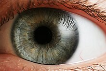
I stumbled across this by accident earlier this week while looking for material related to my pshychology class (which is apparently a cleverly disguised biology class. Go figure :/ ). Anyway, this image got my attention right quick, so I decided to put it up and see what everyone else thinks. This image is used on the page eye; the photo originates from the commons and is already featured over there.
- Nominate and Support TomStar81 (Talk) 10:42, 31 October 2006 (UTC)
- Support. Great photo, and encyclopaedic. It should be put in the article Iris (anatomy) too, since it's better than the photos that are there. Stephen Turner (Talk) 11:02, 31 October 2006 (UTC)
- Weak oppose, the big spot of glare on the right really wipes out a lot of detail, and the image is blurry at full res. Night Gyr (talk/Oy) 15:30, 31 October 2006 (UTC)
- Support. The image is gorgeous. Sharkface217 21:57, 31 October 2006 (UTC)
- Support Not much more to say than amazing. Staxringold talkcontribs 02:04, 1 November 2006 (UTC)
- Strong support What a featured picture should be. HighInBC (Need help? Ask me) 04:30, 1 November 2006 (UTC)
- Support Great image but would appreciate it if you could remove that little blood vessel on the bottom right as it is distracting. — Preceding unsigned comment added by Antilived (talk • contribs)
- Comment. Please don't. I would change my vote to oppose if you did that, because I don't think photos should be manipulated in that way. Stephen Turner (Talk) 10:25, 1 November 2006 (UTC)
- Oppose. Irregular focus, and lack of sharpness for nature of subject to my eye (perhaps downsampling would help?). Also composition - if it's of the iris then it should be more centred and there's too much sclera; if it's of the whole eye then it's cut off. --jjron 09:27, 1 November 2006 (UTC)
- Oppose. The glare and the off-center composition are the biggest problems.--ragesoss 16:43, 1 November 2006 (UTC)
- Support Some minor features already explained that aren't good, but looking at the big picture, it is a very good picture that illustrates and focuses on the subject. Hello32020 02:49, 2 November 2006 (UTC)
- Weak oppose. I recall an old message board thread (outside Wikipedia, of course) in which hundreds of people took photos of their eyes, often with stunning results. I've seen better eye macro photos than this one, although this is not really that bad, although it has some problems as the above editors have mentioned. I think that an enterprising Wikipedia editor with a bit of time and a really good camera can do better. SnurksTC 06:48, 2 November 2006 (UTC)
- Oppose. It seems to me that a picture of an eye should be easily obtainable by anyone. Thus, we shouldn't accept anything less than perfection. howcheng {chat} 17:10, 2 November 2006 (UTC)
 Oppose Per above. Once my exams are over, I'm sure I'll be able to get a better image with my new Sigma 150 macro. --Fir0002 06:37, 3 November 2006 (UTC)
- I keep having to remind myself that you are also in school; that comment about having to take exams really caught me off guard. Pretty quick here I am going to be taking a wikibreak for the exact same reason. I wish you good luck and God speed with your exams. TomStar81 (Talk) 08:08, 3 November 2006 (UTC)
- Thanks Tom and likewise for you; I appreciate your support. --Fir0002 09:48, 4 November 2006 (UTC)
- Oppose. Could benefit from downsampling, but even then a better picture could be obtained. --Tewy 02:55, 5 November 2006 (UTC)
- Support although i would prefer the iris to be directly in the center of the image rather than having the white parts uneven — Preceding unsigned comment added by Ahadland1234 (talk • contribs)
- Support I also would prefer it in the center, but it's very good anyways. | — Preceding unsigned comment added by AndonicO (talk • contribs)
- Oppose per Howcheng. --KFP (talk | contribs) 17:13, 8 November 2006 (UTC)
Not promoted 9.5/7. --NauticaShades 17:36, 9 November 2006 (UTC)
