Wikipedia:Featured picture candidates/Cyrus McCormick engraving
Appearance
Voting period is over. Please don't add any new votes. Voting period ends on 22 Jun 2010 at 14:07:33 (UTC)


- Reason
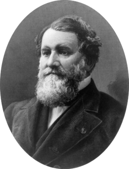
- Earlier today, I had nominated this at VPC because the original image was only 640px. However, a higher resolution version has been found so I am moving the nomination here. For its age this is a quality image and it has high EV. To add some perspective here, I should note the significance of his family name to WP:CHICAGO with McCormick Place, McCormick Tribune Plaza & Ice Rink, McCormick Tribune Freedom Museum, McCormick Theological Seminary, and McCormick Tribune Campus Center. Not all were named after Cyrus specifically because his great nephew Robert R. McCormick was also important to the history of the city.
- Articles in which this image appears
- Cyrus McCormick
McCormick Theological Seminary
International Harvester
Reaper
Irish American - FP category for this image
- Wikipedia:Featured pictures/People/Others
- Creator
- George Smillie
- Support as nominator --TonyTheTiger (T/C/BIO/WP:CHICAGO/WP:FOUR) 14:07, 13 June 2010 (UTC)
- Comment Adding an alt without all the background border, also made blacks stronger and whites whiter. — raeky (talk | edits) 15:04, 13 June 2010 (UTC)
- Comment I do not think the retouched contrast is as good as the original.--TonyTheTiger (T/C/BIO/WP:CHICAGO/WP:FOUR) 15:25, 13 June 2010 (UTC)
- Comment Looks better with the background removed. There is an area towards the bottom of the image where the contrast looks a little washed out to me though. Contrast is ok in most places but the adjusted levels have blown out the left of the forehead losing some detail in white compared to the original IMO. If this can be worked on then I'll give my support. Fallschirmjäger ✉ 17:55, 13 June 2010 (UTC)
- Did a few more contrast tweaks... — raeky (talk | edits) 18:08, 13 June 2010 (UTC)
- Support Alt All my concerns have been addressed. Image has undoubtable EV. Fallschirmjäger ✉ 18:16, 13 June 2010 (UTC)
- Comment On the removed border version, there are a few jagged edges where I presume the 'magic wand' was aggressive in its selection. Could these be softened up a bit? Jujutacular T · C 20:36, 13 June 2010 (UTC)
- That should be fixed now. — raeky (talk | edits) 20:49, 13 June 2010 (UTC)
- Weak oppose original, strong oppose edit - just too small, in my opinion, for a mass-market product like an engraving, of which, by their nature, many, many copies (usually) exist. You can't make out any of the engraving lines, and there's some odd horizontal stripes that maybe are right, maybe are wrong, but which it's impossible to tell because of resolution. The edit has the contrast set much too high, ruining the more delicate greys. I know not everyone can scan from originals like I usually do, but I think we can expect a little more than this: Surely Chicago libraries will have Victorian books about Chicago with similar engravings? Adam Cuerden (talk) 04:49, 18 June 2010 (UTC)
- I do agree this is a sub-par scan, and I indicated as such in the original VPC nomination, but I don't agree to much is lost with my edit, it does look better at least IMHO to the original, given what I had to work with. But It's probably NOT FPC quality, I just felt the edit would be more useful to illustrate with getting rid of all that useless background (useless in a encyclopedic sense). I'm neutral for it being a FPC, and would support it as a VPC (the edit). — raeky (talk | edits) 11:47, 18 June 2010 (UTC)
- Query Does the editor support his own edits?--TonyTheTiger (T/C/BIO/WP:CHICAGO/WP:FOUR) 05:14, 18 June 2010 (UTC)
- see above. — raeky (talk | edits) 11:47, 18 June 2010 (UTC)
Not promoted --Makeemlighter (talk) 19:11, 22 June 2010 (UTC)
