Wikipedia:Featured picture candidates/Common Snipe on a fencepost
Appearance


- Reason
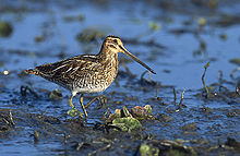
- A nice close-up image of a bird that is normally shy and difficult to approach in its wetland habitat.
- Articles this image appears in
- Common Snipe
- Creator
- User:Talshiarr
- Support as nominator — Talshiarr 12:20, 29 May 2007 (UTC)
- Tentative support. I think the image is sufficiently good to become featured. I might be missing something, though, so, as always, I may choose to change my opinion after other information has come out. For now, though, good image. └Jared┘┌t┐ 12:37, 29 May 2007 (UTC)
- Neutral It's a picture of a bird. (That describes the experience for me.) It has a high enough resolution. I can't find any huge image defects. However, looking at the chest and the wooden post, I have a feeling this image is not as sharp as it could be. I would also have chosen a different crop to avoid placing the bird quite so plainly in the middle of the image, encyclopaedic as that may be! Samsara (talk • contribs) 13:16, 29 May 2007 (UTC)
- Comment - The balance of the picture bothers me. The tension is awkward and I keep waiting for the poor bird to fall off the post. Could you re-crop it so the post is shifted to the right and there is more space in front of his beak? It just doesn't need so tight a crop. pschemp | talk 14:15, 29 May 2007 (UTC)
- Hey, those were my thoughts exactly! ;) Samsara (talk • contribs) 14:30, 29 May 2007 (UTC)
- I'll try and dredge up the original CD I burned this to, it's an older pic. As to it appearing out of balance, this was taken about 3 seconds before he (she?) flew off. When I do run across them on fences they tend to squat down more. This was by far the closest I'd ever gotten to one though and is the clearest shot. Thanks for the kind critiques, everyone. I need to learn and it's helpful getting other POVs that are more than "Oppose: It's ugly." Talshiarr 01:49, 30 May 2007 (UTC)
- Hey, those were my thoughts exactly! ;) Samsara (talk • contribs) 14:30, 29 May 2007 (UTC)
- Oppose - The lighting is too poor toward the back of the bird. Other photos on the Common Snipe page show distinctive white lines/feathers of the bird's back that aren't clear from this picture --McKDandy 14:32, 29 May 2007 (UTC)
- Support Nice pic and I have not problems with the background. --Ba'Gamnan | Talk 16:40, 29 May 2007 (UTC)
- Support, I don't mind the background either. -- Phoenix2 (holla) 22:31, 29 May 2007 (UTC)
 Strong Support Fascinating image, and that bird really scares me, (something about its eye[s]) Booksworm Talk to me! 20:32, 30 May 2007 (UTC)
- Support Lighting isn't really a problem here, it's actually quite good (looks like either very early or very late in the day? nice..) and composition is just fine, tight and balanced. Why would you want to see more empty space on the left? If anything viewpoint is a bit low, so some detail is missing from the wings/back, but you do get a good look at its beak, legs, feet and underbelly. Complemented by other shots, as this kind of illustration ideally is, this is a worthy FP. mikaultalk 14:14, 31 May 2007 (UTC)
- Support Excellent and sharp photograph; the paradigm of an encyclopaedic image. Chris Buttigiegtalk 15:07, 2 June 2007 (UTC)
Promoted Image:Wilson's Snipe on a fencepost, central Utah.jpg MER-C 09:25, 5 June 2007 (UTC)
