Wikipedia:Featured picture candidates/Cola de Caballo
Appearance

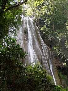
I'm pretty proud of this image, so I thought I'd self-nominate it. It illustrates Cola de Caballo.
- Nominate and support. - Spangineeres (háblame) 21:55, 6 January 2006 (UTC)
- Sorry to do this to you but Oppose - Focus is poor, hazy gray cast over everything, sky is totally blown and highly distracting with all that purple CA and the shot angle feels very awkward. --Deglr6328 00:00, 7 January 2006 (UTC)
- Oppose. Agree with Deglr6318. Plus, I don't find it particularly striking. Alr 00:08, 7 January 2006 (UTC)
- Neutral. Why does the water appears to be so flat? It's like you've over applied a remove noise filter and it removed the details is well. Also, there's quite a bit of purple fringing at the top of the picture and the shrub at the bottom is blocking too much of the waterfall. I would've supported it if you go a few steps closer or to the right to get that shrub out of the way. --antilived T | C 00:11, 7 January 2006 (UTC)
- Oppose. The picture in its full size actually isn't as bad as it is in the middle page (except the purple). It really doesn't look good in the middle size -- not mainpage material, and the un-resized image is just too huge. --JPM 00:19, 7 January 2006 (UTC)
- Oppose per above. Flcelloguy (A note?) 01:06, 7 January 2006 (UTC)
So as not to prolong the misery and waste everyone's time, I'll withdraw the nomination. Thanks for the feedback!
Nomination withdrawn --Spangineeres (háblame) 01:25, 7 January 2006 (UTC)
