Wikipedia:Featured picture candidates/Cassilis
Appearance

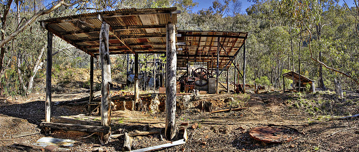
I nice image of the Cassilis Historical Area. Shows the ruins well, and to my mind captures a very Australian Outback scene.
- Support Self Nom. --Fir0002 10:01, 3 September 2006 (UTC)
- Oppose It's seriously not pleasing to the eye, the background if full of small ugly trees which is a big distraction and the image itself has nothing special to tell me it's a gold mine in Australia. Plus that, I can't see anything historical or specific. It's not even close to a ghost town. Arad 13:43, 3 September 2006 (UTC)
- A matter of taste of course, but those "small ugly trees" are what make this such a characteristic image of the bush. And I can't see what more you can want from a ghost town. If you look at the article on Ghost towns you'll see that a ghost town doesn't necessarily mean empty houses and shops. And I can assure you, this is a ghost town.--Fir0002 22:25, 3 September 2006 (UTC)
- Comment Most of the voters agree, this is not pleasing to the eye. The trees, beautiful or not are a distraction. I'm not saying a ghost town is full of houses and shops, I'm saying this is more like a shack where people dump their junk. And it's not at all like a gold mine either. Plus it's nothing historical and the subject with or without explanation is not clear.
Maybe a Kangaroo somewhere in the image could be a hint that this picture is taken in Australia.. Arad 16:43, 4 September 2006 (UTC)- Your comment about kangaroos is a little unwelcome I think in that you are suggesting that the picture would look better if it conformed with the stereotype of Australia as perceived by international viewers. enochlau (talk) 11:36, 9 September 2006 (UTC)
- I think what he meant was clear and simple. This image has no hint where is this old "historical" mine is located. 66.36.132.147 00:09, 10 September 2006 (UTC)
- Oppose Nice picture, but the subject is not clear without further explanation. I think a FP should make the subject clear within the image itself. HighInBC 15:42, 3 September 2006 (UTC)
- Support pleasing to my eye. background full of small beautiful trees, adds to the subject.Henry A-W 18:20, 3 September 2006 (UTC)
- Oppose The largest version of this picture has a grainy look characteristic of too heavy a hand on the sharpening. Fir, am I right? - Adrian Pingstone 20:13, 3 September 2006 (UTC)
- No - it's an exposure bracket which probably does some contrasting to the image - this may introduce grain. Other than that I can't see how you could get a grainy look out of it. Personally I can't see the effect you describe. --Fir0002 22:25, 3 September 2006 (UTC)
- Oppose the background makes this very hard to discern. 24.31.9.226
- Oppose An interesting picture perhaps, but lacks the "wow" factor. --Vircabutar 04:25, 4 September 2006 (UTC)
- Oppose per HighInBC. —Jared Hunt September 4, 2006, 17:49 (UTC)
- Weak support. It's quite representative of its subject I'd agree, but the background makes things slightly hard to discern... but that's how it is. enochlau (talk) 21:43, 6 September 2006 (UTC)
- Support. Unique subject for a panorama! Has a 'wow' factor for me - most people with a camera aren't going to leave with this. I find the contrast very high, but can live with that. –Outʀiggʀ 03:43, 7 September 2006 (UTC)
- Support. As per nomination. I also think we should give this
 a chance. Nauticashades 16:51, 8 September 2006 (UTC)
Not promoted Raven4x4x 02:39, 11 September 2006 (UTC)
