Wikipedia:Featured picture candidates/Bridgewater Bridge
Appearance


- Reason
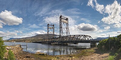
- I must like bridges? Good quality, large resolution, really clear day (haze wise) and a pretty sky. Mt Wellington in the background gives it's location good context.
- Articles this image appears in
- Bridgewater Bridge, Vertical lift bridge
- Creator
- Noodle snacks
- Support as nominator (strong prefer original) --Noodle snacks (talk) 22:31, 16 October 2008 (UTC)
- Support well done. —αἰτίας •discussion• 23:39, 16 October 2008 (UTC)
- Support Really great picture. --Silvestra (talk) 23:54, 16 October 2008 (UTC)
- User's 3rd edit of 5. SpencerT♦C 21:00, 17 October 2008 (UTC)
- Support Yet another fine photograph of Australian infrastructure.--HereToHelp (talk to me) 01:21, 17 October 2008 (UTC)
- Support. I'm starting to think I should buy that 10-20mm Sigma lens.--ragesoss (talk) 03:40, 17 October 2008 (UTC)
- Oppose Good composition with great background, but the the picture looks very retouched, unreal shadows contrast in the right and the aspect of grass in the bottom is not natural.--Jf268 (talk) 06:59, 17 October 2008 (UTC)
- This is the user's 5th edit, all of which have been to FPC. Intothewoods29 (talk) 16:57, 17 October 2008 (UTC)
- See below for a comment on the grass. regarding the shadow on the right it actually looks pretty good. For the sake of discussion i have attached a crop from the middle exposure of the bushes, showing that the amount of shadow detail is actually pretty realistic. The HDR has done very little to the forground and bridge, just given a pretty blue sky instead of a pretty blew sky :P. Noodle snacks (talk) 22:46, 17 October 2008 (UTC)
- Oppose Great shot, and a wonderful subject, but have to oppose for the odd grass in the front - seems blurred. Stiching error maybe? At full res it sticks out too much .--gazhiley (talk) 13:19, 17 October 2008 (UTC)
- This is the user's 1st edit. Intothewoods29 (talk) 16:57, 17 October 2008 (UTC)
- I suspect it was more movement from wind causing trouble there, I could have cropped it out entirely but its not as if detail in that part of the shot matters imo, and i feel a bit of foreground adds some context to the camera location. Noodle snacks (talk) 22:46, 17 October 2008 (UTC)
- Support Good composition and quality. Muhammad(talk) 17:20, 17 October 2008 (UTC)
- Support Very nice. I think the grass in the front provides a little context for the image as a whole. SpencerT♦C 21:00, 17 October 2008 (UTC)
Opposesupport croppedregretfully I have to oppose this beautiful image as it currently stands. There is some kind of blurring issue with the grass in the foreground, probably not a motion blur as the water is quite sharp. I would support the image if the bottom 10% or so was cropped removing the offending grass. I think this would still leave enough of the aforementioned context.--Leivick (talk) 09:16, 18 October 2008 (UTC)- It isn't motion blur in the traditional sense, I suspect it is movement between the three HDR frames of differing exposures. I have uploaded a crop, but I feel the crop detracts from the composition. I think an oppose on these grounds would be sensible if it was the subject, but i don't think some blurred grass in the forground does any damage. I have uploaded the crop but I think it detracts from the image Noodle snacks (talk) 09:45, 18 October 2008 (UTC)
- Support. People seem to forget that we're building an encyclopedia here - high enc. definitely wins over a few nitpickingly unsharpish blades of grass in an otherwise technically OK shot... --Janke | Talk 10:23, 18 October 2008 (UTC)
- Comment. I'm not going to nitpick blades of grass, but what about the clouds around the middle of the bridge supports?? The clouds on either side of the image look fine, but in the middle, they suddenly go really soft and diffused, almost like you've applied a really strong, wide gaussian blur to them or something? I can also see movement between frames. Minor movement could be excused but they do look a bit funny. Have you tried to mask it by softening it? Diliff | (Talk) (Contribs) 10:33, 18 October 2008 (UTC)
- Only real PP there has been noise reduction, which may have had some effect on the clouds. I have attached a reference Noodle snacks (talk) 10:39, 18 October 2008 (UTC)
- Support - the original version. looks good --T-rex 16:43, 18 October 2008 (UTC)
- Support Essentially per Janke, all the anal retentives really need to take a good look at whether they really should be here if they forget that we're actually building an encyclopedia. This is a very encyclopedic shot and is of generally good quality and I am beginning to think that people oppose good noms (not just this but many) solely so that they can feel good about the fact that they're opposing good noms. Cat-five - talk 01:13, 21 October 2008 (UTC)
- Comment - The crop is an improvement. The foreground grass is a distraction from the bridge, IMO. The focus should be squarely on the bridge; artistic composition should be secondary. Kaldari (talk) 15:51, 21 October 2008 (UTC)
- Support, Prefer Cropped Nice image, and the crop further focuses the viewer's attention to the bridge. —Black and White 16:01, 21 October 2008 (UTC)
Promoted Image:Bridgewater Causeway Crop.jpg MER-C 06:52, 23 October 2008 (UTC)
