Wikipedia:Featured picture candidates/Blue-crowned Motmot back
Appearance


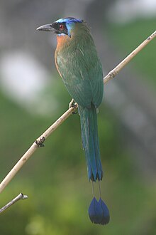
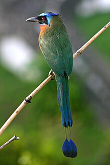
I'm nominating two photos of a motmot taken by myself. They're illustrating the articles Motmot and Blue-crowned Motmot. I hope it's not rude to nominate both. I think having both illustrates the articles better than either on its own, and I can't decide which I prefer. But of course, you can discuss them individually, or combine them into one nomination if that's more appropriate.
- Self-nominate. - Stephen Turner 14:36, 8 October 2005 (UTC)
- A slight lack of sharpness may be a problem, but I like this one a lot. Raven4x4x 02:05, 9 October 2005 (UTC)
- It is a bit too blurry at full res, I'd suggest to resize it down to lessen the blur. I have uploaded an edited version which is still at full res. --Fir0002 05:43, 9 October 2005 (UTC)
- Thank you very much for brightening up the colours, Fir0002. I think it's a definite improvement. But could you explain your comment about reducing the size to lessen the blur? I agree that it has a very slight lack of crispness at full size which is not visible at smaller sizes. But I assumed that it was better to upload the full-size version, which could then be scaled at viewing time, rather than make the original smaller. Am I wrong? -- Stephen Turner 07:38, 9 October 2005 (UTC)
- No worries Stephen, glad to help. Personally I'd resize an image to make the blur less visible (if you have a look at Carolina Anole Close-up nomination you can see what I mean by resizing the image to reduce blur) but I don't know what others think. As you said the lack of crispness is not visible on a lower res, and it can sometimes spoil an image if you see it at full res and it's not perfectly in focus. Just my opinion though --Fir0002 11:10, 9 October 2005 (UTC)
- Thanks for your comments, Fir0002 and Cliffhanger407. I've uploaded half-size versions. Stephen Turner 09:38, 10 October 2005 (UTC)
- I'll support the third image. It like the colours a lot. Raven4x4x 09:52, 11 October 2005 (UTC)
- Oppose all 3 Nothing about the images is too bad, but the beak is out of focus even in the 3rd picture. Cliffhanger407 00:50, 12 October 2005 (UTC)
- Oppose all. I have problems with the focus as well as per Cliffhanger407, and it's a little too grainy in the full sized image. Enochlau 13:08, 15 October 2005 (UTC)
- Support. Blurriness at full res is undeniable, but catches the eye when viewed as part of an article; either the 2nd or 3rd works for me. Unschool 02:43, 16 October 2005 (UTC)
- ( + ) Support 3rd Version --Fir0002 10:23, 16 October 2005 (UTC)
- Oppose all 3 I just think they're all pretty boring and just a tad blurry. --ScottyBoy900Q∞ 19:58, 16 October 2005 (UTC)
- Well as you say they haven't much "wow" factor, but if you take into consideration how hard it is to get a photo of a wildbird (I'm assuming this one is wild?) I think it is acceptable. --Fir0002 21:06, 17 October 2005 (UTC)
- Yes, it's a wild bird, but it's a bit of a cheat too. It's beside a hotel where they feed the birds once a day. The funny thing is, feeding time hasn't yet started, but a few birds have started gathering in anticipation. Somehow they know what's going to happen. Stephen Turner 09:04, 18 October 2005 (UTC)
- Support most recent image. - Bevo 07:04, 22 October 2005 (UTC)
Not promoted Raven4x4x 00:32, 23 October 2005 (UTC)
