Wikipedia:Featured picture candidates/Baghe Eram Shiraz
Appearance


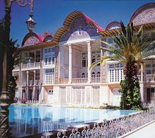
It's a photo of good quality taken from one of the most famous Persian Gardens in Iran. It represents the elements of a Persian garden. It Appears in Shiraz, Iran, Persian Gardens articles and I took the photo.
- Nominate and support. - Arad 12:08, 31 August 2006 (UTC)
- oppose - Blownout highlights, jpg artifacts along the top left of the photo. Nice looking place though.--Niro5 13:47, 31 August 2006 (UTC)
- Support Nice pic. Deserves to be a FP. Good job. QAZ 14:32, 31 August 2006 (UTC)
- NOTE: User's only three edits are to FPC nominations. howcheng {chat} 23:24, 31 August 2006 (UTC)
- Oppose Over compressed resulting in jpeg artifacts. Wall is so overblown it bleeds through the fence. HighInBC 15:14, 31 August 2006 (UTC)
- Oppose per Niro5 and HighInBC. howcheng {chat} 15:48, 31 August 2006 (UTC)
- Support. That's a pretty good shot actually. The building area is always saturated with tourists, and the suns angles make it difficult to get a good shot like this one. (Unsigned by User:Zereshk 2006-08-31 18:34:30))
- Oppose. Overexposed central part, blurry in full size. --Janke | Talk 17:24, 31 August 2006 (UTC)
- Comment Downsampled edit uploaded as Edit 1, as per the Bam photo. I couldn't do as much for this one, though. For what it's worth, there aren't any substantial blown areas of the photo in the technical sense; though there are quite a few that skim the top of the histogram for a pixel or two. TSP 19:31, 31 August 2006 (UTC)
- Support As have already mentioned Zereshk, This garden is always full of tourists and once I tried, the results were disappointing. Support either. Good job. 66.36.155.198 21:12, 31 August 2006 (UTC)
- NOTE: Six of user's seven edits are to FPC nominations. howcheng {chat} 23:24, 31 August 2006 (UTC)
- Support It does what it says, elements of Persian Garden. I say good. both are good but edit 1 look a bit better (not much) Babayi 21:21, 31 August 2006 (UTC)
- NOTE: User's only 6 edits are to FPC nominations. howcheng {chat} 23:24, 31 August 2006 (UTC)
- Oppose Too washed out, too out of focus -- doesn't convey the information that it should. SteveHopson 22:51, 31 August 2006 (UTC)
- I don't understand what you mean from washed out. The building is white, doesn't mean it's washed out. And the focus is fine in my opinion, specially on Edit 1. Arad 23:14, 31 August 2006 (UTC)
- Oppose--Vircabutar 07:06, 1 September 2006 (UTC)
- Oppose The pierced wall below the two columns is far too bright, spoiling the picture for me - Adrian Pingstone 07:34, 1 September 2006 (UTC)
- weak support--Pejman47 12:55, 1 September 2006 (UTC)
- Oppose the water and the wall are severly blown out. Hbdragon88 20:14, 3 September 2006 (UTC)
Not promoted Raven4x4x 03:44, 8 September 2006 (UTC)
