User talk:Sakurambo/Archive Aug 2007
xy chromaticity svg
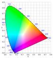
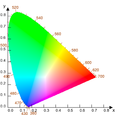
[edit]Thanks for the svg. But it is a bit strange. I had downloaded it to see how it was done, to see if I could fix it get rid of the luma Mach bands, but I found that it would not display correctly in InkScape. There may be other problems, but I'm not sure. I was wondering two things: (1) is it possible to do something like this with gradients, instead of embedded bitmaps? (2) can you re-do the bitmap to show chromaticity without the luma ridges that show up as bright bands? I can help with the latter, e.g. by writing matlab code to make the bitmap, if you like. Dicklyon 15:28, 14 July 2007 (UTC)
- (1) I don't think so. SVG supports linear and radial gradients, but neither of these are suitable. It might be possible to fake it by assembling a load of coloured vector regions and blurring them all together, but a bitmap is much more accurate and efficient.
- I was thinking maybe three gradients could be overlaid, for the r, g, and b layers, but I have no idea if such combining options exist in SVG, or if so whether any editor supports them. Dicklyon 18:33, 14 July 2007 (UTC)
- I see what you're driving at, but I don't think it would be possible to achieve the sort of colour-wheel effect you're after. -- Sakurambo 桜ん坊 20:55, 14 July 2007 (UTC)
- I was thinking maybe three gradients could be overlaid, for the r, g, and b layers, but I have no idea if such combining options exist in SVG, or if so whether any editor supports them. Dicklyon 18:33, 14 July 2007 (UTC)
- (2) I've just updated the image with a new bitmap based on a different algorithm (found at easyrgb.com). This seems to result in fewer artifacts, but obviously it's going to be impossible to represent out-of-gamut colours correctly. Anyway, at least the results look a lot more like the original PNG image this time (including the D65 white point). Will that do? -- Sakurambo 桜ん坊 18:09, 14 July 2007 (UTC)
- Thanks for trying. That's probably better, but still has problems. My preference would be to do a gamut mapping such that you don't see the triangle, and smooth the luminance to where you don't see the ribs. I'll let you know if I come up with one. Dicklyon 18:33, 14 July 2007 (UTC)
- The problem is caused by the fact that your monitor uses combinations of primaries to simulate spectral colours. So for example, yellow pixels are brighter than red or green pixels because both the red and green phosphors are lit to produce this colour. That's why you see ridges along the secondary colours. To get rid of them, you would have to make the image very dark indeed so that the "white" point has an intensity of approximately r=g=b=0.333, like this: . Alternatively you could blur the whole thing, but that would make all the colours incorrect. User:PAR actually describes the problem quite well in the description of CIExy1931.png. -- Sakurambo 桜ん坊 20:55, 14 July 2007 (UTC)
- I just read his description, and while it's not quite wrong, it also doesn't quite get at the issue. He says "if the luminosities were all made equal" which is not what I'm suggesting, and not in fact even well defined since there is no colorimetric quantity luminosity (it's something that the author of Photoshop made up for use in the that program). I'm also not suggesting that luminance or mean RGB level or anything like that be made equal. But let me work on it rather than explain more... Dicklyon 00:21, 15 July 2007 (UTC)
- Have you made any progress? There are a lot of other images based on the CIE chromaticity diagram that are waiting to be updated:
- I just read his description, and while it's not quite wrong, it also doesn't quite get at the issue. He says "if the luminosities were all made equal" which is not what I'm suggesting, and not in fact even well defined since there is no colorimetric quantity luminosity (it's something that the author of Photoshop made up for use in the that program). I'm also not suggesting that luminance or mean RGB level or anything like that be made equal. But let me work on it rather than explain more... Dicklyon 00:21, 15 July 2007 (UTC)
- The problem is caused by the fact that your monitor uses combinations of primaries to simulate spectral colours. So for example, yellow pixels are brighter than red or green pixels because both the red and green phosphors are lit to produce this colour. That's why you see ridges along the secondary colours. To get rid of them, you would have to make the image very dark indeed so that the "white" point has an intensity of approximately r=g=b=0.333, like this: . Alternatively you could blur the whole thing, but that would make all the colours incorrect. User:PAR actually describes the problem quite well in the description of CIExy1931.png. -- Sakurambo 桜ん坊 20:55, 14 July 2007 (UTC)
- Thanks for trying. That's probably better, but still has problems. My preference would be to do a gamut mapping such that you don't see the triangle, and smooth the luminance to where you don't see the ribs. I'll let you know if I come up with one. Dicklyon 18:33, 14 July 2007 (UTC)
I added the last one (Image:CIExy1931 srgb gamut.png) to your gallery. I haven't worked on this yet; maybe soon. Dicklyon 15:30, 25 July 2007 (UTC)
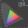
- I just uploaded a different version that looks a bit like Image:Gamut-sRGB.png. It still has artifacts, and looks rather lousy against a white background (hence the inverted colours). What do you think? -- Sakurambo 桜ん坊 17:21, 25 July 2007 (UTC)

What about the image at http://www.ledtronics.com/datasheets/Pages/chromaticity/097b.htm ? — DIV (128.250.204.118 05:26, 30 July 2007 (UTC))
- Hi Div, sorry about the slow reply. The image at ledtronics.com looks like more of an artist's impression of the CIE colour space than an actual rendering. Personally, I'd be happier using colour values that have actually been calculated. If there's some way of calculating the perceived brightness of any RGB value, then it ought to be possible to produce a "correct" rendering without any unusual artifacts. I'll look into it some more when I get some free time. -- Sakurambo 桜ん坊 22:15, 2 August 2007 (UTC)
- The perceived brightness is essentially just luminance, or Y value. You can't keep it constant, but keeping it smooth is a good idea. It's hard to do even that, though, if you start with colors of accurate chromaticity when in gamut, and clipped when out. Dicklyon 23:23, 2 August 2007 (UTC)
User is spamming her book again
[edit]Hi, I noticed you have been reverting user 201.53.42.63 for spamming her personal website and book. After the block imposed upon this person by Utcursch, she now started spamming again with IP-address 201.53.0.244 and with username Profes001. Did you warn utcursh about this? Cheers, DVdm 16:46, 2 August 2007 (UTC)
- Indefinitely blocked by Edgar181. Cheers, DVdm 20:25, 2 August 2007 (UTC)
- Spamtastic
 -- Sakurambo 桜ん坊 22:08, 2 August 2007 (UTC)
- Spamtastic
Why the different shape for the love mark (or point d'amour)?
[edit]Hello, I was wondering if you could help me, as you uploaded the "point d'amour.svg". I've noticed that the old point d'amour (![]() ) is a different shape to the new svg version, and I wanted to know if the old jpg image was not the correct shape? The svg is quite different (
) is a different shape to the new svg version, and I wanted to know if the old jpg image was not the correct shape? The svg is quite different (![]() ), not nearly as circular, and looks to be different at the bottom. Is the jpg shape just as correct to use (are both shapes valid, as it were); was the only problem that the jpg image is of lower quality? I've been using the jpg shape quite a lot when writing recently, and I'd hate to think that it wasn't correct! Thank you very much for your time. 82.27.24.88 17:13, 7 August 2007 (UTC)
), not nearly as circular, and looks to be different at the bottom. Is the jpg shape just as correct to use (are both shapes valid, as it were); was the only problem that the jpg image is of lower quality? I've been using the jpg shape quite a lot when writing recently, and I'd hate to think that it wasn't correct! Thank you very much for your time. 82.27.24.88 17:13, 7 August 2007 (UTC)
- Hello, I posted the question above a few days ago, and I was wondering if you could get back to me either way? Thank you very much. 82.27.24.88 18:06, 10 August 2007 (UTC)


