User talk:MaximQ421
Appearance
AJM's advice to new editors
[edit]- Look at the article to see how it is laid out. The Table of Contents is the best place to start.
- Read the article to see if what you want to add or remove is appropriate, necessary, or adds value.
- Search for the right place to put it.
- Check Use the "Show Preview" to make sure that what you have done is appropriate and correct.
- Discuss any change about which you are uncertain, by placing your proposed text, or just a suggestion, on the talk page. Someone who watches the article will usually answer in a day or so. You can monitor this by clicking the watch tag at the top of the page.
- Be aware
- that an addition inserted between two sentences or paragraphs that are linked in meaning can turn the existent paragraphs into nonsense.
- that a lengthy addition or the creation of a new sub-section can add inappropriate weight to just one aspect of a topic.
When adding images
- Look to see if the subject of your image is already covered. Don't duplicate subject matter already present. Don't delete a picture just to put in your own, unless your picture is demonstrably better for the purpose. The caption and nearby text will help you decide this.
- Search through the text to find the right place for your image. If you wish it to appear adjacent to a particular body of text, then place it above the text, not at the end of it.
- Look to see how the pictures are formatted. If they are all small thumbnails, do not size your picture at 300 px. The pictures in the article may have been carefully selected to follow a certain visual style e.g. every picture may be horizontal, because of restricted space; every picture might be taken from a certain source, so they all match. Make sure your picture looks appropriate in the context of the article.
- Read the captions of existent pictures, to see how yours should fit in.
- Check the formatting, placement, context and caption before you leave the page by using the Show preview function, and again after saving.
- Discuss If your picture seems to fill a real identifiable need in the article, but doesn't fit well, because of formatting or some other constraint, then put it on the talk page and discuss, before adding.
- Be aware that adding a picture may substantially change the layout of the article. Your addition may push another picture out of its relevant section or cause some other formatting problem.
- Edit before adding. Some pictures will look much better, or fit an article more appropriately if they are cropped to show the relevant subject.
NOTE: I have deleted the pictures that you added to Romanesque architecture, and this message is to explain why.
- The two galleries together contained ten pics to introduce the major concepts of the article. The article covers the whole of Europe. Some parts of Europe, particularly France and Italy, have thousands of Romanesque buildings, large and small. There are so many major churches and abbeys in France that only a few of the most important ones are in this article. In England there are hundreds of parish churches that have at least part of their building dating from this period. Italy has so many churches from this date that it would be impossible to list them all. These ten pictures are a broad introduction. Eastern Europe is really well covered within these pictures. Two more are not necessary.
- Read the captions of the two galleries. One is about "Architectural forms". One is about "Scope" i.e. the types of buildings which might be found from the Romanesque era. Even if the word "Scope" is not in your vocabulary, the picture gives a very clear indication.
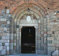
- Gallery 1. shows only parts of buildings. Gallery 2. shows only complete buildings. There is a song that goes: "One of these things just doesn't belong here. One of these things is not the same." In both cases you put the wrong picture into the wrong gallery. It is obvious that the doorway should be in the top gallery..... but there is already a better picture of a doorway. The rotunda should obviously be in the lower gallery.... but there is already a better picture of a rotunda. So the pictures are completely out of place, where they are now, and are unnecessary in the other gallery because the subject matter has been dealt with already.
- Also, I would avoid using the Rotunda of St George, Skalica in a section about "Romanesque forms", because its doorway, the ocular window and the turret on top are all later additions or changes- i.e. three of the major features of that small building are misleading to the average reader, not helpful. The building might date from the right period but it does not demonstrate Typical architectural forms which is the caption that it has been put it under.
- Typical Romanesque architectural forms
-
Portal, Church of Santa Maria, Viu de Llevata, Catalonia, Spain
-
The vault at the Abbey Church of Saint-Foy, Conques, France
-
Cloister of the Basilica di San Giovanni in Laterano, Rome
-
Bell tower of Angoulême Cathedral, Charente, SW France
-
Window and Lombard band of the Rotunda of San Tomè, Almenno San Bartolomeo
- The scope of Romanesque architecture
-
Saint Nicholas Rotunda in Cieszyn, Poland
-
The Civic Hall in Massa Marittima, Italy
-
The keep of Conisbrough Castle, England.
-
Church in Inowrocław, Poland
Please keep editting Wikipedia, but abide by the rules of reading and looking carefully before you make additions. Amandajm (talk) 09:50, 11 March 2014 (UTC)


