User:Fir0002/Design comp
Appearance
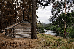
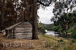
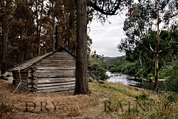
I have a rather unusual request, I would like to enter a design competition which has the theme "the seasons". What would people think is the best (or least worst) out of the following versions:
Thank you very much for any comments! --Fir0002 www 11:03, 8 April 2006 (UTC)
- I like 01 the best, it is most artsy. This, of course, depends on the details of the competition. The plain pic 04 is also good.-- Chris 73 | Talk 18:01, 8 April 2006 (UTC)
- I like 3 best, or 1 if you make the color of the text slightly different (blueish?) +sj + 18:47, 8 April 2006 (UTC)
- In a way, none of the above. I like the idea, and #1 or #3 are in the right direction. But I would go with Sj in saying that it might be better to treat the overlaid text a little differently. It looks like you are shooting for subtle overlay (which is good), but at the moment the lettering is coming across as more obfuscated and cluttered. I would guess that a lighter (bluish?) grey for the 'Winter' and 'Spring' in #1 might help, so that they are closer in tone to the image but less translucent - ideally the edges of the main letters should be distinct and legible. Alternatively, it might just need a font that doesn't have such thin sections. -- Solipsist 21:22, 8 April 2006 (UTC)
- I like number 1 and number 3 also. It really does depend on the details of the competition aswell. I like the idea of number 5, it is easier to read than number 1, and you get a greater feel of the dead vs. alive. --Ali K 02:42, 9 April 2006 (UTC)
- I like 3 better than 1 because 1 is too heavy and messy down at the bottom. I actually like 4 better, but obviously the text is important, and it helps get the message across. I do not like the last three. The last one could be the best though, because of the text being cut down to ≤4 letters. Why is "SPRING" farther to the left of the edge than "WINTER" is to the right of its edge?-- User:Mac_Davis


