User:Cmglee/Dynamic SVG for Wikimedia projects

This article describes an initiative by user:cmglee to explore techniques to employ dynamic Scalable Vector Graphics to enhance content on Wikimedia projects.
Rationale
[edit]| Chrome | Chrome for Android | Internet Explorer | Firefox | IOS Safari | Opera Mini | Android Browser |
|---|---|---|---|---|---|---|
| 8 S C | 4.3 | |||||
| 45 | 9 S C | 4.4 | ||||
| 46 | 10 S | 42 | 8.4 | 4.4.4 | ||
| 47 | 47 | 11 S | 43 | 9.2 | 8 S C | 46 |
| 48 | 44 | 9.3 | ||||
| 49 | 45 | |||||
| 50 | 46 |
Though Wikimedia projects such as Wikipedia, Wikibooks and Wikiversity are excellent in describing concepts textually and graphically, some are better explained interactively, such as when comparing members of a set or showing components of a system. We have been traditionally limited to video clips and GIF animations but now that Scalable Vector Graphics (SVG) is becoming well-supported in web browsers (see table),[1][2][3] the author believes that these Wikimedia projects stand to gain by exploring ways to enhance articles with dynamic SVG.
JavaScript or ECMAScript allow almost limitless interactivity, but uploads with it are barred, understandably for security reasons — on popular sites like Wikipedia, cross-site scripting issues are a concern. Fortunately, SVG provides two other techniques for interactivity and animation, each of which has its pros and cons:
- Synchronized Multimedia Integration Language (SMIL), and
- Cascading Style Sheets (CSS).
The author has explored applications, techniques and best practice for the last two years and contributed over 300 SVGs, some with animated and interactive, and aim to create demonstrations and tutorials to allow users to create their own dynamic content.
The following are some areas identified. As the author is learning as he goes along, some of his images, especially earlier work, violate his own guidelines, so the developer is requested to exercise caution when studying the examples provided.
Animation
[edit]SVG animations show how a system changes with time and are an alternative to video clips. Advantages are
- Has much smaller file size,
- Can be enlarged without getting blocky, and
- Potentially allows interaction besides pause and seek.
Non-interactive animation
[edit]The simplest type of animation starts running automatically and optionally repeats. Examples:
As the author wrote in the SVG animation article, the following code snippets demonstrate two techniques to create animated SVG on compatible browsers. The relevant parts are in bold green.
SVG animation using SMIL
[edit]<!DOCTYPE svg PUBLIC "-//W3C//DTD SVG 1.1//EN" "http://www.w3.org/Graphics/SVG/1.1/DTD/svg11.dtd">
<svg version="1.1" xmlns="http://www.w3.org/2000/svg" xmlns:xlink="http://www.w3.org/1999/xlink"
width="100%" height="100%" viewBox="-4 -4 8 8">
<title>SVG animation using SMIL</title>
<circle cx="0" cy="1" r="2" stroke="red" fill="none">
<animateTransform
attributeName="transform"
attributeType="XML"
type="rotate"
from="0"
to="360"
begin="0s"
dur="1s"
repeatCount="indefinite"/>
</circle>
</svg>
SVG animation using CSS
[edit]<!DOCTYPE svg PUBLIC "-//W3C//DTD SVG 1.1//EN" "http://www.w3.org/Graphics/SVG/1.1/DTD/svg11.dtd">
<svg version="1.1" xmlns="http://www.w3.org/2000/svg" xmlns:xlink="http://www.w3.org/1999/xlink"
width="100%" height="100%" viewBox="-4 -4 8 8">
<title>SVG animation using CSS</title>
<style type="text/css">
@keyframes rot_kf { from { transform: rotate(0deg); }
to { transform: rotate(360deg); } }
@-moz-keyframes rot_kf { from { -moz-transform: rotate(0deg); }
to { -moz-transform: rotate(360deg); } }
@-webkit-keyframes rot_kf { from { -webkit-transform: rotate(0deg); }
to { -webkit-transform: rotate(360deg); } }
.rot { animation: rot_kf 1s linear infinite;
-moz-animation: rot_kf 1s linear infinite;
-webkit-animation: rot_kf 1s linear infinite; }
</style>
<circle class="rot" cx="0" cy="1" r="2" stroke="blue" fill="none"/>
</svg>
Note: the -moz and -webkit styles are pre-CSS3 browser-specific styles.
Interactive animation
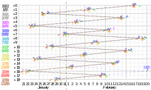
[edit]Interactivity can be easily combined with animation. The Interactivity section describes interactivity in more detail. Example:
 |
Interactivity
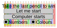
[edit]The real power of dynamic SVG comes from interactivity. At its simplest, tooltips can display supplementary information, or with cunning trickery, one can write a simple applet, such as these examples:
 |
 |
Tooltips
[edit]Neither CSS nor SMIL is needed — four methods have been identified:
- Title tag — the recommended method, supported on all Chrome, Firefox and Internet Explorer: add an attribute
<title>TOOLTIP TEXT</title>inside an element, such as<use xlink:href="#object"><title>TOOLTIP TEXT</title></use>to show "TOOLTIP TEXT" in a tooltip when the user hovers over the element. Newlines can be inserted using\nbut Internet Explorer shows them as spaces. - Anchor link, supported on all Chrome, Firefox and Internet Explorer: enclose the element in a hyperlink (described in the section below) to an non-existent anchor in the same document e.g.
<a xlink:href="#MESSAGE"> … </a>— highest compatibility though the text is not displayed adjacent to the element, and includes the URL of the SVG. - Embedded custom cursor, supported on Chrome and Firefox: Base64-encode a 32×32 image and include it in the cursor attribute of the element, e.g.
cursor="url(data:image/png;base64,iVBORw0KGgoAAAANSUhEUgAAACAAAAAgCAMAAABEpIrGAAAADFBMVEUAAABVVVWqqqr////Bf2LRAAAAUUlEQVR42t2TMQ4AIAgDLfz/zw4OTSRCqkze2htKgNELfIE8phJzgjSnEQUbyAXQ3DBVcPwocPxCILWgrZM9wQ4HBOFx3XZzctJZQ3ucOGEnEyz6BGX+V2aMAAAAAElFTkSuQmCC),auto"— tedious to generate and not easily changed though allows an image to be displayed. - CSS hover selector: add a transparent SVG element as a child of the element and a CSS
:hoverselector in its style to make it visible.pointer-events:none;prevents the invisible tooltip itself triggering the hover effect. The element can be any SVG element — not necessarily text. A drawback is that CSS is needed, but all Chrome, Firefox and Internet Explorer support it. Example stylesheet:
 <style type="text/css">
  .parentclass       .tooltip { opacity:0; pointer-events:none; }
  .parentclass:hover .tooltip { opacity:1; }
 </style>
Examples:
Hyperlinks
[edit]Neither CSS nor SMIL is needed — enclose the element to be hyperlinked in <a xlink:href="URL" target="FRAME"> and </a> to link to "URL" on the frame or window named "FRAME". If target="FRAME" is omitted, the page loads over the SVG and the user has to click Back to return to it, and this resets any changes the user has made to the SVG. On Internet Explorer, the element enclosed cannot be in a block which is inserted using the use tag. Example:
 |
 |
Progressive disclosure
[edit]Some infographics are better absorbed in small bites!
Changing an element's appearance when the user moves the mouse pointer over it can be done in CSS, but responding to clicks (other than on hyperlinks) requires SMIL, which is not supported on Internet Explorer.
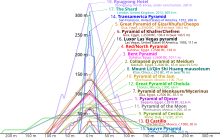
In the File:Comparison_of_pyramids.svg example above, the overlapping shapes can appear overwhelming. Highlighting just the pyramid hovered over lets the user see its shape much more clearly. File:CIE1931xy_ColorChecker_SMIL.svg below takes it a step further: SMIL allows an object to change state when clicked, so that the user can select any combination of objects to compare. The objects toggled need not be the objects clicked. The File:Milky_Way_multispectral_SMIL.svg example demonstrates mixing photographs taken at different wavelengths of light by clicking on thumbnails.
Complex graphs, too, can benefit from progressive disclosure. In File:Doubling_time_vs_half_life.svg below, individual graphs can be isolated to aid readability.
The following code combines CSS and SMIL for maximum compatibility and functionality, and demonstrates how two selectable objects can be created, the first initially unselected and the second preselected. The opacity values can be tweaked to taste.
 <style type="text/css">
  /* Styles for interactivity: */
  #main:hover   { stroke-opacity:0.1; fill-opacity:0.1; }
  .nofade       { stroke-opacity:1;   fill-opacity:1;   }
  .base         { cursor:default; cursor:-webkit-grab; cursor:grab; }
  .base:hover,
  .active:hover { stroke-opacity:0.9; fill-opacity:0.5; }
  .active       { stroke-opacity:0.8; fill-opacity:0.5; visibility:visible;
                  cursor:-webkit-grabbing; cursor:grabbing; }
 </style>
 <!-- Event-handlers to link clicks to the state of active parts: -->
 <set xlink:href="#object1a" attributeName="class" to="active" begin="object1b.click"    end="object1a.click"/>
 <set xlink:href="#object2a" attributeName="class" to="active" begin="object2b.click;0s" end="object2a.click"/>
 <!-- Element which triggers general fade when hovered over: -->
 <g id="main">
  <!-- Elements which do not fade when general fade is triggered -->
  <g class="nofade">
   ...
  </g>
  <!-- Selectable elements, each comprising a base part and an active part, and a tooltip: -->
   <g>
    <g id="object1b" class="base"><!-- Selectable element when unselected --></g>
    <g id="object1a" visibility="hidden"><!-- Selectable element when selected --></g>
    <title>Tooltip for object1</title>
    <a xlink:href="URL1"><!-- Element to load URL1 when clicked --></a>
   </g>
   <g>
    <g id="object2b" class="base"><!-- Selectable element when unselected --></g>
    <g id="object2a" visibility="hidden"><!-- Selectable element when selected --></g>
    <title>Tooltip for object2</title>
    <a xlink:href="URL2"><!-- Element to load URL2 when clicked --></a>
   </g>
 </g>

With reference to the code of the sample SVG on the right, the #main:hover style fades the image when elements in it are hovered over, providing greater contrast for selected elements. The nofade class is applied to elements which should not fade such as the background and user interface elements.
Each selectable object has up to four elements:
- A base part (suffixed "b") provides its unselected appearance and a trigger to click to select it
- An active part (suffixed "a") provides its selected appearance and a trigger to click to deselect it.
- An optional tooltip appears when the object is hovered over.
- An optional hyperlink loads a URL when clicked.
The base and active parts can be two instances of the same object (such as a triangle or bridge silhouette in the File:6-set_Venn_diagram_SMIL.svg or File:Comparison_of_notable_bridges_SMIL.svg examples), or separate objects (such as the glow and photograph mix in File:Milky_Way_multispectral_SMIL.svg). For the former, the object can be defined separately and instanced using use tags.
The active part is initially hidden by default and is revealed when the base part is clicked. Appending ;0s to an object's set tag selects it by default, as in the example code for object2a above. When the revealed active part is clicked, it hides itself. The cursor is also appropriately changed to reflect the object's state in Firefox and Chrome.
As Internet Explorer does not support SMIL, a CSS hover effect is added to highlight the base part when the user hovers over it.
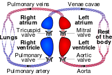
It is possible to group selectable objects by category, as in this demo and interactive map; each group button highlights/selects all its members. The interactive map also shows how certain elements (such as the lines joining the map locations with its photo) can be made unresponsive to hover or click by adding pointer-events:none; to their styles to avoid flashing when the pointer briefly passes over them.
The SVG can be modified to deselect members on a second click, as in the above graph, but its use may be unintuitive: if the user clicks the group button to select the entire group then manually deselects each member, the group will still be selected, and clicking the button again appears to do nothing. It should decrement a counter and turn off the group button when every member has been deselected and vice versa, but the author does not know of a way to do this.
Interactive timelines
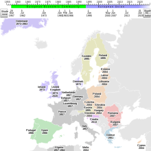
[edit]While animations are often enough to show changes in a system through time, it is sometimes useful to let the user move through it at his or her own pace, even in a non-linear fashion. The File:Evolution_of_the_European_Union_SMIL.svg example below lets the user highlight countries by year of accession or departure. The simpler File:BlueMarble_monthlies_SMIL.svg lets the user jump to specific frames of a sequence by hovering over the appropriate part of the graphic.
Simple 3D viewer
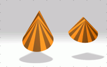
[edit]At a Cambridge Wikimedia meetup, a participant suggested that photographs of 3-dimensional artifacts could be displayed as part of a GLAM initiative. There are certainly QuickTime VR and Adobe Flash-based viewers, but these tend to be proprietary. The author has created two prototypes below: one of a rendered globe and the other a museum piece, which lets the user virtually rotate an object but lacks support for zoom and drag.
GIF animation to SVG converter
[edit]The author has written the Python script below which uses ImageMagick to download a GIF animation, extract its frames as PNGs and compile Base64-encoded versions into an SVG with a row of thumbnails at the bottom.
| Python 2 source code |
|---|
#!/usr/bin/env python
import re, json

## http://stackoverflow.com/questions/3503879
import subprocess, sys
def system(command, is_verbose=False):
 if (is_verbose): sys.stdout.write(command) ## write omits newline
 stdout = subprocess.check_output(command, shell=True)
 if (is_verbose): print(": " + stdout)
 return stdout

import os.path ## to check if file exists
def mkdir_cache(is_refresh_cache=False, is_verbose=False, suffix='.cache/'):
 basename = __file__[:__file__.rfind('.')]
 dir_cache = basename + suffix
 if (is_refresh_cache):
  for (dir, dirs, filenames) in os.walk(dir_cache, topdown=False): os.rmdir(dir)
  if (is_verbose): print("delete {dir_cache}".format(**locals()))
 if (not os.path.exists(dir_cache)):
  if (is_verbose): print("make {dir_cache}".format(**locals()))
  os.makedirs(dir_cache)
 elif (is_verbose): print("{dir_cache} already exists".format(**locals()))
 return dir_cache

## http://www.techrepublic.com/article/parsing-data-from-the-web-in-python/
import urllib2, time ## urllib2 for web access, time for sleep
def read_webpage(url, path_cache='', is_refresh_cache=False, is_verbose=False):
 dir_cache = mkdir_cache(is_refresh_cache=is_refresh_cache, is_verbose=is_verbose)
 if (not path_cache): path_cache = dir_cache + urllib2.quote(url, safe='')
 if (is_refresh_cache or (not os.path.isfile(path_cache))):
  html = urllib2.urlopen(url).read()
  file_html = open(path_cache, 'wb')
  file_html.write(html)
  if (is_verbose): print("fetch {url} into {path_cache}".format(**locals()))
  time.sleep(1) ## avoid rate-limit-exceeded error
 else:
  file_html = open(path_cache)
  html = file_html.read()
  if (is_verbose): print("read from {path_cache}".format(**locals()))
 file_html.close()
 return html

## http://stackoverflow.com/questions/3715493
import base64
def base64_encode(path):
 with open(path, 'rb') as file: return base64.b64encode(file.read())

def make_svg(url, increment, message_action):
 if (message_action == '3D'  ): message_action = 'to rotate the 3D model'
 if (message_action == 'time'): message_action = 'to move through time'
 ## Get image URL if description page URL given
 dir_cache   = mkdir_cache()
 filename    = url[url.rfind('/')+1:]
 if (filename.lower().find('file:') == 0):
  filename  = filename[filename.rfind(':') + 1:]
  path_html = '{dir_cache}{filename}.htm'.format(**locals())
  html      = read_webpage(url, path_html, is_verbose=True)
  url       = re.search(r'http.*?//upload\.[^"]+', html).group(0)
 ## Fetch image if needed
 basename      = filename[:filename.rfind('.')]
 path_gif      = dir_cache + filename
 path_basename = path_gif[:path_gif.rfind('.')]
 read_webpage(url, path_gif, is_verbose=True)
 ## Extract GIF animation frames if needed
 if (os.path.isfile('{dir_cache}{basename}-0.png'.format(**locals()))):
  print("skip extracting GIF animation frames")
 else:
  print("extract GIF animation frames")
  system('magick "{path_gif}" -coalesce "{path_basename}.png"'.format(**locals()), is_verbose=True)
 ## Base64-encode frames if needed
 path_json    = dir_cache + basename + '.json'
 jsons        = {}
 n_image      = 0
 n_frame      = 0
 if (0):
 # if (os.path.isfile(path_json)):
  file_json    = open(path_json, 'r')
  jsons        = json.loads(file_json.read())
  n_frame      = jsons['n_frame']
  out_image    = jsons['out_image']
  width_image  = jsons['width_image']
  height_image = jsons['height_image']
 else:
  ## Count frames
  n_image = 0
  while (os.path.isfile('{dir_cache}{basename}-{n_image}.png'.format(**locals()))): n_image += 1
  ## Base64-encode relevant frames
  n_frame    = int(n_image / abs(increment))
  out_images = []
  for i_frame in range(n_frame):
   i_image    = i_frame * increment + (0 if (increment > 0) else n_image + increment)
   path_frame = '{dir_cache}{basename}-{i_image}.png'.format(**locals())
   stdout     = system('magick "{path_frame}" info:'.format(**locals()), is_verbose=True)
   (width_image, height_image) = [int(dim) for dim in re.search(r'\d+x\d+', stdout).group(0).split('x')]
   base64_encoded = base64_encode(path_frame)
   out_images.append('''\
  <image id="image_{i_frame}" x="0" y="0" width="{width_image}" height="{height_image}" xlink:href="data:image/png;base64,{base64_encoded}"/>\
'''.format(**locals()))
  out_image = '\n'.join(out_images)
  jsons     = {'out_image':out_image, 'width_image' :width_image,
               'n_frame'  :n_frame  , 'height_image':height_image}
  file_json = open(path_json, 'w')
  try: ## use try/finally so that file is closed even if write fails
   file_json.write(json.dumps(jsons, indent=1, separators=(',',':')))
  finally:
   file_json.close()
 ## Create SVG
 out_mains = []
 scale_thumbnail = round(1.0 / n_frame, 5)
 height_trigger  = int(height_image * (scale_thumbnail + 1) + 0.5)
 width_trigger   = round(width_image * scale_thumbnail, 2)
 width_thumbnail = int(width_trigger + 0.9999)
 for i_frame in range(n_frame):
  x_trigger = round(i_frame * width_trigger, 2)
  out_mains.append('''\
  <g class="frame">
   <g class="content">
    <use xlink:href="#image_{i_frame}"/>
   </g>
   <g class="trigger" transform="translate({x_trigger},{height_image})">
    <use xlink:href="#image_{i_frame}" transform="scale({scale_thumbnail})"/>
    <use xlink:href="#triggers"/>
   </g>
   <!-- <title>frame {i_frame}</title> -->
  </g>'''.format(**locals()))
 out_main         = '\n'.join(out_mains)
 title            = basename.replace('_', ' ')
 stroke_width     = max(width_image, height_image) / 200
 font_size        = width_image  / 20
 x_help           = width_image  / 2
 y_help           = height_image / 2
 height_thumbnail = height_image * scale_thumbnail - stroke_width / 2
 width_images     = [width_image * multiple for multiple in range(99)]
 ## Compile everything into an .svg file
 file_out = open(basename + '.svg', 'w')
 try: ## use try/finally so that file is closed even if write fails
  print("write SVG")
  file_out.write('''<?xml version="1.0" encoding="utf-8"?>
<!DOCTYPE svg PUBLIC "-//W3C//DTD SVG 1.1//EN" "http://www.w3.org/Graphics/SVG/1.1/DTD/svg11.dtd">
<svg xmlns="http://www.w3.org/2000/svg" xmlns:xlink="http://www.w3.org/1999/xlink" width="100%" height="100%" viewBox="0 0 {width_image} {height_trigger}">
 <title>{title}</title>
 <desc>Interactive SVG by CMG Lee of the GIF animation at {url} . Move left and right over the SVG image {message_action}.</desc>
 <style type="text/css">
  #main {{ font-family:Helvetica,Arial,sans-serif; font-size:{font_size}px; text-anchor:middle;
           stroke-width:{stroke_width}; fill:#000000; }}
  #trigger              {{ stroke:none; fill-opacity:0; }}
  .frame       .content {{ visibility:hidden; pointer-events:none; fill:#000000; }}
  .frame       .trigger {{ opacity:0.5; cursor:ew-resize; }}
  .frame:hover .content {{ visibility:visible; }}
  .frame:hover .trigger {{ opacity:1; pointer-events:auto; font-weight:bold; stroke:#ff0000; }}
 </style>
 <defs>
  <g id="help">
   <text x="{x_help}" y="{y_help}" dy="-1ex">Move left and right</text>
   <text x="{x_help}" y="{y_help}" dy="1ex">{message_action}</text>
  </g>
  <rect id="trigger" x="0" y="-4999" width="{width_thumbnail}" height="9999"/>
  <g id="triggers">
   <rect x="0" y="0" width="{width_thumbnail}" height="{height_thumbnail}" fill="none"/>
   <use xlink:href="#trigger"/>
   <use xlink:href="#trigger" transform="translate(-{width_images[1]},0)"/>
   <use xlink:href="#trigger" transform="translate( {width_images[1]},0)"/>
   <use xlink:href="#trigger" transform="translate(-{width_images[2]},0)"/>
   <use xlink:href="#trigger" transform="translate( {width_images[2]},0)"/>
   <use xlink:href="#trigger" transform="translate(-{width_images[3]},0)"/>
   <use xlink:href="#trigger" transform="translate( {width_images[3]},0)"/>
   <use xlink:href="#trigger" transform="translate(-{width_images[4]},0)"/>
   <use xlink:href="#trigger" transform="translate( {width_images[4]},0)"/>
  </g>
{out_image}
 </defs>
 <g id="main">
  <circle cx="0" cy="0" r="9999" fill="#ffffff"/>
  <use xlink:href="#image_0" opacity="0.5"/>
  <use xlink:href="#help" stroke-opacity="0.5" stroke="#ffffff"/>
  <use xlink:href="#help"/>
  <g id="frames">
{out_main}
  </g>
 </g>
</svg>
'''.format(**locals()))
 finally:
  file_out.close()

n_argv = len(sys.argv)
if (n_argv < 2):
 print(("usage: {sys.argv[0]} <URL of GIF animation file> [<use every nth GIF frame;" +
        " negative reverses order>] [<action message or '3D' or 'time'>]")
       .format(**locals()))
else:
 make_svg(    sys.argv[1],
          int(sys.argv[2]) if (n_argv > 2) else 1,
              sys.argv[3]  if (n_argv > 3) else '3D')
|
Moving left and right over the SVG image rotates the 3D model. As it uses CSS (no SMIL), it supports Internet Explorer. Below are some fields of study that can benefit:
 |
 |
 |
 |
 |
 |
 |
 |
Some categories containing GIF animations that can be converted are
- commons:Category:Animations_using_BodyParts3D_polygon_data
- commons:Category:Animations_from_Anatomography
User:Shyamal suggested using it to navigate through a timeline. Additionally, it can be used to control the position of an object in the scene. As examples, I've converted the following:
 |
 |
 |
 |
Limitations
[edit]Backward compatibility
[edit]Thumbnails are often used to link to a media file, and so the SVG should be presentable when rendered as a thumbnail and on browsers which support SVG but not animations or interactivity. One method the author has used is to first create a static SVG, but leaving space or structuring the code for dynamic parts to be added later.
A link can be added to the thumbnail caption to inform the user that an interactive version is available, as in this example:
As CSS is more widely supported than SMIL, CSS methods are preferred, where possible. For example, in File:Comparison_of_notable_bridges_SMIL.svg above, CSS hover effects are used to highlight a bridge profile or label when the user moves the mouse-pointer over it. If his or her Web browser supports SMIL, the profile or label can also be clicked to keep it highlighted. This lets Internet Explorer users use the hover effect while letting Chrome users use both hover and click.
Touchscreen support
[edit]Most tablets and smartphones break the hover and click model as it is almost impossible (except by clicking and cancelling the "Open with" menu) to hover without also clicking. The File:Comparison_of_notable_bridges_SMIL.svg example above puts the link to the bridges' Wikipedia articles in an icon button. As both hover and click highlight a bridge, the touchscreen user can operate the user interface without handicap.
Editor support
[edit]As the author handcrafts his SVG files (or write Python or Perl programs to generate them), they are currently not editable on editors such as Inkscape. The author will endeavour to provide support for at least Inkscape if this project takes off.
See also
[edit]- SVG tutorial at Wikibooks
- Extensive SVG tutorial in German at Wikibooks
- CSS3 animations tutorial at Wikiversity


