Signage systems
Signage systems are visually oriented information systems, consisting of signs, maps, arrows, color-codings systems, pictograms and different typographic elements. Signage systems differ from other methods of information presentation because they are typically used to guide people's passage through the physical world; road signs on a highway, station identification signs in a subway and overhead signs in an airport are all common examples of signage systems. The act of following a signage system is known as wayfinding, waysigning or signposting.
While any collection of correlated signs can be considered a signage system, the term is typically used to refer to a group of signs with a coherent design and purpose. Frequently, significant effort is put into creating an intelligent presentation for a sign that takes into account scientific knowledge about humans' reactive capabilities to typefaces and colors. This research has produced a design aesthetic of certain fonts that are frequently used (especially humanist sans-serif designs like Frutiger, which was created in 1969 for signage in Paris' Charles de Gaulle Airport.)
Examples
[edit]London Underground
[edit]
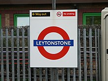
One of the most commonly cited examples of a well-designed signage system is the London Underground. The Underground's station signs consist of a red roundel and a horizontal blue bar containing the station name. They are instantly recognizable to riders throughout London, are unlikely to be confused with other signage, and can be replicated throughout printed materials, stations, and street-level entrances to provide consistency throughout the entire system. The typeface used on the signs, New Johnston, was designed in 1913 specifically for the Underground to provide readability at a distance.
External links
[edit]![]() The dictionary definition of sign at Wiktionary
The dictionary definition of sign at Wiktionary
