Montserrat (typeface)
 | |
| Category | Sans-serif |
|---|---|
| Classification | Geometric |
| Designer(s) | Julieta Ulanovsky |
| Foundry | ZkySky |
| Date created | 2010 |
| Date released | 2011 |
| License | SIL Open Font License |
| Variations |
|
| Website | fonts |
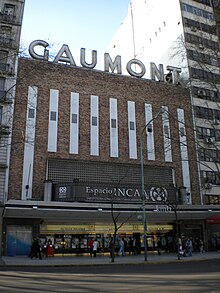
Montserrat is a geometric sans-serif typeface designed by Argentine graphic designer Julieta Ulanovsky and released in 2011. It was inspired by posters, signs and painted windows from the first half of the twentieth century, seen in the historic Montserrat neighbourhood of Buenos Aires.[1]
The project was started in 2010 by Ulanovsky[2] and was released through the Google Fonts catalogue in 2011. Montserrat has become increasingly popular among web designers, and it is used on over 17 million websites.[3]
Featuring a large x-height, short descenders and wide apertures, this typeface achieves high legibility even in small sizes.
Montserrat has been developed into a large family, consisting of nine weights (from Thin to Black), a set of alternate characters, a distinctive Subrayada (underlined) variant, and support for the Cyrillic character set.[4]
According to lead designer Ulanovsky, it is a functional and contemporary alphabet, with uses ranging from publishing to the corporative world. She refers to it as a "geometric typeface with bold optical adjustments."[1]
Background and development
[edit]Ulanovsky began the project in 2010 while she was studying for a master's degree at the Faculty of Architecture, Design and Urbanism (FADU), University of Buenos Aires. She gathered inspiration from the 1920-1950s lettering on street signs, posters, painted windows, and cafe canopies in the homonymous neighborhood.[3] During the course of her studies, she realised that these letterforms were not as common as they once had been, so she felt compelled to "rescue the beauty of urban typography" through a new font under a free and open source license.[2]
As urban development changes this place, it will never return to its original form and loses forever the designs that are so special and unique. To draw the letters, I rely on examples of lettering in the urban space. Each selected example produces its own variants in length, width and height proportions, each adding to the Montserrat family. The old typographies and canopies are irretrievable when they are replaced.
— Julieta Ulanovsky
For its financing, the project was launched in the Kickstarter website in 2011, and was crowdfunded by anonymous backers. The typeface was published in Google Fonts the same year.[4] Eventually, it became the third most popular font on the platform, gathering over 2.7 trillion views as of September 2023.[5]
Ulanovsky also stated that "this can be a lifelong project, because letterforms are continuously being discovered in urban situations. This case is the opposite from common typography, characters go from the streets to the computer, it is like digitizing something completely analogical."[6]

Usage
[edit]Montserrat has gained popularity as a free alternative to other similar sans-serif fonts, such as Gotham or Avenir.[7] Although mainly seen in websites and online media, its high readability and ease of scaling make Montserrat a suitable typeface for printed material, such as brochures, signage and even books (as can be seen in the "Científicas de Acá" acknowledgements.)[8]
In 2018, with the release of the 2018-2024 Graphic Identity Manual for the Presidential Office of Mexico, Montserrat became the official font for documentation, presentations and publicity for the Government of Mexico. It is also the official typeface of Ādaži Municipality (previously also Carnikava Municipality) in Latvia and the Legislative Assembly of Vologda Oblast in Russia.[9][10][11]
Since January 2021, it also serves as the Government of Puerto Rico's official typeface for body text and its agencies' logos, used alongside Cormorant Garamond for headlines.[12]
Montserrat also won Fiverr's 2024 Font of the Year due its popularity.[13]
Variations
[edit]The typeface also includes two sister font families: a special letterforms set called "Montserrat Alternates" and an underlined one called "Montserrat Subrayada".
In 2015, a set of some weights and italics were developed by Ulanovsky, Ale Paul, Carolina Giovagnoli, Andrés Torresi, Juan Pablo del Peral and Sol Matas. In November 2017, the font family was redrawn by Jacques Le Bailly to include a full set of weights, and to adjust the regular set for a better use in longer text.[4]
Unicode support
[edit]The character set features over 250 glyphs, covering the Latin alphabet with a wide range of diacritics, extended characters and various symbols.
In late 2017, Julieta Ulanovsky and her collaborators worked together with Maria Doreuli and Alexei Vanyashin for the development of a Cyrillic character set.[4] Ulanovsky's collaborator, Sol Matas, stated that, being unfamiliar with the writing system, the greatest challenge they faced was to remain faithful to the Argentine inspiration while designing characters that looked natural in the Cyrillic context. The Cyrillic expansion culminated in 8,640 new characters for Montserrat across all nine weights.[14]
References
[edit]- ^ a b Redacción LA NACION (2011-11-09). "Tipografía porteña". La Nación (in Spanish). ISSN 0325-0946. Retrieved 2021-10-08.
- ^ a b Ulanovsky, Julieta (2021-10-06), The Montserrat Font Project, retrieved 2021-10-08
- ^ a b "Google Design - Scripting Cyrillic". Google Design. 2017-11-22.
- ^ a b c d "Google Fonts - Montserrat". Google Fonts. Retrieved 2021-10-08.
- ^ "Google Fonts - Analytics". Google Fonts. Retrieved 2021-10-08.
- ^ Moreno, Silvana (2012-04-15). "Barrio chino - Tipografía de Barrio". La Nación (in Spanish). ISSN 0325-0946. Retrieved 2021-10-08.
- ^ "The Rise of Grotesque". ZevenDesign. 2018-02-25. Retrieved 2021-10-08.
- ^ Alcain, Julieta; Edelsztein, Valeria; Elffman, Julieta; Hadad, Carolina (2021-04-30). Científicas de Acá: Historias que cambian la historia (in Spanish). TantaAgua Editorial. ISBN 978-987-86-9252-4.
- ^ "Graphic Identity Manual 2018-2024". Gobierno de México. Nov 29, 2019.
- ^ "Vologda Oblast Legislative Assembly".
- ^ "Novada simbolika | Ādaži". www.adazunovads.lv (in Latvian). Retrieved 2024-08-10.
- ^ "PRITS-004 - Guías de Interfaz y Diseño (GUIDI)" (PDF). Gobierno de Puerto Rico.
- ^ "Fiverr Declares Montserrat 2024 'Font of the Year'". Yahoo.
- ^ "Google Design - Scripting Cyrillic". Google Design.
