File talk:H1N1 map by total cases.svg
< Talk:2009 swine flu outbreak

| This is the talk page for discussing improvements to the H1N1 map by total cases.svg file. |
|
| If this page has been recently modified, it may not reflect the most recent changes. Please purge this page to view the most recent changes. |
| This file does not require a rating on Wikipedia's content assessment scale. It is of interest to the following WikiProjects: | |||||||||||||||||||||||||||||
| |||||||||||||||||||||||||||||
|
no archives yet (create) |

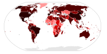
| +5000 cases with deaths +500 cases with deaths +50 cases with deaths +5 cases with deaths +1 cases with deaths | +5000 confirmed cases +500 confirmed cases +50 confirmed cases +5 confirmed cases +1 confirmed cases | +5000 unconfirmed cases +500 unconfirmed cases +50 unconfirmed cases +5 unconfirmed cases +1 unconfirmed cases | No cases |
Map by case type
[edit]
This map is different from the Image:H1N1 map.svg map, which is a map by case type, this is a map by number of cases.
70.29.208.129 (talk) 21:24, 29 May 2009 (UTC)
Map by confirmed cases
[edit]
This map is different from the Image:H1N1 map by confirmed cases.svg map, which is a map by number of confirmed cases.
70.29.208.129 (talk) 21:24, 29 May 2009 (UTC)
Map by confirmed deaths
[edit]
This map is different from the Image:H1N1 map by confirmed deaths.svg map, which is a map by number of deaths.
70.29.208.129 (talk) 21:24, 29 May 2009 (UTC)
USA
[edit]Are you sure you've got the deaths colored right? It seems USA is blacker than Mexico, and Canada and Mexico have the same color... By your scale, Canada and Costa Rica should be the same color, USA and Mexico two shades darker. 70.29.208.129 (talk) 21:45, 29 May 2009 (UTC)
- The image at the moment shows USA as being blacker than Mexico because there are more confirmed cases in the USA than in Mexico. This is a bit confusing as to the casual viewer it looks as though USA has had more deaths than Mexico. I think that when it comes to deaths in a country it shouldn't matter about confirmed cases, just the number of deaths. I think the map would be easier to understand that way. Alexdeangelis86 (talk) 13:02, 01 June 2009 (UTC)
-- Well that is confusing... 70.29.208.129 (talk) 10:43, 4 June 2009 (UTC)
- I Know, i think too many maps are so confusing, 3 maps are just fine, right now we have 3 types of maps, and 2 'official' maps, by types of cases and by number of cases, and those maps are easily understandable, not like this one that is so confusing. And by the way, is outdated. With 3 maps is enough or at least 2. --Vrysxy! (talk) 07:11, 5 June 2009 (UTC)
Updating
[edit]When was the last time you updated this map? Because this map is quite inaccurate. Mudkip201 (talk) 13:52, 14 June 2009 (UTC)
- File-Class geography articles
- NA-importance geography articles
- WikiProject Geography articles
- File-Class Disaster management articles
- NA-importance Disaster management articles
- File-Class virus articles
- NA-importance virus articles
- WikiProject Viruses articles
- File-Class medicine articles
- NA-importance medicine articles
- All WikiProject Medicine pages
- File-Class International relations articles
- NA-importance International relations articles
- WikiProject International relations articles


