File talk:H1N1 map by confirmed deaths.svg
< Talk:2009 swine flu outbreak

| This is the talk page for discussing improvements to the H1N1 map by confirmed deaths.svg file. |
|
| If this page has been recently modified, it may not reflect the most recent changes. Please purge this page to view the most recent changes. |
| This file does not require a rating on Wikipedia's content assessment scale. It is of interest to the following WikiProjects: | |||||||||||||||||||||||||||||
| |||||||||||||||||||||||||||||
|
no archives yet (create) |

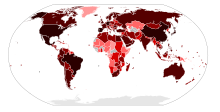
| 0 deaths suspected deaths | 1+ deaths 5+ deaths | 10+ deaths 50+ deaths | 100+ deaths 500+ deaths | 1000+ deaths 5000+ deaths |
Map by case type
[edit]
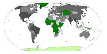
This map is different from the Image:H1N1 map.svg map, which is a map by case type, this is a map by number of deaths.
70.29.208.129 (talk) 11:02, 29 May 2009 (UTC)
Map by confirmed cases
[edit]
This map is different from the Image:H1N1 map by confirmed cases.svg map, which is a map by number of confirmed cases, this is a map by number of deaths.
70.29.208.129 (talk) 11:02, 29 May 2009 (UTC)
Scale
[edit]It might be good to readjust the scale a bit, now that I think it over...
suggestions:
|
0 deaths
suspected deaths
|
1+ deaths
5+ deaths
|
10+ deaths
20+ deaths
50+ deaths
|
100+ deaths
200+ deaths
500+ deaths
|
1000+ deaths
2000+ deaths
5000+ deaths
|
|
0 deaths
suspected deaths
|
1+ deaths
5+ deaths
|
20+ deaths
100+ deaths
|
500+ deaths
2000+ deaths
|
10000+ deaths
50000+ deaths
|
70.29.208.129 (talk) 11:24, 29 May 2009 (UTC)
File:H1N1 map by total cases.svg
[edit]
A new map has appeared... 70.29.208.129 (talk) 21:28, 29 May 2009 (UTC)
Chile June 2 update needed
[edit]This map needs to be updated with Chile, it has death now. 70.29.208.129 (talk) 11:30, 3 June 2009 (UTC)
![]() Done
Done
Domincan Republic 5 June update needed
[edit]Can someone update this for the Dominican Republic? 70.29.208.129 (talk) 08:40, 6 June 2009 (UTC)
![]() Done
Done
Used scale
[edit]I am in totally disagree with the used colors in this map. Is a convention that the gray color (or white) must be used as base. The argument for using gray because the deaths were painted in black is easily refutable, all the scales of all the colors finish with black!
So, I recommend a scale in violet, something like this:
|
0 deaths
suspected deaths
|
1+ deaths
5+ deaths
|
10+ deaths
20+ deaths
and the rest... |
--201.255.176.159 (talk) 16:34, 3 June 2009 (UTC)
- Can you come up with a longer scale? It has to have atleast 200+ deaths 70.29.208.129 (talk) 04:47, 6 June 2009 (UTC)
- There is the unused blue scale...
- 200,000+ total cases50,000+ total cases10000+ total cases2000+ total cases500+ total cases100+ total cases20+ total cases5+ total cases1+ total cases
- 70.29.208.129 (talk) 04:47, 6 June 2009 (UTC)
Yes, the scale that I suggested must to be longer, but I don't know how to make them... =(
The color blue has to be avoided because it can be confused with water, and talk of more than 10,000 deaths in one country is a bit apocalyptic, as an example, the map of cases only talks about 5,000. --201.255.152.243 (talk) 23:11, 6 June 2009 (UTC)
- I was planning for a Spanish Flu scale disaster, so that there are no arguments on colors if the outbreak turned especially deadly. 70.29.208.129 (talk) 08:36, 7 June 2009 (UTC)
- There's always the green-scale which I've not mentioned until now...
- TurquoiseAquamarinePale GreenLight GreenChartreuseForest GreenGreenDark Green
- or
- 1+5+10+20+50+100+200+500+1000+2000+5000+10000+20,000+50,000+100,000+
- 70.29.208.129 (talk) 08:54, 7 June 2009 (UTC)
Well, working with Inkscape I did this scale. If you like it I can edit the map with this colors:
--201.255.152.243 (talk) 03:01, 7 June 2009 (UTC)
- I know the current scale works that way, but that's why I made a suggestion for a revised scaling... so that it's more like doubling (0/1+/5+/10+/20+/50+/100+/200+/500+/1000+/2000+/5000+/10000+) or the "5x scale" (0/1+/5+/20+/100+/500+/2000+/10000+)... there's always the magnitude scale (0/1+/10+/100+/1000+/10000+) and the scale used on the other maps (0/1+/5+/50+/500+/5000+) ... after some thought, I believe the jump from 10y->50y is a bit large, so modify it to 10y->20y->50y 70.29.208.129 (talk) 08:41, 7 June 2009 (UTC)
So will the color scale be changed? The grey is very difficult to discern what number of deaths the shades on the map correspond with. 71.101.144.182 (talk) 23:37, 7 September 2009 (UTC)
Colombia 9 June update needed
[edit]Can someone update the world map for deaths, for Colombia? 70.29.210.174 (talk) 06:29, 10 June 2009 (UTC)
![]() Done
Done
Guatamala 10 June death
[edit]Can someone update this map for the June 10 death in Guatamala? 70.29.210.174 (talk) 06:31, 11 June 2009 (UTC)
![]() Done
Done
14 June Scotland
[edit]So can someone add Scotland to the deaths? 70.29.212.226 (talk) 04:16, 15 June 2009 (UTC)
![]() Done
Done
June 15 Argentina
[edit]Someone needs to update the map to take account of the death in Argentina. 70.29.212.226 (talk) 03:46, 16 June 2009 (UTC)
![]() Done
Done
22/06
[edit]Coloring is needed for
- Honduras
- Philippines
70.29.212.226 (talk) 07:57, 23 June 2009 (UTC)
Hungary.
[edit]A Hugarian is now dead.--86.25.15.159 (talk) 19:44, 25 July 2009 (UTC)
Belgium and The Netherlands
[edit]At Belgium and The Netherlands there are now 1 death (in total: 2). Can someone update the map? Zhongwenxuexia (talk) 20:17, 4 August 2009 (UTC)
- File-Class geography articles
- NA-importance geography articles
- WikiProject Geography articles
- File-Class Disaster management articles
- NA-importance Disaster management articles
- File-Class virus articles
- NA-importance virus articles
- WikiProject Viruses articles
- File-Class medicine articles
- NA-importance medicine articles
- All WikiProject Medicine pages
- File-Class International relations articles
- NA-importance International relations articles
- WikiProject International relations articles


