Wikipedia:Featured picture candidates/delist/Image:Tesseract.gif


- Reason
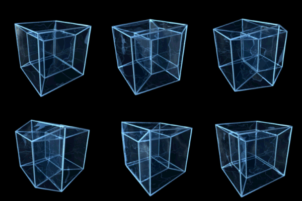
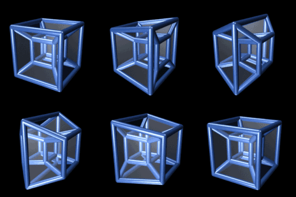
- This amazing animation no longer appears in the article for the subject it depicts: a tesseract. I posit that if it's not good enough to be in there, it shouldn't be a featured picture either. There are two other animated tesseracts from the article that I would propose to replace this one, so take your pick. I joe nuts pls candidate 1 myself.
- Nominator
- howcheng {chat}
- Replace with candidate 1 — howcheng {chat} 23:26, 4 June 2007 (UTC)
- Support replacement with candidate 1.--Pharos 02:00, 5 June 2007 (UTC)
- What is the purpose of the reflections in the first image? — BRIAN0918 • 2007-06-05 14:32Z
- You can see the philosophical debate about the different versions here. Basically, candidate 1 is designed to be maximally visually impressive, showing off the complex geometry, and candidate 2 is designed to be maximally understandable, keeping it as simple as possible.--Pharos 18:27, 5 June 2007 (UTC)
- Replace with candidate 2 — I prefer this edit, as it is much better suited for an encyclopedia. We're trying to understand the image, not make it more complicated in favor of aesthetics. ♠ SG →Talk 18:08, 6 June 2007 (UTC)
- I'd support either one, really. My reasoning was, if they are both being used in the article (as they are now), then we might as well make the more visually impressive one the FP. But either one would be acceptable.--Pharos 05:05, 7 June 2007 (UTC)
- Replace with either. Whichever gets more support shas 11:38, 8 June 2007 (UTC)
- Replace with none I think that the perspective is confusing. It is turning on its side like any cube could but also doing the weird inside-out thing that we're trying to have the reader understand. I like the perspective of this one, but the quality will have to be improved (or a new one created).--HereToHelp 15:22, 8 June 2007 (UTC)
- On second thought… Would option 2 look better rotated 90˚?--HereToHelp 22:16, 8 June 2007 (UTC)
- around which of it's 4 dimensions would you propose to rotate it 90°? Debivort 07:47, 9 June 2007 (UTC)
- I think he meant rotating the picture 90°. howcheng {chat} 16:07, 12 June 2007 (UTC)
- That's correct; preferably clockwise.--HereToHelp 21:25, 12 June 2007 (UTC)
- Haha that makes sense. I'd support a rotated version. Debivort 06:03, 13 June 2007 (UTC)
- That's correct; preferably clockwise.--HereToHelp 21:25, 12 June 2007 (UTC)
- I think he meant rotating the picture 90°. howcheng {chat} 16:07, 12 June 2007 (UTC)
- around which of it's 4 dimensions would you propose to rotate it 90°? Debivort 07:47, 9 June 2007 (UTC)
- On second thought… Would option 2 look better rotated 90˚?--HereToHelp 22:16, 8 June 2007 (UTC)
- support either slight pref for second, as the first looks like a bubbly minimal surface. Debivort 07:47, 9 June 2007 (UTC)
- Replace with candidate 2 Candidate 1 is too shiny and the animation is a bit too fast for my taste. Candidate 2 is much better in showing the concept. Jumping cheese Cont@ct 09:42, 12 June 2007 (UTC)
- Replace with Candidate 2 I like this one best. It is very good, and it goes slowly enough for you to see what it is showing. And the fact that the other ones rotate makes it harder to see what is going on. Althepal 18:25, 15 June 2007 (UTC)
- Replace with Cand. 2 per Althepal. The extra rotation is not really necessary. Spebudmak 18:57, 16 June 2007 (UTC)
- Keep original - replacement 1 is confusing, replacement 2 doesn't rotate, robbing it of much of its illustrative value. Adam Cuerden talk 08:44, 19 June 2007 (UTC)
- Replace with Candidate 1 Personal feeling, candidate two is too slow. – Esurnir 20:48, 19 June 2007 (UTC)
- Keep - The glass looks nice, but takes away from the encyclopedic value of the image. Chris H 01:34, 20 June 2007 (UTC)
- Keep Original As above the glass is useless and distracting. -Fcb981 04:08, 21 June 2007 (UTC)
Comments from the original artist: The original tesseract animation was removed from the tesseract page because I wanted to maintain some consistency with the other 4D geometry animations that I had rendered, and those were all done in the style of candidate #1. I find it interesting how much debate the different versions have sparked. I would be willing to render new versions of the tesseract at any angle or speed, but fear that additional versions would only make a consensus more difficult to reach. This really does appear to be a conflict between function and form. I suspect that there are four orthogonal issues that actually need to be decided.
A) Should we keep the reflections?
B) Should the tesseract rotate about a single plane, or two planes simultaneously?
C) What camera orientation should be used? (Should starting frame center view on a face, edge, or corner? Should tesseract rotate horizontally or vertically?)
D) What speed should the animation be rendered at?
I suspect that because explanatory power should probably trump eye candy in any encyclopedia, both A and B will be decided in favor of simplicity. But to add to the confusion, I also have the ability to render the center cube in a different color, as seen in the logo I developed for this page: http://www.hc-info.net/
I will be happy to go with whatever the community consensus is... I just hope that I have not created a religious divide by offering too many options :) JasonHise 16:58, 30 June 2007 (UTC)
- Replace with 2 - The subtle planes make it easier to understand than the original. Candidate 1 is distractingly shiny, includes a confusing and unnecessary second axis of rotation and is too fast. When it comes to trying to visualize 4-dimensional shapes, clarity should beat pretty every time. —dgiestc 06:50, 2 July 2007 (UTC)
- Replace with 2 8thstar 17:44, 3 July 2007 (UTC)
- Replace with 2. This one is significantly easier to make sense of. ~Inkington 12:56, 5 July 2007 (UTC)
- Replace with 2. When I came to this article it is immediately obvious this is the easiest to understand -
there's no point having rotation or reflective glass, it's just confusing Nuclear froggy 07:06, 9 November 2007 (UTC)
- No replacement needed-There's no need to worry that an image is too slow. 3.14159265358pi (talk) 14:21, 23 November 2011 (UTC)
Replaced with Image:8-cell-simple.gif MER-C 02:19, 9 July 2007 (UTC)
