Wikipedia:Featured picture candidates/delist/Image:Hans Holbein d. J. 065.jpg
Appearance


- Reason
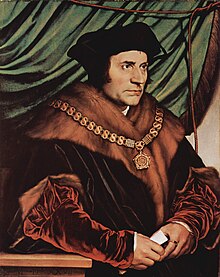
- I am gearing up to work on the Hans Holbein the Younger article, and I want the images there to all be of a high quality, because the reader will scrutinise the paintings in response to the text. This is a significant Holbein painting that marked a step forward in his art. In my opinion, the reproduction is rather blurry and not large enough. As a potential replacement, I have uploaded Image:Sir Thomas More, by Hans Holbein the Younger.jpg. This version is less tinged and shows the fine detail of Holbein's rendering—for example the dots of white stubble on More's chin. Having never nominated before, I've no idea whether this new image is of FP quality; but I'm sure that the old one no longer is.
- Previous nomination/s
- Wikipedia:Featured picture candidates/Sir Thomas More
- Nominator
- qp10qp (talk)
- Delist — qp10qp (talk) 01:32, 24 November 2008 (UTC)
ReplaceDelist see below why I changed my vote. At any rate your version is indeed better. But which one of the two shows the actual coloring of the paining? Diego_pmc Talk 07:06, 24 November 2008 (UTC)
- I have several books with this picture in it. The FP has a pink tone that I've not seen elsewhere. I haven't seen the picture in the flesh, but I agree (see comment below) that the second one does seem to have a yellowish cast. I have a nice natural one, between the two, in another book (see right), but it is a smaller reproduction and even more printy. For some reason I can't get the picture on the Frick Collection site, but this page gives a small reproduction: [1]. The present picture has been scanned from a big reproduction that only just fit on a scanner. The book seemed to me printed to a high quality, but in view of the present remarks, I am now having doubts. I'm not actually bothered so much about this being an FP candidate as about delisting the other, which is blurry by any standards. qp10qp (talk) 12:49, 24 November 2008 (UTC)
- Delist but do not replace. Current FP is not up to standard, but neither is the replacement offered. The replacement suffers from serious offset printing offset artifacting. --Leivick (talk) 07:38, 24 November 2008 (UTC)
- Fair enough. qp10qp (talk) 12:49, 24 November 2008 (UTC)
- Keep. I see the new image as having a yellow cast. I'd like to see more evidence that this colouring is present in the original. Papa Lima Whiskey (talk) 12:52, 24 November 2008 (UTC)
- Good point about the yellow cast. I now have three big reproductions spread out before me. Two have the yellow cast (so this may be to do with the photograph), and one looks natural, though without the pink cast of the FP (see 3rd image, right). All in all, I am starting to agree that my new version is unsatisfactory, but not as unsatisfactory as the FP. qp10qp (talk) 13:15, 24 November 2008 (UTC)
- I understand your criticism, but the size of the current FP is large enough to compensate for the slight lack of sharpness. So a sharper image of the same resolution could certainly replace it so long as this new image is also otherwise satisfactory. Papa Lima Whiskey (talk) 13:33, 24 November 2008 (UTC)
- I think "slight lack of sharpness" is an understatement. Compare the chins. The subteties of Holbein's work are lost, in my opinion. It is not enough for the picture to look OK on the thumbnail, because readers of the Holbein article, for example, will want to look closely. I always open up the full file when reading art articles. qp10qp (talk) 14:23, 24 November 2008 (UTC)
- Do the maths. It's 2.5 times larger than the minimum required by the criteria. If you scale it down 2.5 times, it will be sharp. Papa Lima Whiskey (talk) 15:07, 24 November 2008 (UTC)
- I think "slight lack of sharpness" is an understatement. Compare the chins. The subteties of Holbein's work are lost, in my opinion. It is not enough for the picture to look OK on the thumbnail, because readers of the Holbein article, for example, will want to look closely. I always open up the full file when reading art articles. qp10qp (talk) 14:23, 24 November 2008 (UTC)
- I understand your criticism, but the size of the current FP is large enough to compensate for the slight lack of sharpness. So a sharper image of the same resolution could certainly replace it so long as this new image is also otherwise satisfactory. Papa Lima Whiskey (talk) 13:33, 24 November 2008 (UTC)
- Good point about the yellow cast. I now have three big reproductions spread out before me. Two have the yellow cast (so this may be to do with the photograph), and one looks natural, though without the pink cast of the FP (see 3rd image, right). All in all, I am starting to agree that my new version is unsatisfactory, but not as unsatisfactory as the FP. qp10qp (talk) 13:15, 24 November 2008 (UTC)
- How can it recover detail by becoming smaller? If the detail is not there, it is not there.qp10qp (talk) 15:14, 24 November 2008 (UTC)
- The featured picture criterion says images should be at least 1000 pixels in the larger dimension. For the rest, see my comment below. Papa Lima Whiskey (talk) 18:54, 28 November 2008 (UTC)
- How can it recover detail by becoming smaller? If the detail is not there, it is not there.qp10qp (talk) 15:14, 24 November 2008 (UTC)
- I agree with qp10qp. Scaling it down is not a solution. It is okay for photographs, but a FP of a painting should show all the details of the painting. Scaling it down will only reduce its quality. Also if the hairs from the beard are actually white in the painting, then the current FP is certainly not encyclopedic.
I have also changed my vote to "delist". I had a better look at the proposed version, and there are actually some pretty obvious signs that it was scanned from a book (lines). Diego_pmc Talk 18:37, 24 November 2008 (UTC)
- Please assess images relative to the requirements, i.e. to the minimum size. The fact that it's 2.5 times larger (or 6.25 times if you will) larger than the minimum is a bonus. If it *were* the minimum size, it would be sharp, so it fulfils the minimum criteria. If you can upload a picture that is both accurate in colour *and* sharper (and not through manual sharpening, as often happens), then we can reach an agreement that we're making an improvement on the status quo. And as for the tone comparison image, it has some space left in the histogram, which makes it difficult to assess. Papa Lima Whiskey (talk) 20:57, 24 November 2008 (UTC)
- Keep Short of better information on the yellow tint being true to the original I can't support replacing the current FP with that. Although I'm sure it wasn't your original intention Qp I strongly oppose any attempt to turn this from a possible replacement to some sort of "ninja delist" as Leivick is attempting. Cat-five - talk 18:40, 24 November 2008 (UTC)
- I can assure you that my purpose was to see if I could get the image delisted and that the replacement idea was secondary (see here). As I understand it, the delisting vote does not depend on finding a suitable replacement; after all, we are not talking about deletion. My reason for wanting to see the image delisted is that I am hoping to ensure that all the images in the Holbein article are of a decent quality (I've only just started, and this will take time). However, one has to be extremely respectful of featured content; although I have replaced this image in the article, I would expect that someone will change it back for the featured image, which, in principle, would be logical; worse still, they might delete the alternative on the grounds that we have a featured image of the same picture.qp10qp (talk) 20:05, 24 November 2008 (UTC)
- Just commenting to clarify that my opinion is still keep as there is still insufficient reason in my opinion to delist this and the replace is not a good enough replacement due to the yellow tint issue. Cat-five - talk 01:34, 28 November 2008 (UTC)
- Delist, but do not replace - Existing FP is pretty poor quality with heavy artifacting. The proposed replacement, however, has a strong yellow cast and the levels are off in general (blacks are grey for example). Kaldari (talk) 19:29, 1 December 2008 (UTC)
No consensus --Wronkiew (talk) 01:59, 6 January 2009 (UTC)
