Wikipedia:Featured picture candidates/File:80 - Machu Picchu - Juin 2009 - edit.jpg
Appearance


- Reason
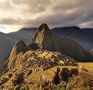
- Of high technical standard, high resolution (near 100 mpx) and represents well Machu Picchu. If you have problems viewing at full resolution, downsampled versions are available here
- Articles this image appears in
- Machu Picchu
- Creator
- S23678
- Support as nominator --S23678 (talk) 07:20, 14 November 2009 (UTC)
- Comment Wow, this is a impressively large version of Machu Picchu. I'm not sure the colors are right, might need better white balancing (Although I assume it was taken during the golden hour.) So long as there is no major stitching errors, which would require some time to examine, very big image, I'm definitely leaning towards support here. ;-)
- Support edit 1 After going over it in Photoshop I can't see anything that would qualify as a stitching error, so it has my support. — raeky (talk | edits) 07:48, 14 November 2009 (UTC)
- I also think it's probably a bit too warm - even the shadows look warm, which wouldn't normally be the case). Clearly it was taken near sunset, but IMO it looks a bit more balanced with a WB correction - just doing an auto colour correction in Photoshop looks more balanced to me. Still, the photographer is experienced, so I guess I will just take their word for it. Ðiliff «» (Talk) 15:16, 14 November 2009 (UTC)
- I've uploaded a new version, were the levels were set to offer a more neutral look. Less pleasing to the eye, but closer to reality. --S23678 (talk) 16:04, 14 November 2009 (UTC)
- Thanks, I'm glad you agree that it is more realistic in Alt 1. I would even argue that it is also more pleasing to the eye as I found the first one a little 'washed out' in terms of colour. Ðiliff «» (Talk) 19:44, 14 November 2009 (UTC)
- Changing my support for Edit 1. — raeky (talk | edits) 21:50, 14 November 2009 (UTC)
- Thanks, I'm glad you agree that it is more realistic in Alt 1. I would even argue that it is also more pleasing to the eye as I found the first one a little 'washed out' in terms of colour. Ðiliff «» (Talk) 19:44, 14 November 2009 (UTC)
- I've uploaded a new version, were the levels were set to offer a more neutral look. Less pleasing to the eye, but closer to reality. --S23678 (talk) 16:04, 14 November 2009 (UTC)
- Support magnificent picture.--Caspian blue 08:15, 14 November 2009 (UTC)
- Support - Edit 1 only. - ☩Damërung ☩. -- 18:09, 14 November 2009 (UTC)
- Support Edit 1 only. Ðiliff «» (Talk) 19:44, 14 November 2009 (UTC)
- Support Edit 1 only. Noodle snacks (talk) 22:49, 14 November 2009 (UTC)
- Support Edit 1, per above. Cowtowner (talk) 01:42, 15 November 2009 (UTC)
- Support Edit 1, Oppose Original Blurry, but absurdly large to the point that it can be downsampled and look good as a full standard size poster (approx 4000 x 3000 px). Nezzadar [SPEAK] 07:02, 15 November 2009 (UTC)
- Support Edit 1, per above. Elekhh (talk) 13:21, 15 November 2009 (UTC)
- Support Edit 1. I've replaced the original in the article with the edit. Mostlyharmless (talk) 04:22, 16 November 2009 (UTC)
- Comment. An interesting comparison with the last Maccu Picchu nom, put up by Janke back in April 2006, which failed due to lack of consensus on a version to promote. This a considerably superior image to that one, in my opinion, in both quality and EV. Mostlyharmless (talk) 04:29, 16 November 2009 (UTC)
- Agree. this is a poster quality image that I would expect to see in a magazine or something, the resolution is great, you can zoom in and see all the people walking around in sufficient detail. — raeky (talk | edits) 16:10, 17 November 2009 (UTC)
- Support alt 1. It looks sharper and lightens up the atmosphere.Tim1337 (talk) 07:45, 19 November 2009 (UTC)
- Support alt 1. Also think it should be downsampled a bit. —Krm500 (Communicate!) 23:04, 19 November 2009 (UTC)
- Support. Rather amazing. --JN466 23:23, 20 November 2009 (UTC)
Promoted File:80 - Machu Picchu - Juin 2009 - edit.2.jpg --ZooFariThank you Wikipedia! 15:29, 26 November 2009 (UTC)
