Wikipedia:Featured picture candidates/AcueductoSegovia04.JPG
Appearance


- Reason
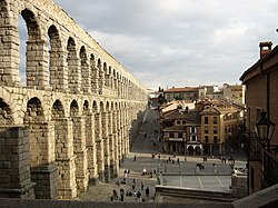
- Already a FP on Commons and WP:es. I believe it illustrates its subject well, and it also is visually pleasant.
- Articles this image appears in
- Segovia, Arch bridge, Roman art, Revolt of the Comuneros, Aqueduct of Segovia
- Creator
- Manuel González Olaechea y Franco
- Support as nominator --Diego_pmc Talk 07:44, 6 October 2008 (UTC)
- Weak Support - The only part letting this one down, in my opinion, is the side of a building on the right. Perhaps if this was edited out I wouldn't have any problems with this image.Matthuxtable (talk) 20:58, 7 October 2008 (UTC)
- Support edit one. I like how the picture has both old and new (or at least, newer) buildings. I don't really see any problem with the building on the side. :) Intothewoods29 (talk) 16:15, 10 October 2008 (UTC)
- Support. I agree with intothewoods, the building on the right does not cause problems. Spinach Dip 22:31, 7 October 2008 (UTC)
- Weak support, Though small issues with noise and sharpness, I enjoy the contrast of the old and new architectural features. SpencerT♦C 00:58, 8 October 2008 (UTC)
- Support edit 1. A little better. SpencerT♦C 01:42, 20 October 2008 (UTC)
WeakOpposeuntil the tilting is fixed. If the aquaduct were really leaning to the left this much, the water would all be falling off the other side. I thought it might be an optical illusion caused by the base being wider, but the verticals on the house in the center are leaning left too, so I think the whole thing just needs slight perspective correction. However the entire image is also too soft. Mfield (talk) 04:58, 8 October 2008 (UTC)- Oppose original - As above, until the tilt is fixed -- Alvesgaspar (talk) 07:24, 8 October 2008 (UTC)
- Support edit 1 -- OK. Alvesgaspar (talk) 19:39, 8 October 2008 (UTC)
- Oppose Tilted, not the best quality and I dislike the ridge at the bottom of the picture. The composition itself is good though. --Massimo Catarinella (talk) 16:54, 8 October 2008 (UTC)
- Comment - I have uploaded the edited version. Diego_pmc Talk 18:54, 8 October 2008 (UTC)
- Weak support edit 1 - I think this is a great image, but perhaps slightly more interesting lighting might have improved it even more, as it looks a teensy bit washed out in this light. Shoemaker's Holiday (talk) 04:08, 10 October 2008 (UTC)
- Neutral even after edit 1. Frankly I think the picture would be stronger if the houses on the right were removed entirely, or at least lightened so they aren't so distracting. I understand what the picture is currently trying to do, but I don't think they balance the aqueduct enough as is. This picture is about the scale of the aqueduct ... it doesn't need that symmetry, and when you put your hand over the houses you get that massive aqueduct dwarfing the buildings below, which is what I think the photographer wants to show us.
- Done - I have removed the building on the right as well. Diego_pmc Talk 17:42, 14 October 2008 (UTC)
- Comment - In the future, will you not save an edit over an already uploaded picture? It looks like we all support edit one, when in reality we actually supported your first edit which is not displayed here anymore. I support any of the pictures, but just FYI :) Intothewoods29 (talk) 21:36, 15 October 2008 (UTC)
- Sorry. I thought it wasn't necessary to upload it separately. Diego_pmc Talk 20:05, 17 October 2008 (UTC)
- Oppose the angle doesn't really help the enc value etc. Noodle snacks (talk) 00:22, 16 October 2008 (UTC)
- Strong Support: Great picture shows exactly what a aqueduct is. Support either one, but edit 1 more. Epson291 (talk) 19:15, 19 October 2008 (UTC)
Promoted Image:AcueductoSegovia edit1.jpg MER-C 06:53, 23 October 2008 (UTC)
