Talk:The Street Enters the House
Appearance
A fact from The Street Enters the House appeared on Wikipedia's Main Page in the Did you know column on 21 October 2010 (check views). The text of the entry was as follows:
|
| This article is rated C-class on Wikipedia's content assessment scale. It is of interest to the following WikiProjects: | ||||||||||||||||||
| ||||||||||||||||||
Image of the work
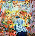
[edit]I've just uploaded an image of the work that most accurately represents the colors of the painting. The former, was exceedingly over-saturated, i.e., unacceptable. If consensus is needed to resolve this apparent problem (of higher resolution vs. accurate colors) then let's begin the process. Coldcreation (talk) 12:54, 20 February 2015 (UTC)
- Here are the two possibilities: Coldcreation (talk) 12:56, 20 February 2015 (UTC)
- I have the book on Futurism here by Taschen that devotes a whole page to the image. Taschen are known for their high quality art books. The image on the left is not at all like the image in the book. The one on the right, which I scanned from the book, is a very close match for the image in the book. I think you are taking the accuracy of the first image for granted. Zoom and you can see that it is itself a low quality book scan. It is the colours in the first image that are wrong. The extra resolution of the second image is just a bonus. Philafrenzy (talk) 12:59, 20 February 2015 (UTC)
- Incorrect. I saw the work in person a few months ago. The book image you scanned in entirely wrong as far as colors and brightness are concerned. Those are ink colors, not oil paint colors. Books, i.e., printers, hardly ever get the colors right. Coldcreation (talk) 13:24, 20 February 2015 (UTC)
- The only difference in resolution is that the printed dots (the screened image, or halftone for each ink color) are visible in the higher rez version. Coldcreation (talk) 13:29, 20 February 2015 (UTC)
- They might not but I don't think you can say the original grainy image is right either. Philafrenzy (talk) 13:30, 20 February 2015 (UTC)
- I have just added the museum version on the right which does not match either. Check the dark of the skirt and the whites at the top. Philafrenzy (talk) 13:46, 20 February 2015 (UTC)
- Incorrect. I saw the work in person a few months ago. The book image you scanned in entirely wrong as far as colors and brightness are concerned. Those are ink colors, not oil paint colors. Books, i.e., printers, hardly ever get the colors right. Coldcreation (talk) 13:24, 20 February 2015 (UTC)
- I have the book on Futurism here by Taschen that devotes a whole page to the image. Taschen are known for their high quality art books. The image on the left is not at all like the image in the book. The one on the right, which I scanned from the book, is a very close match for the image in the book. I think you are taking the accuracy of the first image for granted. Zoom and you can see that it is itself a low quality book scan. It is the colours in the first image that are wrong. The extra resolution of the second image is just a bonus. Philafrenzy (talk) 12:59, 20 February 2015 (UTC)
That's actually the best picture of the painting I've seen to date, online. Feel free to add it to the article. Thank you for not pushing the saturation level on this one. Coldcreation (talk) 15:24, 20 February 2015 (UTC)
- Again, you are under a misapprehension, I haven't adjusted the saturation levels of any of them, including the cyclist (which you also replaced) which came from the Guggenheim Museum here. Philafrenzy (talk) 15:32, 20 February 2015 (UTC)
- The Cyclist I uploaded came from the Guggenheim Museum too, here. It's fairly obvious when the saturation levels are increased on artworks (regardless of who is at fault). When this is the case, images should be sought that do not have this artifact. Coldcreation (talk) 05:52, 21 February 2015 (UTC)
- Again, you are under a misapprehension, I haven't adjusted the saturation levels of any of them, including the cyclist (which you also replaced) which came from the Guggenheim Museum here. Philafrenzy (talk) 15:32, 20 February 2015 (UTC)
- I went ahead and posted the museum photograph. Thank you for uploading that one. Coldcreation (talk) 15:29, 20 February 2015 (UTC)


