Talk:Area codes 609 and 640
| This article is rated Stub-class on Wikipedia's content assessment scale. It is of interest to the following WikiProjects: | |||||||||||||||||||||||||||||||
| |||||||||||||||||||||||||||||||
Comments
[edit]I have added a brief description of the area code because there are some differences within the area code that should be noted. Of note, please note the differences between Mercer County and the shorelien areas covered by the area code. Given these differences, I feel a description is warranted. Jps57 (talk) 16:33, 16 April 2008 (UTC)jps57
Dude, are you serious? This page is horrible and it's so poorly written! Why does it matter that Mercer County is different from Atlantic City? Why should the phone company care if there are prep schools in Mercer County, and tourism on the shore? Are your descriptions even correct?
If people wanted to read about what happens in these areas, aren't there pages already that give info on them? Isn't this page about a number? I don't understand...
Oh, and I made some changes to help you along your way. For instance, you didn't mention that Trenton actually isn't part of Mercer County. Also, the thing about Frank Lautenberg. He's cool. Also, maybe you should put something about how nice the beach is in the summer?
-cgwazda
I agree. This is one of the worst pages I've read on Wikipedia. I'll try to clean it up a bit. —Preceding unsigned comment added by 128.112.162.33 (talk) 15:18, 3 July 2008 (UTC)
External links modified
[edit]Hello fellow Wikipedians,
I have just modified one external link on Area code 609. Please take a moment to review my edit. If you have any questions, or need the bot to ignore the links, or the page altogether, please visit this simple FaQ for additional information. I made the following changes:
- Added archive https://web.archive.org/web/20090302233203/http://areacodedownload.com:80/609/index.html to http://www.areacodedownload.com/609/index.html
When you have finished reviewing my changes, please set the checked parameter below to true or failed to let others know (documentation at {{Sourcecheck}}).
This message was posted before February 2018. After February 2018, "External links modified" talk page sections are no longer generated or monitored by InternetArchiveBot. No special action is required regarding these talk page notices, other than regular verification using the archive tool instructions below. Editors have permission to delete these "External links modified" talk page sections if they want to de-clutter talk pages, but see the RfC before doing mass systematic removals. This message is updated dynamically through the template {{source check}} (last update: 5 June 2024).
- If you have discovered URLs which were erroneously considered dead by the bot, you can report them with this tool.
- If you found an error with any archives or the URLs themselves, you can fix them with this tool.
Cheers.—InternetArchiveBot (Report bug) 12:48, 17 October 2016 (UTC)
Map dispute
[edit]

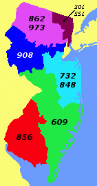
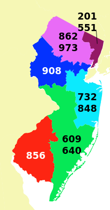
User:Kbrose reverted my vector map [1]. I reverted their revert [2] because I believe I am in the right here. According to commons:COM:MFC, specifically this section [3], SVG images are always preferred over PNG images when not inferior. The PNG image in this case is worse than most, it is low resolution and hard to see on my high DPI 4K monitor. Now, I am trying to understand their POV also. They say "poor visual features, hard to read". The "visual features" (colors, borders, area shown) are exactly the same between the two images, so I don't understand this part. However, "hard to read". I agree with him that small sizes of the Computer Modern font are hard to read in my new map, so I have changed the font of it from Computer Modern to just `sans-serif`, which will let Wikipedia (and browsers) choose an appropriate font.
If you still find my map lacking, or indeed my entire planned project lacking, please do not hesitate to provide more feedback User:Kbrose. ![]() --Psiĥedelisto (talk) 16:41, 2 December 2016 (UTC)
--Psiĥedelisto (talk) 16:41, 2 December 2016 (UTC)
- Oh, here's another thing that we can do. We can use Template:CSS image crop and a larger px size of the base image without me changing my image if it's very important to you that the area of the new image is exactly the same as the area of the old image. I personally prefer the new one as it shows more of New Jersey's neighbors and that looks better to me, but let me know what you think about this option also. --Psiĥedelisto (talk) 16:50, 2 December 2016 (UTC)
First of all, thank you for recognizing the need to uniformly display maps of numbering plan areas on WP. Please don't take my reversal as sign that this is undesired. We should have the best format to accommodate all display devices equally well. Using a 4K TV as the justification is not the best argument for making sweeping changes, the most common device used by the audience is probably a 3 to 10 inch screen. When you yourself already acknowledge display problems, you should have consulted consensus first. I feel the display problems were not only the fonts used, but also the heavy emphasis on black borders. They very much clutter the display. Since the plan areas are colored, no borders are necessary. The old image has a nice clean uncluttered look to it, that we should try to emulate. The new map is also too large, the image can be reduced to half its size by cutting away the space surrounding the state of relevance. These maps are not supposed to show where the states are located, but the plan areas within each state. For geography lessons, we have plenty of other articles. I think this discussion should also involve the use of image maps to link to the area code articles relevant to each image. Another user has recently begun to consolidate some of the image map data into templates, and this work should be in coordination with new vector maps. Kbrose (talk) 12:59, 3 December 2016 (UTC)
- "Since the plan areas are colored, no borders are necessary." This may be true if the goal was just to copy 1:1 the NJ map as it was in PNG form, but, many other area code maps here that use imagemaps are linking to area codes even outside of the state of the area code being shown. At first, I thought I'd copy the NJ map's way of doing things and only show the area codes inside the state in question. But the NJ map is in the minority on Wikipedia, the maps of Texas, California, New York, and the previous West Virginia map all show area codes outside of the state also, so I'm wondering if I shouldn't actually add area code labels outside the state for New Jersey. That's not to say that the borders have to be black solid lines, mind, but they do have to be there if we're going to go this route. I wonder what you think about perhaps dotted or dashed lines.
- You brought up imagemaps also - but since imagemaps are made out of polygons, having vector files makes making imagemaps much easier since they can be generated from the vector files if you know what size the vector file will be rendered at. That's as good of an argument as any for switching.
- As far as the viewport of the vector map being too large - what do you think about the CSS option above for the imagemap template? --Psiĥedelisto (talk) 13:20, 3 December 2016 (UTC)
- I have uploaded a version without black borders, and this looks clean. The font face for the codes is still not rescaling optimally, perhaps an Arial font displays better. I also have not cropped any data. PS: looking at the image now, it is also clear now that the New Jersey coast barrier islands are not colored properly. Kbrose (talk) 21:49, 3 December 2016 (UTC)
- Hi @Kbrose:. I have not lost interest, so thanks for your revert...I was not aware of how to use the watchlist feature then, and you didn't try to contact me via talk. Anyway, maybe my bad. You just completely ignored the fundamental reason I put the borders so I became discouraged: if I have this big of a fight on the very first state I attempt, how will I ever unify the area code maps? Like I said above...
At first, I thought I'd copy the NJ map's way of doing things and only show the area codes inside the state in question. But the NJ map is in the minority on Wikipedia, the maps of Texas, California, New York, and the previous West Virginia map all show area codes outside of the state also, so I'm wondering if I shouldn't actually add area code labels outside the state for New Jersey. That's not to say that the borders have to be black solid lines, mind, but they do have to be there if we're going to go this route.
So how can I unify them with these two styles in contention? I'm happy to fix the barrier islands, crop, do whatever else to make you happy, but this is my big concern. I'm trying to assume good faith and think you didn't ignore it on purpose. Psiĥedelisto (talk) 15:55, 15 January 2017 (UTC)
- I've re-added my image via the {{CSS image crop}} template to crop it so it looks (almost) exactly the same as the previous version minus the blue ocean. I would still like your input on the border problem so I can move forward with the other states. Psiĥedelisto (talk) 06:52, 16 January 2017 (UTC)

