Menu (computing)
This article needs additional citations for verification. (September 2021) |
In user interface design, a menu is a list of options presented to the user.
Navigation
[edit]
A user chooses an option from a menu by using an input device. Some input methods require linear navigation: the user must move a cursor or otherwise pass from one menu item to another until reaching the selection. On a computer terminal, a reverse video bar may serve as the cursor.
Touch user interfaces and menus that accept codes to select menu options without navigation are two examples of non-linear interfaces.
Some of the input devices used in menu interfaces are touchscreens, keyboards, mice, remote controls, and microphones. In a voice-activated system, such as interactive voice response, a microphone sends a recording of the user's voice to a speech recognition system, which translates it to a command.
Types of menus
[edit]

A computer using a command line interface may present a list of relevant commands with assigned short-cuts (digits, numbers or characters) on the screen. Entering the appropriate short-cut selects a menu item. A more sophisticated solution offers navigation using the cursor keys or the mouse (even in two dimensions; then the menu items appear or disappear similarly to the menus common in GUIs). The current selection is highlighted and can be activated by pressing the enter key.
A computer using a graphical user interface presents menus with a combination of text and symbols to represent choices. By clicking on one of the symbols or text, the operator is selecting the instruction that the symbol represents. A context menu is a menu in which the choices presented to the operator are automatically modified according to the current context in which the operator is working.
A common use of menus is to provide convenient access to various operations such as saving or opening a file, quitting a program, or manipulating data. Most widget toolkits provide some form of pull-down or pop-up menu. Pull-down menus are the type commonly used in menu bars (usually near the top of a window or screen), which are most often used for performing actions, whereas pop-up (or "fly-out") menus are more likely to be used for setting a value, and might appear anywhere in a window.
According to traditional human interface guidelines, menu names were always supposed to be verbs, such as "file", "edit" and so on.[1] This has been largely ignored in subsequent user interface developments. A single-word verb however is sometimes unclear, and so as to allow for multiple word menu names, the idea of a vertical menu was invented, as seen in NeXTSTEP.
Menus are now also seen in consumer electronics, starting with TV sets and VCRs that gained on-screen displays in the early 1990s, and extending into computer monitors and DVD players. Menus allow the control of settings like tint, brightness, contrast, bass and treble, and other functions such as channel memory and closed captioning. Other electronics with text-only displays can also have menus, anything from business telephone systems with digital telephones, to weather radios that can be set to respond only to specific weather warnings in a specific area. Other more recent electronics in the 2000s also have menus, such as digital media players.
Submenus
[edit]
Menus are sometimes hierarchically organized, allowing navigation through different levels of the menu structure. Selecting a menu entry with an arrow will expand it, showing a second menu (the submenu) with options related to the selected entry.
Usability of submenus has been criticized as difficult, because of the narrow height that must be crossed by the pointer. The steering law predicts that this movement will be slow, and any error in touching the boundaries of the parent menu entry will hide the submenu. Some techniques proposed to alleviate these errors are keeping the submenu open while moving the pointer in diagonal, and using mega menus designed to enhance scannability and categorization of its contents.[2][3] Negative user experience with submenus is referred to as "menu diving".[4]
Usage of attached ellipses
[edit]In computer menu functions or buttons, an appended ellipsis ("…") means that upon selection, another dialog will follow, where the user can or must make a choice.[5] If the ellipse is missing, the function will be executed upon selection.
- "Save": the file will be overwritten without further input.
- "Save as ...": in the following dialog, the user can, for example, select another location or file name or other file format.
Touchscreens
[edit]
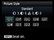
Displays with touchscreen functionality, e.g. modern cameras and printers, also have menus: these are not drop-down menus but buttons.
See also
[edit]References
[edit]- ^ Apple Human Interface Guidelines – Menus
- ^ Jakob Nielsen. "Mega Drop-Down Navigation Menus Work Well".
- ^ Jakob Nielsen. "Mega-Menus Gone Wrong". Archived from the original on July 20, 2018.
- ^ Hennion, Antoine; Levaux, Christophe (May 3, 2021). Rethinking Music through Science and Technology Studies. Routledge. p. 178. ISBN 978-1-000-38195-5.
- ^ developer.apple.com: Menu and Menu Item Titles
