File talk:Vostok Petit data.svg
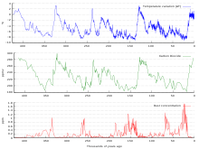
The horizontal zero points here are misleading. Why is the vertical axis on the uppermost graph shifted slightly to the left? This makes it harder to be able to tell exactly what points correspond to where, as simply moving up vertically directly will cause >1000 years of misadjustment. 69.116.196.223 (talk) 16:33, 18 March 2011 (UTC)
———————————————
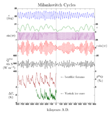
Oh there's much more involved than CO2 alone, which was just varying by a hundred ppm here. It isn't the primary driver of the ice age cycle. This graph is kind of misleading actually if you see it in isolation. Over thousands of years, Earth's orbit, tilt, and precession varies a bit in a pattern that initiates ice ages. I was working on the climate change article recently, so let me lazily copy and paste a relevant bit with talk page link adjustment:
Milankovitch cycles have a large impact on climate and are notable for their correlation to glacial and interglacial periods, their correlation with the advance and retreat of the Sahara, and for their appearance in the stratigraphic record.
The IPCC notes that Milankovitch cycles drove the ice age cycles; CO2 followed temperature change "with a lag of some hundreds of years"; and that as a feedback amplified temperature change. Among other factors, CO2 is more soluble in colder than in warmer waters.
Sokavik (talk) 16:19, 2 June 2011 (UTC)
———————————————
Why is the time axis in the CO2 graph shifted against the temperature graph's time axis? Measure it on the right side, they're not synchronous. I find this confusing. 84.134.78.132 (talk) —Preceding undated comment added 20:11, 13 March 2012 (UTC).


