
File:Data from National Vital Statistics Report tPx.png
Data_from_National_Vital_Statistics_Report_tPx.png (623 × 434 pixels, file size: 186 KB, MIME type: image/png)
Summary
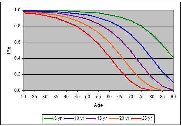
[edit]Using from Table 1 data, the chart shows with (Age) ranging from 20 to 90 years and ranging from 5 to 25 future years.


These curves show the probability that someone at (who has reached) the age of will live at least years and can be used to discuss annuity issues from the boomer viewpoint where an increase in group size will have major effects.
For those in the age range covered by the chart, the "5 yr" curve indicates the group that will reach beyond the life expectancy. This curve represents the need for support that covers longevity requirements.
The "20 yr" and "25 yr" curves indicate the continuing diminishing of the life expectancy value as "age" increases. The differences between the curves are very pronounced starting around the age of 50 to 55 and ought to be used for planning based upon expectation models.
The "10 yr" and "15 yr" curves can be thought of as the trajectory that is followed by the life expectancy curve related to those along the median which indicates that the age of 90 is not out of the question.
Licensing
[edit]
| I, the copyright holder of this work, hereby release it into the public domain. This applies worldwide. If this is not legally possible: |
| This image was uploaded in the PNG, GIF or other lossless image format. However, it contains visible lossy compression artifacts. These artifacts may have come from the JPEG format or from saving a colorful image in the GIF format instead of the PNG format. If possible, please upload a PNG or SVG version of this image, derived from a non-lossy source so that it doesn't contain any compression artifacts (or with existing artifacts removed). After doing so, please replace all instances of the artifacted version throughout Wikipedia (noted under the "File links" header), tag the old version with {{obsolete|NewImage.ext}}, and remove this tag. For more information, see Wikipedia:Preparing images for upload. |
| This chart image was uploaded in a raster graphics format such as PNG, GIF, or JPEG. However, it contains information that could be stored more efficiently and/or accurately in the SVG format, as a vector graphic. If possible, please upload an SVG version of this image. After confirming it is of comparable quality, please replace all instances of the previous version throughout Wikipedia (noted under the "File links" header), tag the old version with {{Vector version available|NewImage.svg}}, and remove this tag. For more information, see Wikipedia:Preparing images for upload. For assistance with converting to SVG, please see the Graphics Lab.Do not re-draw or auto-trace non-free images; instead, seek out vector versions from official sources. |  |
 | This file is a candidate to be copied to Wikimedia Commons.
Any user may perform this transfer; refer to Wikipedia:Moving files to Commons for details. If this file has problems with attribution, copyright, or is otherwise ineligible for Commons, then remove this tag and DO NOT transfer it; repeat violators may be blocked from editing. Other Instructions
| ||
| |||
File history
Click on a date/time to view the file as it appeared at that time.
| Date/Time | Thumbnail | Dimensions | User | Comment | |
|---|---|---|---|---|---|
| current | 01:38, 10 April 2007 | | 623 × 434 (186 KB) | JMSwtlk (talk | contribs) | ==Summary== Using <math>\,l_x</math> from Table 1 data, the chart shows <math>\,{}_tp_x</math> with <math>x</math> (Age) ranging from 50 to 90 years and <math>t</math> ranging from 5 to 25 future years. These curves show the probability th |
| 15:45, 9 April 2007 |  | 840 × 525 (15 KB) | JMSwtlk (talk | contribs) | == Licensing == {{PD-self}} |
You cannot overwrite this file.