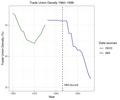
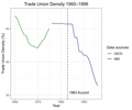
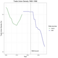
File:Australias Trade Union Density 1960-1996 with the 1983 Accord indicated.png
Appearance

Size of this preview: 720 × 600 pixels. Other resolutions: 288 × 240 pixels | 576 × 480 pixels | 900 × 750 pixels.
Original file (900 × 750 pixels, file size: 44 KB, MIME type: image/png)
Summary
[edit]Self-made by User:A B C D E soup.
Uses data from the OECD and the ABS.
Here is the source code for this chart, written in R.
library(ggplot2)
library(dplyr)
library(tidyr)
library(stringr)

dependent_variable <- "Trade Union Density"
font_size <- 11
accord_start_year <- 1983
accord_end_year <- 1996

abs_data <- (read.csv("Trade union membership by sex - 1976 to 2022.csv")
             %>% select(Year, Total)
             %>% rename(Density = Total)
             %>% fill(Density, .direction = "down")
             %>% filter(Year <= accord_end_year)
)

abs_data_start_year <- min(abs_data$Year)

oecd_data <- (read.csv("TUD_13012024005237384.csv")
              %>% select(Time, Value)
              %>% rename(Year = Time)
              %>% rename(Density = Value)
              %>% filter(Year < abs_data_start_year)
)

oecd_data_start_year <- min(oecd_data$Year)

all_data <- rbind(abs_data, oecd_data)

scale_x_start_year <- floor(min(all_data$Year) / 10) * 10
scale_x_end_year <- ceiling(max(all_data$Year) / 10) * 10
scale_y_start_year <- floor(min(all_data$Density) / 5) * 5
scale_y_end_year <- ceiling(max(all_data$Density) / 5) * 5

plot <- (ggplot()
         + geom_line(data = oecd_data, aes(x = Year, y = Density, color = "OECD"))
         + geom_line(data = abs_data, aes(x = Year, y = Density, color = "ABS"))
         + scale_color_manual(name = "Data sources:", breaks = c("OECD", "ABS"), values = c("OECD" = "darkgreen", "ABS" = "darkblue"))
         + scale_x_continuous(limits = c(oecd_data_start_year, accord_end_year), breaks = seq(scale_x_start_year, scale_x_end_year, by = 10))
         + scale_y_continuous(limits = c(scale_y_start_year, scale_y_end_year), breaks = seq(scale_y_start_year, scale_y_end_year, by = 10))
         + geom_vline(xintercept = accord_start_year, linetype = "dashed")
         + geom_text(aes(accord_start_year, scale_y_start_year + 0.75, label = str_glue("{accord_start_year} Accord"), hjust = -0.075), size = 3.25)
         + ggtitle(str_glue("{dependent_variable} {oecd_data_start_year}–{accord_end_year}"))
         + labs(x = "Year", y = str_glue("{dependent_variable} (%)"))
         + theme_bw()
         + theme(text = element_text(size = font_size))
         + theme(plot.title = element_text(size = font_size))
         + theme(plot.title = element_text(hjust = 0.5))
         + theme(aspect.ratio=1)
)

ggsave(str_glue("Australias {dependent_variable} {oecd_data_start_year}-{accord_end_year} with the {accord_start_year} Accord indicated.png"), plot, dpi = 150, height = 5, width = 6)
Licensing
[edit]I, the copyright holder of this work, hereby publish it under the following license:
| This file is made available under the Creative Commons CC0 1.0 Universal Public Domain Dedication.
The person who associated a work with this deed has dedicated the work to the public domain by waiving all of his or her rights to the work worldwide under copyright law, including all related and neighboring rights, to the extent allowed by law. You can copy, modify, distribute and perform the work, even for commercial purposes, all without asking permission. |
File history
Click on a date/time to view the file as it appeared at that time.
| Date/Time | Thumbnail | Dimensions | User | Comment | |
|---|---|---|---|---|---|
| current | 11:05, 13 January 2024 |  | 900 × 750 (44 KB) | A B C D E soup (talk | contribs) | Added a colon to the legend ("Data sources:"). |
| 09:49, 13 January 2024 |  | 900 × 750 (44 KB) | A B C D E soup (talk | contribs) | Improved font size in chart | |
| 09:29, 13 January 2024 |  | 900 × 750 (47 KB) | A B C D E soup (talk | contribs) | Reduced file size and reduced height. | |
| 08:39, 13 January 2024 |  | 2,100 × 2,100 (120 KB) | A B C D E soup (talk | contribs) | Self-made by Wikipedia user A B C D E soup but uses data from the OECD and the ABS. |
You cannot overwrite this file.
File usage
The following page uses this file:
