Color photography
This article has multiple issues. Please help improve it or discuss these issues on the talk page. (Learn how and when to remove these messages)
|
Color photography is photography that uses media capable of capturing and reproducing colors. By contrast, black-and-white or gray-monochrome photography records only a single channel of luminance (brightness) and uses media capable only of showing shades of gray.
In color photography, electronic sensors or light-sensitive chemicals record color information at the time of exposure. This is usually done by analyzing the spectrum of colors into three channels of information, one dominated by red, another by green and the third by blue, in imitation of the way the normal human eye senses color. The recorded information is then used to reproduce the original colors by mixing various proportions of red, green and blue light (RGB color, used by video displays, digital projectors and some historical photographic processes), or by using dyes or pigments to remove various proportions of the red, green and blue which are present in white light (CMY color, used for prints on paper and transparencies on film).
Monochrome images which have been "colorized" by tinting selected areas by hand or mechanically or with the aid of a computer are "colored photographs", not "color photographs". Their colors are not dependent on the actual colors of the objects photographed and may be inaccurate.
The foundation of all practical color processes, the three-color method was first suggested in an 1855 paper by Scottish physicist James Clerk Maxwell, with the first color photograph produced by Thomas Sutton for a Maxwell lecture in 1861.[1][2] Color photography has been the dominant form of photography since the 1970s, with monochrome photography mostly relegated to niche markets such as fine art photography.
History
[edit]Early experiments
[edit]
Color photography was attempted beginning in the 1840s. Early experiments were directed at finding a "chameleon substance" which would assume the color of the light falling on it. Some early results, typically obtained by projecting a solar spectrum directly onto the sensitive surface, seemed to promise eventual success, but the comparatively dim image formed in a camera required exposures lasting for hours or even days. The quality and range of the color was sometimes limited mainly to primary colors, as in the chemically complicated "Hillotype" process invented by American daguerreotypist Levi Hill around 1850. Other experimenters, such as Edmond Becquerel, achieved better results but could find no way to prevent the colors from quickly fading when the images were exposed to light for viewing. Over the following decades experimentation continued without practical results.
Three-color processes
[edit]The three-color method, the foundation of most color processes, chemical or electronic, was first suggested in an 1855 paper on color vision by Scottish physicist James Clerk Maxwell.[1][2]
The method is based on the Young–Helmholtz theory, which states that the human eye sees color using millions of intermingled cone cells of three types on its inner surface. According to the theory, one type of cone is most sensitive to the end of the spectrum called "red", another is sensitive to the middle or "green" region, and the third is sensitive to the "blue" region. The named colors are arbitrary divisions imposed on the continuous spectrum of visible light and the theory is not an entirely accurate description of cone sensitivity. The simple description of these three colors coincides enough with the sensations experienced by the eye that when these three colors are used the three cones types are adequately and unequally stimulated to form the illusion of various intermediate wavelengths of light.
In his studies of color vision, Maxwell showed, by using a rotating disk with which he could alter the proportions, that any visible hue or gray tone could be made by mixing only three pure colors of light – red, green and blue – in proportions that would stimulate the three types of cells to the same degrees under particular lighting conditions.[4] To emphasize that each type of cell by itself did not actually see color but was simply more or less stimulated, he drew an analogy to black-and-white photography: if three colorless photographs of the same scene were taken through red, green and blue filters, and transparencies ("slides") made from them were projected through the same filters and superimposed on a screen, the result would be an image reproducing not only red, green and blue, but all of the colors in the original scene.[5]
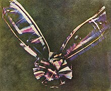
The first color photograph made according to Maxwell's prescription, a set of three monochrome "color separations", was taken by Thomas Sutton in 1861 for use in illustrating a lecture on color by Maxwell, where it was shown in color by the triple projection method.[6] The test subject was a bow made of ribbon with stripes of various colors, apparently including red and green. During the lecture, which was about physics and physiology, not photography, Maxwell commented on the inadequacy of the results and the need for a photographic material more sensitive to red and green light. A century later, historians were mystified by the reproduction of any red at all, because the photographic process used by Sutton was for all practical purposes totally insensitive to red light and only marginally sensitive to green. In 1961, researchers found that many red dyes also reflect ultraviolet light, coincidentally transmitted by Sutton's red filter, and surmised that the three images were probably due to ultra-violet, blue-green and blue wavelengths, rather than to red, green and blue.[7]
Additive color
[edit]Creating colors by mixing colored lights (usually red, green and blue) in various proportions is the additive method of color reproduction. LCD, LED, plasma and CRT (picture tube) color video displays all use this method. If one of these displays is examined with a sufficiently strong magnifier, it will be seen that each pixel is actually composed of red, green and blue sub-pixels which blend at normal viewing distances, reproducing a wide range of colors as well as white and shades of gray. This is also known as the RGB color model.
Subtractive color
[edit]The same three images taken through red, green and blue filters which are used for additive color synthesis may also be used to produce color prints and transparencies by the subtractive method, in which colors are subtracted from white light by dyes or pigments. In photography, the dye colors are normally cyan, a greenish-blue which absorbs red; magenta, a purplish-pink which absorbs green; and yellow, which absorbs blue. The red-filtered image is used to create a cyan dye image, the green-filtered image to create a magenta dye image, and the blue-filtered image to create a yellow dye image. When the three dye images are superimposed they form a complete color image.
This is also known as the CMYK color model. The "K" is a black component normally added in ink-jet and other mechanical printing processes to compensate for the imperfections of the colored inks used, which ideally should absorb or transmit various parts of the spectrum but not reflect any color, and to improve image definition.
At first it may seem that each image ought to be printed in the color of the filter used in making it, but by following any given color through the process the reason for printing in complementary colors should become apparent. A red object, for example, will be very pale in the red-filtered image but very dark in the other two images, so the result will be an area with just a trace of cyan, absorbing just a bit of red light, but a large amount of magenta and yellow, which together absorb most of the green and blue light, leaving mainly red light to be reflected back from the white paper in the case of a print, or transmitted through a clear support in the case of a transparency.
Before the technical innovations of the years 1935 to 1942, the only way to create a subtractive full-color print or transparency was by means of one of several labor-intensive and time-consuming procedures. Most commonly, three pigment images were first created separately by the so-called carbon process and then carefully combined in register. Sometimes, related processes were used to make three gelatin matrices which were dyed and assembled or used to transfer the three dye images into a single layer of gelatin coated on a final support. Chemical toning could be used to convert three black-and-white silver images into cyan, magenta and yellow images which were then assembled. In a few processes, the three images were created one on top of another by repeated coating or re-sensitizing, negative registration, exposure and development operations. A number of variations were devised and marketed during the first half of the 20th century, some of them short-lived, others, such as the Trichrome Carbro process, enduring for several decades. Because some of these processes allow very stable and light-fast coloring matter to be used, yielding images which can remain virtually unchanged for centuries, they are still not quite completely extinct.

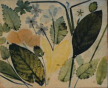
The production of photographic three-color prints on paper was pioneered by Louis Ducos du Hauron, whose comprehensive 1868 French patent also included the basic concepts of most of the color photographic processes which were subsequently developed. For making the three color-filtered negatives required, he was able to develop materials and methods which were not as completely blind to red and green light as those used by Thomas Sutton in 1861, but they were still very insensitive to those colors. Exposure times were impractically long, the red or orange-filtered negative requiring hours of exposure in the camera. His earliest surviving color prints are "sun prints" of pressed flowers and leaves, each of the three negatives having been made without a camera by exposing the light-sensitive surface to direct sunlight passing first through a color filter and then through the vegetation. His first attempts were based on the red-yellow-blue colors then used for pigments, with no color reversal. Later he used the primary colors of light with color reversal.
Color sensitization
[edit]As long as photographic materials were usefully sensitive only to blue-green, blue, violet and ultraviolet, three-color photography could never be practical. In 1873 German chemist Hermann Wilhelm Vogel discovered that the addition of small amounts of certain aniline dyes to a photographic emulsion could add sensitivity to colors which the dyes absorbed. He identified dyes which variously sensitized for all the previously ineffective colors except true red, to which only a marginal trace of sensitivity could be added.[8][9][10][11] In the following year, Edmond Becquerel discovered that chlorophyll was a good sensitizer for red.[12] Although it would be many more years before these sensitizers (and better ones developed later) found much use beyond scientific applications such as spectrography, they were quickly and eagerly adopted by Louis Ducos du Hauron, Charles Cros and other color photography pioneers. Exposure times for the "problem" colors could now be reduced from hours to minutes. As ever-more-sensitive gelatin emulsions replaced the old wet and dry collodion processes, the minutes became seconds. New sensitizing dyes introduced early in the 20th century eventually made so-called "instantaneous" color exposures possible.
Color cameras
[edit]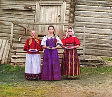
Making color separations by reloading the camera and changing the filter between exposures was inconvenient, added delays to the already long exposure times and could result in the camera being accidentally shifted out of position. To improve the actual picture-taking, a number of experimenters designed one or more special cameras for color photography. They were usually of two main types.
The first type used a system of partially reflecting surfaces to divide the light coming through the lens into three parts, each part passing through a different color filter and forming a separate image, so that the three images could be photographed at the same time on three plates (flexible film had not yet replaced glass plates as the support for the emulsion) or different areas of one plate. Later known as "one-shot" cameras, refined versions continued to be used as late as the 1950s for special purposes such as commercial photography for publication, in which a set of color separations was ultimately required in order to prepare printing plates.
The second type, known variously as a multiple back, repeating back or drop back camera, still exposed the images one at a time but used a sliding holder for the filters and plates which allowed each filter and the corresponding unexposed area of emulsion to be quickly shifted into place. German photochemistry professor Adolf Miethe designed a high-quality camera of this type which was commercially introduced by Bermpohl in 1903. It was probably this Miethe-Bermpohl camera which was used by Miethe's pupil Sergei Mikhailovich Prokudin-Gorskii to make his now-celebrated color photographic surveys of Russia before the 1917 revolution. One sophisticated variant, patented by Frederic Eugene Ives in 1897, was driven by clockwork and could be adjusted to automatically make each of the exposures for a different length of time according to the particular color sensitivities of the emulsion being used.[13]
Otherwise simple cameras with multiple color-filtered lenses were sometimes tried, but unless everything in the scene was at a great distance, or all in a plane at the same distance, the difference in the viewpoints of the lenses (parallax) made it impossible to completely register all parts of the resulting images at the same time.
Color photography leaves the laboratory
[edit]Prior to the late 1890s color photography was strictly the domain of a very few experimenters willing to build their own equipment, do their own color-sensitizing of photographic emulsions, make and test their own color filters and otherwise devote a large amount of time and effort to their pursuits. There were many opportunities for something to go wrong during the series of operations required and problem-free results were rare. Most photographers still regarded the whole idea of color photography as a pipe dream, something only madmen and swindlers would claim to have accomplished.
In 1898, however, it was possible to buy the required equipment and supplies ready-made. Two adequately red-sensitive photographic plates[14] were already on the market, and two very different systems of color photography with which to use them, described in photographic magazines for several years prior, were finally available to the public.
The most extensive and expensive of the two was the "Kromskop" (pronounced "chrome-scope") system developed by Frederic Eugene Ives.[15] This was a straightforward additive system and its essential elements had been described by James Clerk Maxwell, Louis Ducos du Hauron and Charles Cros much earlier, but Ives invested years of work and ingenuity in refining the methods and materials to optimize color quality, in overcoming problems inherent in the optical systems involved, and in simplifying the apparatus to bring down the cost of producing it commercially. The color images, dubbed "Kromograms", were in the form of sets of three black-and-white transparencies on glass, mounted onto special cloth-tape-hinged triple cardboard frames. To see a Kromogram in color it had to be inserted into a "Kromskop" (generic name "chromoscope" or "photochromoscope"), a viewing device which used an arrangement of colored glass filters to illuminate each slide with the correct color of light and transparent reflectors to visually combine them into a single full-color image. The most popular model was stereoscopic. By looking through its pair of lenses, an image in full natural color and 3-D was seen, a startling novelty in the late Victorian age.
The results won near-universal praise for excellence and realism. At demonstrations, Ives sometimes placed a viewer displaying a still-life subject next to the actual objects photographed, inviting direct comparison. A Kromskop triple "lantern" could be used to project the three images, mounted in a special metal or wooden frame for this purpose, through filters as Maxwell had done in 1861. Prepared Kromograms of still-life subjects, landscapes, famous buildings and works of art were sold and these were the Kromskop viewer's usual fodder, but a "multiple back" camera attachment and a set of three specially adjusted color filters could be bought by "Kromskopists" wishing to make their own Kromograms.
Kromskops and ready-made Kromograms were bought by educational institutions for their value in teaching about color and color vision, as well as by wealthy individuals. A few people made their own Kromograms. These were not enough to sustain Ives’ businesses, which had been set up to exploit the system; they soon failed, but the viewers, projectors, Kromograms and several varieties of Kromskop cameras and camera attachments continued to be available through the Scientific Shop in Chicago as late as 1907.
Screen-plate era
[edit]
The simpler and somewhat more economical alternative was the Joly screen process. This required no special camera or viewer, just a special color-compensating filter for the camera lens and a special holder for the photographic plates. The holder contained the heart of the system: a clear glass plate on which very fine lines of three colors had been ruled in a regular repeating pattern, completely covering its surface. The idea was that instead of taking three separate complete photographs through three colored filters, the filters could be in the form of a large number of very narrow strips (the colored lines) allowing the necessary color information to be recorded in a single compound image. After the negative was developed, a positive transparency was printed from it and a viewing screen with red, green and blue lines in the same pattern as the lines of the taking screen was applied and carefully aligned. The colors then appeared as if by magic. The transparency and screen were very like the layer of monochrome liquid crystal elements and overlay of hair-thin red, green and blue color filter stripes which create the color image in a typical LCD display. This was the invention of Irish scientist John Joly, although he, like so many other inventors, eventually discovered that his basic concept had been anticipated in Louis Ducos du Hauron's long-since-expired 1868 patent.[16]
The Joly screen process had some problems. First and foremost, although the colored lines were reasonably fine (about 75 sets of three colored lines to the inch) they were still disturbingly visible at normal viewing distances and nearly intolerable when enlarged by projection. This problem was exacerbated by the fact that each screen was individually ruled on a machine which used three pens to apply the transparent colored inks, resulting in irregularities, high reject rates and high cost. The glass used for photographic plates at the time was not perfectly flat, and lack of uniform good contact between the screen and the image gave rise to areas of degraded color. Poor contact also caused false colors to appear if the sandwich was viewed at an angle. Although much simpler than the Kromskop system, the Joly system was not inexpensive. The starter kit of plate holder, compensating filter, one taking screen and one viewing screen cost US$30 (the equivalent of at least $750 in 2010 dollars) and additional viewing screens were $1 each (the equivalent of at least $25 in 2010 dollars). This system, too, soon died of neglect, although in fact it pointed the way to the future.
Surviving examples of the Joly process usually show extremely poor color now. The colors in the viewing screens have badly faded and shifted, making it impossible to judge their original appearance. In some specimens the viewing screen is also misaligned.
Lippmann photography is a way of making a color photograph that relies on Bragg reflection planes in the emulsion to make the colors. It is similar to using the colors of soap bubbles to make an image. Gabriel Jonas Lippmann won the Nobel Prize in physics in 1908 for the creation of the first color photographic process using a single emulsion. The method is based on the interference phenomenon.[17] The color fidelity is extremely high but the images can not be reproduced and viewing requires very specific lighting conditions. The development of the Autochrome process quickly rendered the Lippmann method redundant. The method is still utilized to make singular images that cannot be copied for security purposes.
The first commercially successful color process, the Lumière Autochrome, invented by the French Lumière brothers, reached the market in 1907. Instead of colored strips, it was based on an irregular screen plate filter made of three colors of dyed grains of potato starch which were too small to be individually visible. The light-sensitive emulsion was coated directly onto the screen plate, eliminating problems due to imperfect contact between the screen and image. Reversal processing was used to convert the negative image which was initially produced into a positive image by removing the exposed silver metal, and re-exposing the remaining silver halide, so no printing or screen registration was required. The shortcomings of the Autochrome process were the expense (one plate cost about as much as a dozen black-and-white plates of the same size), the relatively long exposure times which made hand-held "snapshots" and photographs of moving subjects impractical, and the density of the finished image due to the presence of the light-absorbing color screen.
Viewed under optimum conditions and by daylight as intended, a well-made and well-preserved Autochrome can look startlingly fresh and vivid. Unfortunately, modern film and digital copies are usually made with a highly diffused light source, which causes loss of color saturation and other ill effects due to light scatter within the structure of the screen and emulsion, and by fluorescent or other artificial light which alters the color balance. The capabilities of the process should not be judged by the dull, washed-out, odd-colored reproductions commonly seen.
Millions of Autochrome plates were manufactured and used during the quarter century before the plates were replaced by film-based versions in the 1930s. The very last film version, named Alticolor, brought the Autochrome process into the 1950s but was discontinued in 1955. Many additive color screen products were available between the 1890s and the 1950s, but none, with the possible exception of Dufaycolor, introduced as film for still photography in 1935, was as popular or successful as the Lumière Autochrome. The most recent use of the additive screen process for non-digital photography was in Polachrome, an "instant" 35mm slide film introduced in 1983 and discontinued about twenty years later.
-
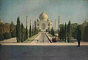
Color photograph of the Taj Mahal published in a 1921 issue of National Geographic magazine, taken in 1914.
-
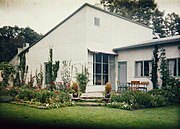
Autochrome of a house in Stockholm, 1930.
-
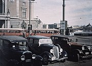
Autochrome of the Royal Swedish Opera, 1934.
Tripacks
[edit]Louis Ducos du Hauron had suggested using a sandwich of three differently color-recording emulsions on transparent supports which could be exposed together in an ordinary camera, then taken apart and used like any other set of three-color separations. The problem was that although two of the emulsions could be in contact face-to-face, the third would have to be separated by the thickness of one transparent support layer. Because all silver halide emulsions are inherently sensitive to blue, the blue-recording layer ought to be on top and have a blue-blocking yellow filter layer behind it. This blue-recording layer, used to make the yellow print which could most afford to be "soft", would end up producing the sharpest image. The two layers behind it, one sensitized to red but not green and the other to green but not red, would suffer from scattering of the light as it passed through the topmost emulsion, and one or both would further suffer by being spaced away from it.
Despite these limitations, some "tripacks" were commercially produced, such as the Hess-Ives "Hiblock" which sandwiched an emulsion on film between emulsions coated on glass plates. For a brief period in the early 1930s, the American Agfa-Ansco company produced Colorol, a roll-film tripack for snapshot cameras. The three emulsions were on unusually thin film bases. After exposure, the roll was sent to Agfa-Ansco for processing and the triple negatives were returned to the customer with a set of color prints. The images were not sharp and the color was not very good, but they were genuine "natural color" snapshots.
"Bipacks" using only two emulsions face-to-face were the subject of some development. Although the range of colors which could be reproduced by only two components was limited, skin tones and most hair and eye colors could be rendered with surprising fidelity, making bipack processes a viable option for color portraiture. In commercial practice, however, the use of bipacks was almost entirely confined to two-color motion picture systems.
If the three layers of emulsion in a tripack did not have to be taken apart in order to produce the cyan, magenta and yellow dye images from them, they could be coated directly on top of each other, eliminating the most serious problems. In fact, some chemical magic was under development which would make that possible.
Color film since the 1930s
[edit]In 1935, American Eastman Kodak introduced the first modern "integral tripack" color film and called it Kodachrome, a name recycled from an earlier and completely different two-color process. Its development was led by the improbable team of Leopold Mannes and Leopold Godowsky Jr. (nicknamed "Man" and "God"), two highly regarded classical musicians who had started tinkering with color photographic processes and ended up working with the Kodak Research Laboratories. Kodachrome had three layers of emulsion coated on a single base, each layer recording one of the three additive primaries, red, green, and blue. In keeping with Kodak's old "you press the button, we do the rest" slogan, the film was simply loaded into the camera, exposed in the ordinary way, then mailed to Kodak for processing. Aside from manufacturing the film, processing was the most complex step. This involved the controlled penetration of chemicals into the three layers of emulsion. A simplified description of the process is as follows: as each layer was developed into a black-and-white silver image, a "dye coupler" added during that stage of development caused a cyan, magenta or yellow dye image to be created along with it. The silver was chemically removed, leaving only the three layers of dye images in the finished film.
Initially, Kodachrome was available only as 16mm film for home movies, but in 1936 it was also introduced as 8mm home movie film and short lengths of 35mm film for still photography. In 1938, sheet film in various sizes for professional photographers was introduced, some changes were made to cure early problems with unstable colors, and a somewhat simplified processing method was instituted.
In 1936, the German Agfa followed with their own integral tripack film, Agfacolor Neu, which was generally similar to Kodachrome but had one important advantage: Agfa had found a way to incorporate the dye couplers into the emulsion layers during manufacture, allowing all three layers to be developed at the same time and greatly simplifying the processing. Most modern color films, excepting the now-discontinued Kodachrome, use the incorporated dye coupler technique, but since the 1970s nearly all have used a modification developed by Kodak rather than the original Agfa version.
In 1941, Kodak made it possible to order prints from Kodachrome slides. The print "paper" was actually a white plastic coated with a multilayer emulsion similar to that on the film. These were the first commercially available color prints created by the chromogenic dye coupler method. In the following year, Kodacolor film was introduced. Unlike Kodachrome, it was designed to be processed into a negative image which showed not only light and dark reversed but also complementary colors. The use of such a negative for making prints on paper simplified the processing of the prints, reducing their cost.
The expense of color film as compared to black-and-white and the difficulty of using it with indoor lighting combined to delay its widespread adoption by amateurs. In 1950, black-and-white snapshots were still the norm. By 1960, color was much more common but still tended to be reserved for travel photos and special occasions. Color film and color prints cost several times as much as black-and-white, and taking color snapshots in deep shade or indoors required flashbulbs—an inconvenience and an additional expense. By 1970, prices were dropping, film sensitivity had improved, electronic flash units were replacing flashbulbs, and color had become the norm for snapshot-taking in most families. Black-and-white film continued to be used by some photographers who preferred it for aesthetic reasons or who wanted to take pictures by existing light in low-light conditions, which was still difficult to do with color film. They usually did their own developing and printing. By 1980, black-and-white film in the formats used by typical snapshot cameras, as well as commercial developing and printing service for it, had nearly disappeared.
Instant color film was introduced by Polaroid in 1963. Like Polaroid's contemporary instant black-and-white film, their first color product was a negative-positive peel-apart process which produced a unique print on paper. The negative could not be reused and was discarded. The blight created by carelessly discarded caustic-chemical-laden Polaroid negatives, which tended to accumulate most heavily at the prettiest, most snapshot-worthy locations, horrified Polaroid founder Edwin Land and prompted him to develop the later SX-70 system, which produced no separate negative to discard.
Some currently available color films are designed to produce positive transparencies for use in a slide projector or magnifying viewer, although paper prints can also be made from them. Transparencies are preferred by some professional photographers who use film because they can be judged without having to print them first. Transparencies are also capable of a wider dynamic range and, therefore, of a greater degree of realism than the more convenient medium of prints on paper. The early popularity of color "slides" among amateurs went into decline after automated printing equipment began improving print quality and lowering prices.
Other currently available films are designed to produce color negatives for use in creating enlarged positive prints on color photographic paper. Color negatives may also be digitally scanned and then printed by photographic or non-photographic means, or viewed as positives electronically. Unlike reversal-film transparency processes, negative-positive processes are, within limits, forgiving of incorrect exposure and poor color lighting, because printing allows considerable correction. Negative film is therefore more suitable for casual use by amateurs. Virtually all single-use cameras employ negative film. Photographic transparencies can be made from negatives by printing them on special "positive film", but this has always been unusual outside of the motion picture industry and commercial service to do it for still images may no longer be available. Negative films and paper prints are by far the most common form of color film photography today.
-
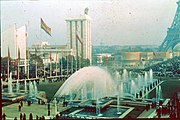
Agfacolor photo, World exposition in Paris, France, 1937.
-
Agfacolor photo of a café in Oslo, Norway, 1937.
-
Agfacolor photo in Sweden 1937.
-
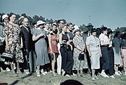
Kodachrome photo taken during the German invasion of Poland in September 1939.
-
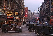
Kodachrome photo by Chalmers Butterfield of Shaftesbury Avenue from Piccadilly Circus, in the West End of London, c. 1949.
-
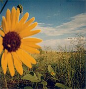
Sample shot of Polaroid Type 600, ISO 640, color film, 2009.
Digital photography
[edit]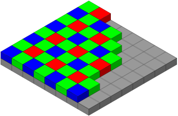
After a transition period centered around 1994–2006, color film was relegated to a niche market by inexpensive multi-megapixel digital cameras that can shoot both in monochrome as well as color. Some photographers continue to prefer film for its distinctive "look" for artistic purposes or out of fondness.
The most commonly used method of obtaining color information in digital photography is the use of a Bayer filter, invented by Bryce Bayer of Eastman Kodak in 1976. In this approach, a sensor that is sensitive to multiple wavelengths of light is placed behind a color filter. Traditionally, each pixel, or "sensel", is thereby assigned an additional light response curve beyond its inherent differential response to different wavelengths - typically the filters applied respond to red, blue and green, the latter being used twice as often based on an argument that the human eye is more sensitive to variation in green than any other color. Thus, the color image produced would preserve color in a way resembling human perception, and not appear unduly deteriorated in any particular color range.

However, alternative approaches do exist. The Foveon sensor uses the fact that light penetrates silicon to a depth that depends on the wavelength of the light. Thus, reading light at a lower layer in a silicon stack would yield a different value than reading it at the top, and the difference can be used to compute the color of the light in addition to its intensity.
Another option is the use of a prism to separate the colors onto three separate capturing devices, as in a three-CCD camera.
The Bayer pattern itself has had various modifications proposed. One class of these uses the same pattern, but changes the colors of the glass, for instance using cyan, yellow, green and magenta for increased sensitivity to the intensity of light (luminance) or replacing one green cell with an "emerald" or cyan one.
Fujifilm in particular has proposed some of the more unusual variations of the Bayer pattern, such as the EXR and X-Trans patterns.
Artists' perspectives
[edit]Photographers differed in opinion about color photography when it was introduced. Some fully embraced it when it was available to the public in the late 1930s, while others remained skeptical of its relevance in the art of photography.
Proponents
[edit]Paul Outerbridge was an American photographer prominent for his early use and experiments in color photography. He began writing a monthly column on color photography for the U.S. Camera Magazine around 1930. Outerbridge became known for the high quality of his color illustrations, made by an extremely complex tri-color carbro process.[18] In 1940 he published his seminal book Photographing in Color, using high quality illustrations to explain his techniques.[19]
Ferenc Berko, a classic photographer[vague] who lived during the rise of color film, was one of the photographers who immediately recognized the potential of color film. He saw it as a new way to frame the world; a way to experiment with the subjects he photographed and how he conveyed emotion in the photograph.[20]
John Hedgecoe, another photographer who lived during this time period,[vague] was another example of those who preferred color. He published a book entitled The Art of Color Photography, in which he explained the importance of understanding the "special and often subtle relationships between different colors". He also described the psychological and emotional power that color can have on the viewer, since certain colors, he argues, can make people feel a certain way.[21]
William Eggleston is widely credited with increasing recognition for color photography as a legitimate artistic medium.
Jan Groover, a postmodernist noted for her work during the 1970s used color extensively in her work.
Skeptics
[edit]Though color photography had its followers, black-and-white still remained the more popular and respected film when color first came out.
According to Eggleston, his former idol, Henri Cartier-Bresson, said to him at a party, “William, color is bullshit”, and then not another word.[22]
Harold Baquet, for instance—a relatively current photographer[vague] known best for documenting New Orleans civil rights—was not keen on color. He preferred to take pictures mainly using black-and-white film. When asked about his reasoning for this preference during an interview, he replied “The less is more thing. Sometimes the color distracts from the essential subject. Sometimes, just light, line and form is enough, and it allows you to explore the sculptural qualities of that third dimension, that illusional dimension of depth. And it’s fun”.[23] This aversion to color was due mainly to a fear of losing simplicity in his pictures. He worried that color gave the eye too much to take in.[23]
This worry was not uncommon. Photographer Ansel Adams, known best for his dramatic black-and-white landscapes, also felt that color could be distracting, and could therefore divert the artist's attention away from creating a photograph to his full potential, according to some experts. Adams actually claimed that he could get "a far greater sense of 'color' through a well-planned and executed black-and-white image than [he had] ever achieved with color photography".[24] Another expert source[vague] mentioned that Adams was a "master of control". He wrote books about technique, developed the Zone System—which helped determine the optimal exposure and development time for a given photograph—and introduced the idea of "previsualization", which involved the photographer imagining what he wanted his final print to look like before he even took the shot. These concepts and methods allowed for nearly total control of all the potential variables that factor into a final print. Because of this love for control, Adams disliked color because it lacked this element that he had mastered with black-and-white.[citation needed]
While Adams initially was far from thrilled with color, he did experiment with it, unknown to many. A few examples of his color work are available in the online archive of the Center for Creative Photography at the University of Arizona. The subjects which he shot in color ranged from portraits, to landscape, to architecture;[25] a similar scope to that of his black and white work. In fact, toward the end of his life, Adams admitted[citation needed] his regret of not being able to master the technique of color, according to an expert source.[vague]
Though a wide range of film preference still exists among photographers today, color has, with time, gained a much larger following in the field of photography.
Preservation
[edit]Color photographic materials are impermanent and, by nature, unstable. Chromogenic color photographs, for example, are composed of yellow, magenta, and cyan organic dyes, which fade at different rates. Even in dark storage and archival material enclosures, deterioration is unavoidable. However, proper care can delay fading, color shifting, and discoloration.
Environment
[edit]Unsuitable environmental conditions will deteriorate or destroy photographs. Examples include:
- High temperature and high relative humidity (RH)
- Air pollution and dirt
- Light exposure
- Biological threats such as fungi and insects
- Residual processing chemicals
- Base and emulsion deterioration
- Handling and usage
- Improper storage and enclosures
Three signs of aging of color images are:
- Dark fading occurs regardless of the procedures taken to preserve a photograph and is unavoidable. It is caused by temperature and humidity. Cyan dyes typically fade more quickly, making the image appear too red.
- Light fading occurs with exposure to light, e.g. while on display. The intensity of the light source and ultraviolet (UV) rays affect the rate of change and fade. Magenta dyes typically fade the quickest.
- Highlight staining of older color photographic papers is yellowing of the border and highlight areas of a photograph.
Storage
[edit]In general, the colder the storage, the longer the lifetime of color photographs. Frost-free cold storage below freezing is one of the most effective ways to halt damage to color images. Cold storage is more costly and requires special training to remove and return items. Cool storage above freezing, which is more common and less costly, requires temperatures between 10–15 °C (50–59 °F) with 30–40% relative humidity and above the dew point to eliminate condensation.
Dark storage in light tight enclosures and storage boxes is advised for individual items. When materials are exposed to light during handling, usage, or display, light sources should be UV-filtered and intensity kept at minimum. In storage areas, 200–400 lux is recommended.[citation needed]
Enclosures
[edit]The use of protective enclosures is the easiest method to preserve photographic materials from damage by handling and light exposure. All protective materials should pass the Photographic Activity Test (PAT) as described both by the American National Standards Institute (ANSI) in standard IT9.2–1988, and the International Organization for Standardization (ISO) in standard 18916:2007(E), Photography – Processed Photographic Materials – Photographic Activity Test for Enclosure Materials. The PAT is an archival science test that determines what kind of storage enclosures will preserve, prolong, and/or prevent further deterioration.
It is recommended that each item have its own archival enclosure of appropriate size. Archival enclosures may be made of paper or plastic. Each has advantages and disadvantages.
- Paper enclosures should be non-acidic, lignin-free paper and may come in either buffered or non-buffered stock. Paper enclosures are generally less costly than plastic ones. Paper's opacity protects photographs from light. Its porosity may protect them from internal humidity and gaseous pollutants. However, images must be removed from the enclosure to be viewed. This risks mishandling and vandalism.
- Archival quality plastic enclosures are made of uncoated polyester, polypropylene, or polyethylene. They are transparent, which enables viewing the photograph without removing the enclosure. Plastic is also more resistant to tears, compared to paper. Disadvantages include being prone to static electricity and risk of ferrotyping (moisture becoming trapped between enclosure and item, causing the materials to stick to one another).
After photographic materials are individually enclosed, housing or storage containers provide another protective barrier, such as folders and boxes made from archival paperboard as addressed in ISO Standards 18916:2007 and 18902. Sometimes these containers must be custom-made for oddly sized materials. In general, flat storage in boxes is recommended because it provides more stable support, particularly for materials that are fragile. Boxes and folders should not be over-filled.
See also
[edit]Notes
[edit]References
[edit]- ^ a b "1861: James Clerk Maxwell's greatest year". King's College London. 3 January 2017. Archived from the original on 4 January 2017. Retrieved 3 January 2017.
- ^ a b "From Charles Mackintosh's waterproof to Dolly the sheep: 43 innovations Scotland has given the world". The independent. 30 December 2016. Archived from the original on 2 October 2017. Retrieved 19 September 2017.
- ^ "The Smithsonian's National Museum of American History, The Getty Conservation Institute, and The Getty Foundation Collaborate to Unravel Photography's Most Controversial Mystery". The Smithsonian's National Museum of American History. 28 October 2007. Retrieved 31 October 2024.
- ^ Maxwell, James Clerk (1855). "Experiments on colour, as perceived by the eye, with remarks on colour-blindness". Transactions of the Royal Society of Edinburgh. XXI part II. Archived from the original on 2014-07-14. Retrieved 2014-07-06.
- ^ Science progress in the twentieth century: a quarterly journal of scientific work & thought, Volume 2. John Murray. 1908. p. 359. Archived from the original on 2019-12-15. Retrieved 2016-10-10. (Note: in apparent deference to the primaries named by Thomas Young, Maxwell calls the short-wavelength primary "violet" in the relevant paragraphs of his 1855 paper, though he actually used blue in his own experiments, which the paper also describes, and in his 1861 demonstration)
- ^ "The first colour photograph, 1861". The Guardian. 3 January 2017. Archived from the original on 4 January 2017. Retrieved 3 January 2017.
- ^ R.W.G. Hunt (2004). The Reproduction of Colour, 6th edition. Wiley. pp 9–10.
R.M. Evans (1961a). “Some Notes on Maxwell’s Colour Photograph.” Journal of Photographic Science 9. pp243–246
R.M. Evans (1961b). “Maxwell's Color Photography”. Scientific Photography 205. pp 117–128. - ^ Vogel, H: "On the sensitiveness of bromide of silver to the so-called chemically inactive colours", Chemical News, December 26, 1873:318–319, copying from The Photographic News, date and page not cited but apparently December 12, 1873 (the latter not known to be available online as of August 6, 2010), in turn translated from Vogel's own publication Photographische Mittheilungen, December, 1873 10(117):233–237. The capital letters used in this and other sources cited refer to the Fraunhofer lines in the solar spectrum, in keeping with contemporary practice. For convenience of reference: C is 656 nm, a slightly deeper red than the output of an average red laser pointer; D is 589 nm, the orange-yellow light of a sodium vapor lamp; E is 527 nm, green.
- ^ Vogel, H: "Photo-spectroscopic researches", The Photographic News, March 20, 1874:136–137, translated from Photographische Mittheilungen, February, 1874 10(119):279–283.
- ^ Vogel, H: "Rendering actinic non-actinic rays", The Photographic News, July 3, 1874:320–321, a direct communication (apparently in the original English) to The Photographic News.
- ^ Meldola, R. "Recent Researches In Photography". "Popular Science", October 1874, Pg.717–720 ISSN 0161-7370
- ^ Becquerel, E: "The action of rays of different refrangibility upon the iodide and bromide of silver: the influence of colouring matters", The Photographic News, October 23, 1874:508–509, translated from Comptes Rendus (1874) 79:185–190 (the latter downloaded from the Bibliotheque Nationale Francaise on January 28, 2006 but not directly linkable). Note one significant error in the Photographic News translation, page 509: "...vigorous band between the rays C and D" (referring to Fraunhofer lines) should be "C and B" per the original French text and in agreement with subsequent mentions in the translation.
- ^ Ives, F: Kromskop Color Photography, pages 33–35. The Photochromoscope Syndicate Limited, London, 1898. Only a brief description of this automated camera is given but a line drawing of the mechanism and the patent reference are included. An Ives one-shot camera is described and illustrated on pages 30–33 and a horizontally oriented multiple back attachment is illustrated on page 37.
- ^ Abney, W: "Orthochromatic photography", Journal of the Society of Arts, May 22, 1896 44:587–597 describes and illustrates (with spectrum photographs and curves) the characteristics of the Lumière Panchromatic and Cadett Spectrum plates as of 1896. Note that during this period "orthochromatic" was not intended to mean "red-blind", although most or all commercial products so labeled indeed were, which may explain the subsequent evolution in the meaning of the word. The wild roller-coaster curves necessitated laborious adjustment and testing of the color filters to obtain the three desired curves. In the cases of the red and green filters, that could mean quashing over ninety-nine percent of the overall sensitivity, requiring exposures measured in seconds under circumstances where one-fiftieth of a second would have sufficed for unfiltered monochrome use. Disproportionate blue sensitivity, requiring the use of a yellow filter for accurate monochrome rendition in daylight, was typical of commercial panchromatic emulsions far into the 20th Century. See also the previously referenced Ives, F: Kromskop Color Photography, price list (following page 80) pages 1–2, and the subsequently referenced Joly, J: "On a method...", page 135 for mentions of the use of the Lumière Panchromatic in those systems. The alternative alluded to in Ives may be the Cadett Spectrum but could also be the Edwards Isochromatic, only slightly sensitive to red, which Ives is on record as having employed at an earlier date. The Cadett Lightning Spectrum plate, with an improved spectral response curve and greatly increased overall speed, was available by mid-1900.
- ^ "Colourful stories no. 2 – the Kromskop". 12 January 2008. Archived from the original on 2018-04-24. Retrieved 2018-04-24.
- ^ Joly, J: "On a method of photography in natural colors", Scientific Transactions of the Royal Dublin Society, October, 1896 6(2):127–138 includes details such as the actual reasons for the unusual colors employed in the taking screen and examples of the exposures required. The color illustrations have obviously had considerable hand-work done by the engravers and may have been entirely hand-colored using the original transparencies as a guide. As is evident from page 127, publication was delayed by more than a year. The 1895 date is confirmed by the publication of a lengthy abstract in Nature, November 28, 1895 53(1361):91–93.
- ^ From Nobel Lectures, Physics 1901–1921, Elsevier Publishing Company, Amsterdam, 1967.
- ^ Szarkowski, John (July 28, 1999). Looking at Photographs: 100 Pictures from the Collection of the Museum of Modern Art. Bulfinch.
- ^ "When Color Was Vulgar: Paul Outerbridge's Avant-Gardist's Eye". The New Yorker. 5 August 2016. Archived from the original on 2018-09-21. Retrieved 2019-08-12.
- ^ Honan, William (March 26, 2000). "Ferenc Berko, 84, Pioneer In Use of Color Photography". The New York Times. Archived from the original on March 4, 2016. Retrieved February 18, 2017.
- ^ Hedgecoe, John (1998). The Art of Color Photography. Reed Consumer Books.
- ^ "Patrik Sandberg » WILLIAM EGGLESTON BY DREW BARRYMORE". www.patriksandberg.com. Archived from the original on 9 September 2012. Retrieved 11 January 2022.
- ^ a b Tuley, Laura Camille (December 2007). "An Interview with Harold Baquet" (PDF). New Orleans Review. 33 (2): 108–116. Archived (PDF) from the original on July 17, 2018. Retrieved March 21, 2012.
- ^ Woodward, Richard B. (November 2009). "Ansel Adams in Color". Smithsonian. Archived from the original on 2018-07-17. Retrieved 2018-07-17.
- ^ "Ansel Adams: Browse". Center for Creative Photography. University of Arizona.
General references
[edit]- Coe, Brian (1978). Colour Photography: the first hundred years 1840–1940. Ash & Grant.
- Coote, Jack (1993). The Illustrated History of Colour Photography. Fountain Press Ltd., ISBN 0-86343-380-4.
- Preservation of Photographs. Kodak publication, no. F-30. (1979). Rochester, NY: Eastman Kodak Co.
- Paine, C. (1996). Standards in the Museum Care of Photographic Collections. London, UK: Museums & Galleries Commission. ISBN 0-948630-42-6.
- Keefe, L.E.; & Inch, D. (1990). The Life of a Photograph: Archival processing, matting, framing, storage. Boston, MA: Focal Press. ISBN 0-240-80024-9, ISBN 978-0-240-80024-0.
- Lavédrine, B.; Gandolfo, J.-P.; Monod, S. (2003). A Guide to the Preventive Conservation of Photograph Collections. Los Angeles, CA: Getty Conservation Institute. ISBN 0-89236-701-6, ISBN 978-0-89236-701-6.
- Photograph Preservation and the Research Library. (1991). Mountain View, CA: The Research Libraries Group. ISBN 0-87985-212-7.
- Penichon, Sylvie (2013). Twentieth-Century Color Photographs: Identification and Care. Los Angeles, CA: Getty Publications. ISBN 978-1-60606-156-5.
- Reilly, J.M.; et al. (1998). Storage Guide for Color Photographic Materials. Albany, NY: University of the State of New York.
- Ritzenthaler, M.L.; Vogt-O'Connor, D. (2006). Photographs: Archival care and management. Chicago, IL: Society of American Archivists. ISBN 1-931666-17-2, ISBN 978-1-931666-17-6.
- Sipley, Louis Walton. (1951). A Half Century of Color, New York, NY: Macmillan.
- Caring for Photographs: Display, storage, restoration. Life library of photography. (1982). Alexandria, VA: Time-Life Books. ISBN 0-8094-4420-8.
- Weinstein, R.A.; Booth, L. (1977). Collection, Use, and Care of Historical Photographs. Nashville, TN: American Association for State and Local History. ISBN 0-910050-21-X.
- Wilhelm, H.G.; Brower, C. (1993). The Permanence and Care of Color Photographs: Traditional and digital color prints, color negatives, slides, and motion pictures. Grinnell, IA: Preservation Pub. Co. ISBN 0-911515-00-3.
- Wythe, D. (2004). Museum Archives: An introduction. Chicago, IL: Society of American Archivists. ISBN 1-931666-06-7, ISBN 978-1-931666-06-0.
Further reading
[edit]- Mathew Carey Lea in 1887 article appearing in Scientific American entitled "Photography in Natural Colors".[1]
- Rogers, David (October 2007), The Chemistry of Photography: From Classical to Digital Technologies, Royal Society of Chemistry, ISBN 9780854042739, OCLC 1184188382
- ^ Scientific American. Munn & Company. 1887-07-09. p. 17.

